> ## Documentation Index
> Fetch the complete documentation index at: https://docs.glood.ai/llms.txt
> Use this file to discover all available pages before exploring further.
# Editing Checkout Upsell Styling
## Overview
This document provides a comprehensive guide to all available styling settings for the Checkout Upsell extension. The styling configuration uses a nested JSON structure where you can customize different components.
## Styling Structure
The styling follows a 3-level hierarchy:
1. **Component Level** (e.g., "productCard", "atcButton")
2. **UI Element Level** (e.g., "border", "borderRadius")
3. **Style Value** (e.g., "base", "loose")
## Styling (JSON Configuration)
**Setting Key:** `styling`
**Type:** Multi-line text field
**Description:** JSON object containing all styling configurations
## Styling Components
### A. Widget Title Styling
**Component Key:** `widgetTitle`
#### Available Properties:
**`size`** - Font size of the widget title
Values:
* `extraSmall`
* `small`
* `base`
* `medium`
* `large`
* `extraLarge`
**`appearance`** - Color/tone of the widget title text
Values:
* `accent` - Brand accent color
* `subdued` - Muted/secondary color
* `info` - Informational blue
* `success` - Success green
* `warning` - Warning yellow
* `critical` - Error/critical red
* `decorative` - Decorative styling
#### Example:
```json theme={null}
{
"widgetTitle": {
"size": "large",
"appearance": "accent"
}
}
```
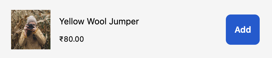
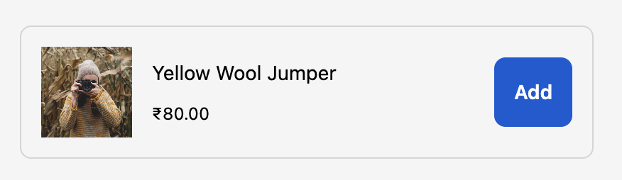
### B. Product Card Container Styling
**Component Key:** `productCard`
#### Available Properties:
**`border`** - Border style around the product card
Values:
* `base` - Standard border
* `dashed` - Dashed border
* `dotted` - Dotted border
* `none` - No border
**`borderWidth`** - Width/thickness of the border
Values:
* `base` - Standard width
* `medium` - Medium thickness
* `thick` - Thick border
**`borderRadius` (or `cornerRadius`)** - Rounded corners of the product card
Values:
* `none` - Square corners
* `small` - Slightly rounded
* `base` - Standard rounding
* `large` - Very rounded
* `fullyRounded` - Fully rounded/pill shape
**`padding`** - Internal spacing within the product card
Values:
* `none` - No padding
* `extraTight` - Minimal padding
* `tight` - Small padding
* `base` - Standard padding
* `loose` - Large padding
* `extraLoose` - Extra large padding
**`background`** - Background color of the product card
Values:
* `transparent` - No background
* `base` - Standard background
* `subdued` - Muted background
#### Example:
```json theme={null}
{
"productCard": {
"border": "base",
"borderRadius": "base",
"borderWidth": "base",
"padding": "base",
"background": "base"
}
}
```
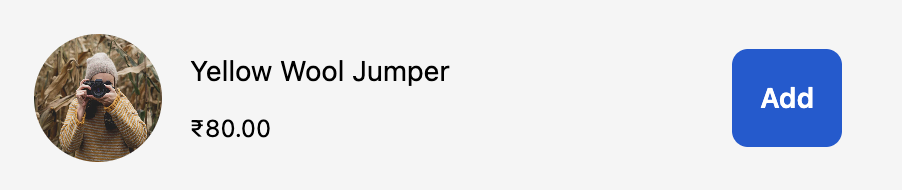
### C. Product Image Styling
**Component Key:** `productImage`
#### Available Properties:
**`border`** - Border style around the product image
Values:
* `base` - Standard border
* `dashed` - Dashed border
* `dotted` - Dotted border
* `none` - No border
**`borderWidth`** - Width/thickness of the image border
Values:
* `base` - Standard width
* `medium` - Medium thickness
* `thick` - Thick border
**`borderRadius` (or `cornerRadius`)** - Rounded corners of the product image
Values:
* `none` - Square corners
* `small` - Slightly rounded
* `base` - Standard rounding
* `large` - Very rounded
* `fullyRounded` - Fully rounded/circular
#### Example:
```json theme={null}
{
"productImage": {
"border": "base",
"cornerRadius": "large",
"borderWidth": "base"
}
}
```
### D. Add to Cart Button Styling
**Component Key:** `atcButton`
#### Available Properties:
**`kind`** - Visual style of the button
Values:
* `primary` - Main action button (filled, prominent)
* `secondary` - Secondary action button (outlined)
* `plain` - Text-only button (looks like a link)
**`appearance`** - Color tone of the button
Values:
* `critical` - Red/error styling
* `monochrome` - Black and white styling
For transparent buttons, use `kind: "plain"` which renders as a text link
**`inlineAlignment`** - Horizontal alignment of button text
Values:
* `start` - Align to start
* `center` - Center alignment (default)
* `end` - Align to end
#### Example:
```json theme={null}
{
"atcButton": {
"kind": "primary",
"inlineAlignment": "center"
}
}
```
#### Example (Transparent/Plain Button):
```json theme={null}
{
"atcButton": {
"kind": "plain",
"inlineAlignment": "start"
}
}
```
#### Example (Critical/Urgent Button):
```json theme={null}
{
"atcButton": {
"kind": "primary",
"appearance": "critical",
"inlineAlignment": "center"
}
}
```
## Complete Examples
### Example 1: Minimal Styling
```json theme={null}
{
"productCard": {
"borderRadius": "base"
}
}
```
 ### Example 2: Card with Border
```json theme={null}
{
"productCard": {
"border": "base",
"borderRadius": "base",
"borderWidth": "base",
"padding": "base"
}
}
```
### Example 2: Card with Border
```json theme={null}
{
"productCard": {
"border": "base",
"borderRadius": "base",
"borderWidth": "base",
"padding": "base"
}
}
```
 ### Example 3: Rounded Images
```json theme={null}
{
"productImage": {
"cornerRadius": "fullyRounded"
}
}
```
### Example 3: Rounded Images
```json theme={null}
{
"productImage": {
"cornerRadius": "fullyRounded"
}
}
```
 ### Example 4: Secondary Button Style
```json theme={null}
{
"atcButton": {
"kind": "secondary"
}
}
```
### Example 4: Secondary Button Style
```json theme={null}
{
"atcButton": {
"kind": "secondary"
}
}
```
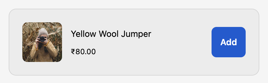
 ### Example 5: Complete Custom Styling
```json theme={null}
{
"widgetTitle": {
"size": "large",
"appearance": "accent"
},
"productCard": {
"border": "base",
"borderRadius": "large",
"borderWidth": "base",
"padding": "loose",
"background": "subdued"
},
"productImage": {
"border": "none",
"cornerRadius": "base"
},
"atcButton": {
"kind": "primary",
"inlineAlignment": "center"
}
}
```
### Example 5: Complete Custom Styling
```json theme={null}
{
"widgetTitle": {
"size": "large",
"appearance": "accent"
},
"productCard": {
"border": "base",
"borderRadius": "large",
"borderWidth": "base",
"padding": "loose",
"background": "subdued"
},
"productImage": {
"border": "none",
"cornerRadius": "base"
},
"atcButton": {
"kind": "primary",
"inlineAlignment": "center"
}
}
```
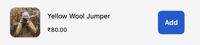
 ### Example 6: Modern Clean Design
```json theme={null}
{
"widgetTitle": {
"size": "extraLarge",
"appearance": "accent"
},
"productCard": {
"border": "none",
"borderRadius": "large",
"padding": "loose",
"background": "transparent"
},
"productImage": {
"border": "base",
"cornerRadius": "large",
"borderWidth": "base"
},
"atcButton": {
"kind": "primary",
"inlineAlignment": "center"
}
}
```
### Example 6: Modern Clean Design
```json theme={null}
{
"widgetTitle": {
"size": "extraLarge",
"appearance": "accent"
},
"productCard": {
"border": "none",
"borderRadius": "large",
"padding": "loose",
"background": "transparent"
},
"productImage": {
"border": "base",
"cornerRadius": "large",
"borderWidth": "base"
},
"atcButton": {
"kind": "primary",
"inlineAlignment": "center"
}
}
```
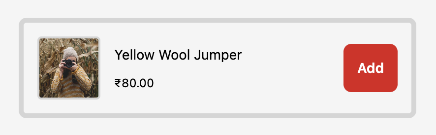
 ### Example 7: Bold with Borders
```json theme={null}
{
"widgetTitle": {
"size": "large",
"appearance": "accent"
},
"productCard": {
"border": "base",
"borderRadius": "base",
"borderWidth": "thick",
"padding": "base",
"background": "base"
},
"productImage": {
"border": "base",
"cornerRadius": "small",
"borderWidth": "medium"
},
"atcButton": {
"kind": "primary",
"appearance": "critical",
"inlineAlignment": "center"
}
}
```
### Example 7: Bold with Borders
```json theme={null}
{
"widgetTitle": {
"size": "large",
"appearance": "accent"
},
"productCard": {
"border": "base",
"borderRadius": "base",
"borderWidth": "thick",
"padding": "base",
"background": "base"
},
"productImage": {
"border": "base",
"cornerRadius": "small",
"borderWidth": "medium"
},
"atcButton": {
"kind": "primary",
"appearance": "critical",
"inlineAlignment": "center"
}
}
```
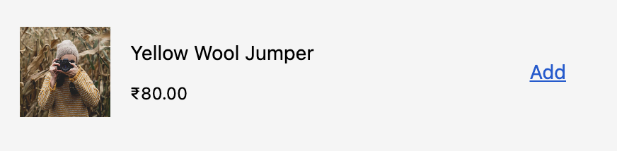
 ### Example 8: Text-Link Style Buttons
```json theme={null}
{
"widgetTitle": {
"size": "medium",
"appearance": "subdued"
},
"productCard": {
"border": "none",
"borderRadius": "none",
"padding": "tight",
"background": "transparent"
},
"productImage": {
"border": "none",
"borderRadius": "base"
},
"atcButton": {
"kind": "plain",
"inlineAlignment": "start"
}
}
```
### Example 8: Text-Link Style Buttons
```json theme={null}
{
"widgetTitle": {
"size": "medium",
"appearance": "subdued"
},
"productCard": {
"border": "none",
"borderRadius": "none",
"padding": "tight",
"background": "transparent"
},
"productImage": {
"border": "none",
"borderRadius": "base"
},
"atcButton": {
"kind": "plain",
"inlineAlignment": "start"
}
}
```
 ## Implementation Notes
### 1. JSON Validation
* The styling field expects valid JSON
* If JSON parsing fails, default styles will be applied
* Empty object `{}` is valid and will use all defaults
### 2. Optional Properties
* All styling properties are optional
* Omitted properties will use Shopify's default styles
* Partial configurations are supported
### 3. Brand Consistency
* Styles respect the merchant's branding settings
* Some colors are controlled by the merchant's brand settings
* Custom styles work within Shopify's design system constraints
### 4. Fallback Behavior
* Invalid values fallback to defaults
* Unknown properties are ignored
* System ensures checkout remains functional
## Troubleshooting
**Solution:** Verify JSON syntax is valid. Use a JSON validator.
**Solution:** Check if merchant's brand settings override your appearance values.
**Solution:** Verify `kind` property has valid value: "primary", "secondary", or "plain"
**Solution:** Ensure both `border` and `borderWidth` are set (not just one)
## Additional Resources
* [Shopify Checkout UI Extensions Documentation](https://shopify.dev/docs/api/checkout-ui-extensions)
* [View Component](https://shopify.dev/docs/api/checkout-ui-extensions/2025-01/components/structure/view)
* [Button Component](https://shopify.dev/docs/api/checkout-ui-extensions/2025-01/components/actions/button)
* [Text Components](https://shopify.dev/docs/api/checkout-ui-extensions/2025-01/components/titles-and-text)
## Implementation Notes
### 1. JSON Validation
* The styling field expects valid JSON
* If JSON parsing fails, default styles will be applied
* Empty object `{}` is valid and will use all defaults
### 2. Optional Properties
* All styling properties are optional
* Omitted properties will use Shopify's default styles
* Partial configurations are supported
### 3. Brand Consistency
* Styles respect the merchant's branding settings
* Some colors are controlled by the merchant's brand settings
* Custom styles work within Shopify's design system constraints
### 4. Fallback Behavior
* Invalid values fallback to defaults
* Unknown properties are ignored
* System ensures checkout remains functional
## Troubleshooting
**Solution:** Verify JSON syntax is valid. Use a JSON validator.
**Solution:** Check if merchant's brand settings override your appearance values.
**Solution:** Verify `kind` property has valid value: "primary", "secondary", or "plain"
**Solution:** Ensure both `border` and `borderWidth` are set (not just one)
## Additional Resources
* [Shopify Checkout UI Extensions Documentation](https://shopify.dev/docs/api/checkout-ui-extensions)
* [View Component](https://shopify.dev/docs/api/checkout-ui-extensions/2025-01/components/structure/view)
* [Button Component](https://shopify.dev/docs/api/checkout-ui-extensions/2025-01/components/actions/button)
* [Text Components](https://shopify.dev/docs/api/checkout-ui-extensions/2025-01/components/titles-and-text)