 ## Image
### Using Markdown
The [markdown syntax](https://www.markdownguide.org/basic-syntax/#images) lets you add images using the following code
```md

```
Note that the image file size must be less than 5MB. Otherwise, we recommend hosting on a service like [Cloudinary](https://cloudinary.com/) or [S3](https://aws.amazon.com/s3/). You can then use that URL and embed.
### Using Embeds
To get more customizability with images, you can also use [embeds](/writing-content/embed) to add images
```html
## Image
### Using Markdown
The [markdown syntax](https://www.markdownguide.org/basic-syntax/#images) lets you add images using the following code
```md

```
Note that the image file size must be less than 5MB. Otherwise, we recommend hosting on a service like [Cloudinary](https://cloudinary.com/) or [S3](https://aws.amazon.com/s3/). You can then use that URL and embed.
### Using Embeds
To get more customizability with images, you can also use [embeds](/writing-content/embed) to add images
```html
 ```
## Embeds and HTML elements
```
## Embeds and HTML elements
{{ section_title }}
{% if section_discount_str.length > 0 %}
{{ section_discount_str }}
{% endif %}
{% for product in products %}
{% assign product_url = root_url | product_url: product.handle, glood.product.id, section.layout %}
{% assign first_available_variant = -1 %}
{% assign available_variants_count = 0 %}
{% for variant in product.variants %}
{% if variant.available_for_sale %}
{% if available_variants_count == 0 %}
{% assign first_available_variant = variant %}
{% endif %}
{% assign available_variants_count = available_variants_count | plus: 1 %}
{% endif %}
{% endfor %}
{% if first_available_variant == -1 %}
{% assign first_available_variant = product.variants[0] %}
{% endif %}
{% assign multiple_variants = available_variants_count > 1 %}
{% capture swatch_component %}
{% assign should_enable_swatch = template.settings.product_card.variant_selector_type == 'swatch' or template.settings.product_card.variant_selector_type == 'swatch_with_atc' %}
{% if should_enable_swatch and product.variants.size > 1 %}
{% assign options = product.options %}
 {% if product.images[1].src %}
 {% endif %}
{% endfor %}
{% endif %}
{% endfor %}
{% if section.layout == 'carousel'%}
{% for swatch in template.settings.swatches %}
{% assign allowed_names = swatch.option_names %}
{% assign found_option = false %}
{% for option in options %}
{% assign found = false %}
{% for name in allowed_names %}
{% if name == option.name %}
{% assign found_option = option %}
{% assign found = true %}
{% break %}
{% endif %}
{% endfor %}
{% if found %}
{% break %}
{% endif %}
{% endfor %}
{% if found_option != false %}
{% assign translation_key = "swatch_label_" | append: found_option.name %}
{% endif %}
{% endcapture %}
{% capture variant_selector %}
{% assign size = available_variants_count %}
{% if size > 1 %}
{% endif %}
{% endcapture %}
{% assign selected_option = first_available_variant.selected_options | find: 'name', found_option.name %}
{% endif %}
{% endfor %}
{% for value in found_option.option_values %}
{% assign swatch_img_url = found_option.swatches[forloop.index0].image.preview_image.url %}
{% assign swatch_color = found_option.swatches[forloop.index0].color %}
{% if swatch_color == blank %}
{% assign swatch_color = value | color_value: template.settings.color_mapping %}
{% endif %}
{% if swatch.type == "size" %}{{ value }}{% endif %}
{% endfor %}
{% if available_variants_count == 0 %}
{{ translations.oos_text | default: 'Out Of Stock' }}
{% endif %}
{% assign labels_cnt = 0 %}
{% for label in template.settings.labels %}
{% if labels_cnt < template.settings.max_labels_count and product.tags contains label.name %}
{{- translations[label.name] | default: label.name -}}
{% assign labels_cnt = labels_cnt | plus: 1 %}
{% endif %}
{% endfor %}
{% assign product_discount = product | product_discount: section.discount_config, translations.discount_label_text, glood.shop.money_format %}
{% if product_discount.length > 0 and template.settings.product_card.show_discount_pill %}
{{ product_discount }}
{% endif %}
{{ translations.added_to_cart_text | default: 'Added to cart' }}
{{ translations.atc_error_text | default: 'Error while add to cart' }}
{% if template.settings.product_card.add_to_cart_mode == 'image_hover' %}
{% if template.settings.product_card.variant_selector_type == 'integrated' %}
{{ variant_selector }}
{% endif %}
{% endif %}
{% if template.settings.product_card.vendor_position == 'above' %}
{{ product.vendor }}
{% endif %}
{{ product.title }}
{% if template.settings.product_card.vendor_position == 'below' %}
{{ product.vendor }}
{% endif %}
{% assign compare_at_price = first_available_variant.compare_at_price | times: 1.0 %}
{% if template.settings.product_card.price_compare_at_mode != 'none' and compare_at_price > 0 %}
{{ first_available_variant.compare_at_price | format_money: glood.shop.money_format }}
{% endif %}
{{ first_available_variant.price | format_money: glood.shop.money_format }}
{% assign save_text = product | save_amount: section.discount_config, translations.discount_save_text, glood.shop.money_format %}
{% if save_text.length > 0 %}
{{ save_text }}
{% endif %}
{{ swatch_component }}
{{ quantity_selector }}
{% if template.settings.product_card.variant_selector_type == 'selector' %}
{{ variant_selector }}
{% endif %}
{% if template.settings.product_card.add_to_cart_mode != 'image_hover' %}
{% if template.settings.product_card.variant_selector_type == 'integrated' %}
{{ variant_selector }}
{% endif %}
{% endif %}
_
{{ section.title }}
{% if section_discount_str.length > 0 %}
{{ section_discount_str }}
{% endif %}
{% for product in products %}
{% assign first_available_variant = -1 %}
{% assign available_variants_count = 0 %}
{% for variant in product.variants %}
{% if variant.available_for_sale %}
{% if available_variants_count == 0 %}
{% assign first_available_variant = variant %}
{% endif %}
{% assign available_variants_count = available_variants_count | plus: 1 %}
{% endif %}
{% endfor %}
{% if first_available_variant == -1 %}
{% assign first_available_variant = product.variants[0] %}
{% endif %}
{% assign multiple_variants = available_variants_count > 1 %}
{% assign product_url = root_url | product_url: product.handle, glood.product.id, section.layout %}
{% if product.images[1].src %}
{% endif %}
{% if forloop.index != products.length %}
{% endif %}
{% endfor %}
{% if available_variants_count == 0 %}
{{ translations.oos_text | default: 'Out Of Stock' }}
{% endif %}
{% assign labels_cnt = 0 %}
{% for label in template.settings.labels %}
{% if labels_cnt < template.settings.max_labels_count and product.tags contains label.name %}
{{- translations[label.name] | default: label.name -}}
{% assign labels_cnt = labels_cnt | plus: 1 %}
{% endif %}
{% endfor %}
{% assign product_discount = product | product_discount: section.discount_config, translations.discount_label_text, glood.shop.money_format %}
✔️
{% if template.settings.product_card.vendor_position == 'above' %}
{{ product.vendor }}
{% endif %}
{{ product.title }}
{% if template.settings.product_card.vendor_position == 'below' %}
{{ product.vendor }}
{% endif %}
{% assign save_text = product | save_amount: section.discount_config, translations.fbt_save_text, glood.shop.money_format %}
{% if save_text.length > 0 %}
{{ save_text }}
{% endif %}
{% assign compare_at_price = first_available_variant.compare_at_price | times: 1.0 %}
{% if template.settings.product_card.price_compare_at_mode != 'none' and compare_at_price > 0 %}
{{ first_available_variant.compare_at_price | format_money: glood.shop.money_format }}
{% endif %}
{{ first_available_variant.price | format_money: glood.shop.money_format }}
{% assign options = product.options %}
{% assign should_enable_swatch = template.settings.product_card.variant_selector_type == 'swatch' or template.settings.product_card.variant_selector_type == 'swatch_with_atc' %}
{% if should_enable_swatch and product.variants.size > 1 %}
{% assign options = product.options %}
{% for swatch in template.settings.swatches %}
{% assign allowed_names = swatch.option_names %}
{% assign found_option = false %}
{% for option in options %}
{% assign found = false %}
{% for name in allowed_names %}
{% if name == option.name %}
{% assign found_option = option %}
{% assign found = true %}
{% break %}
{% endif %}
{% endfor %}
{% if found %}
{% break %}
{% endif %}
{% endfor %}
{% if found_option != false %}
{% assign translation_key = 'swatch_label_' | append: found_option.name %}
{% elsif available_variants_count > 1 %}
{% endif %}
{% assign selected_option = first_available_variant.selected_options | find: 'name', found_option.name %}
{% endif %}
{% endfor %}
{% for value in found_option.option_values %}
{% assign swatch_img_url = found_option.swatches[forloop.index0].image.preview_image.url %}
{% assign swatch_color = found_option.swatches[forloop.index0].color %}
{% if swatch_color == blank %}
{% assign swatch_color = value | color_value: template.settings.color_mapping %}
{% endif %}
{% if swatch.type == "size" %}{{ value }}{% endif %}
{% endfor %}
{{ section.title }}
{% if section_discount_str.length > 0 %}
{{ section_discount_str }}
{% endif %}
{% if translations.total_price_text.length > 0 %}
{{ translations.total_price_text }}
{% endif %}
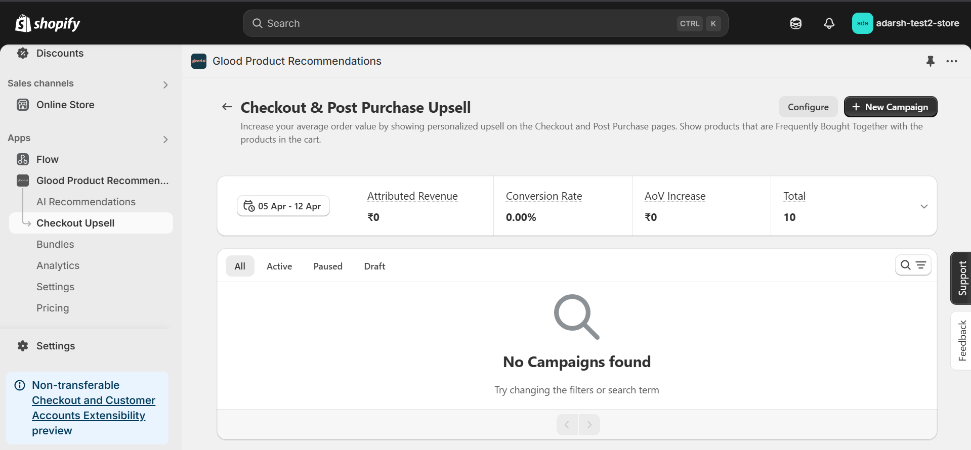
 #### 2. Click on the "Checkout Upsell" section from the app menu.
→ This will open the "Checkout & Post Purchase Upsell" dashboard screen (as shown in the image), where you can manage and create upsell campaigns.
#### 2. Click on the "Checkout Upsell" section from the app menu.
→ This will open the "Checkout & Post Purchase Upsell" dashboard screen (as shown in the image), where you can manage and create upsell campaigns.
 #### 3. Click on the "New Campaign" button at the top right corner to start creating a new upsell campaign.
→ Once you click, the Create Campaign screen will open, where you can enter your campaign details and configure the upsell settings.
#### 3. Click on the "New Campaign" button at the top right corner to start creating a new upsell campaign.
→ Once you click, the Create Campaign screen will open, where you can enter your campaign details and configure the upsell settings.
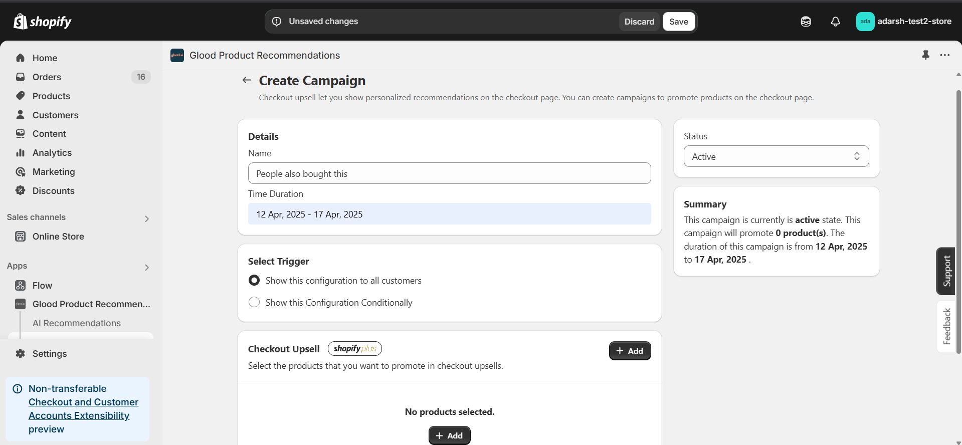
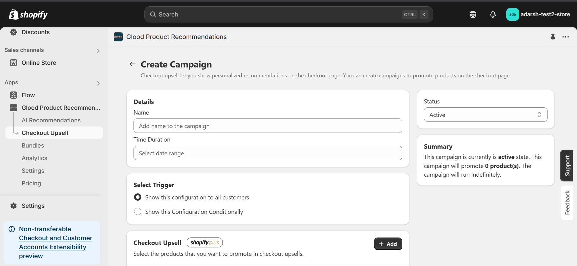 #### 4. After clicking on "New Campaign", the Create Campaign screen will open (as shown in the image).
→ On this screen, you'll need to fill in the following details to set up your Checkout Upsell campaign:
* **Name**: Add a name for your campaign to easily identify it.
* **Time Duration**: Set the start and end date for when the campaign should be active.
* **Status**: Keep this set to Active if you want the upsell campaign to show on the checkout screen.
* **Trigger**: Choose whether this campaign should be shown to all customers or conditionally based on certain rules.
* **Checkout Upsell Products**: Click on the + Add button to select the product(s) that will be promoted as upsell items during checkout.
* **Save**: Click on Save button
#### 4. After clicking on "New Campaign", the Create Campaign screen will open (as shown in the image).
→ On this screen, you'll need to fill in the following details to set up your Checkout Upsell campaign:
* **Name**: Add a name for your campaign to easily identify it.
* **Time Duration**: Set the start and end date for when the campaign should be active.
* **Status**: Keep this set to Active if you want the upsell campaign to show on the checkout screen.
* **Trigger**: Choose whether this campaign should be shown to all customers or conditionally based on certain rules.
* **Checkout Upsell Products**: Click on the + Add button to select the product(s) that will be promoted as upsell items during checkout.
* **Save**: Click on Save button
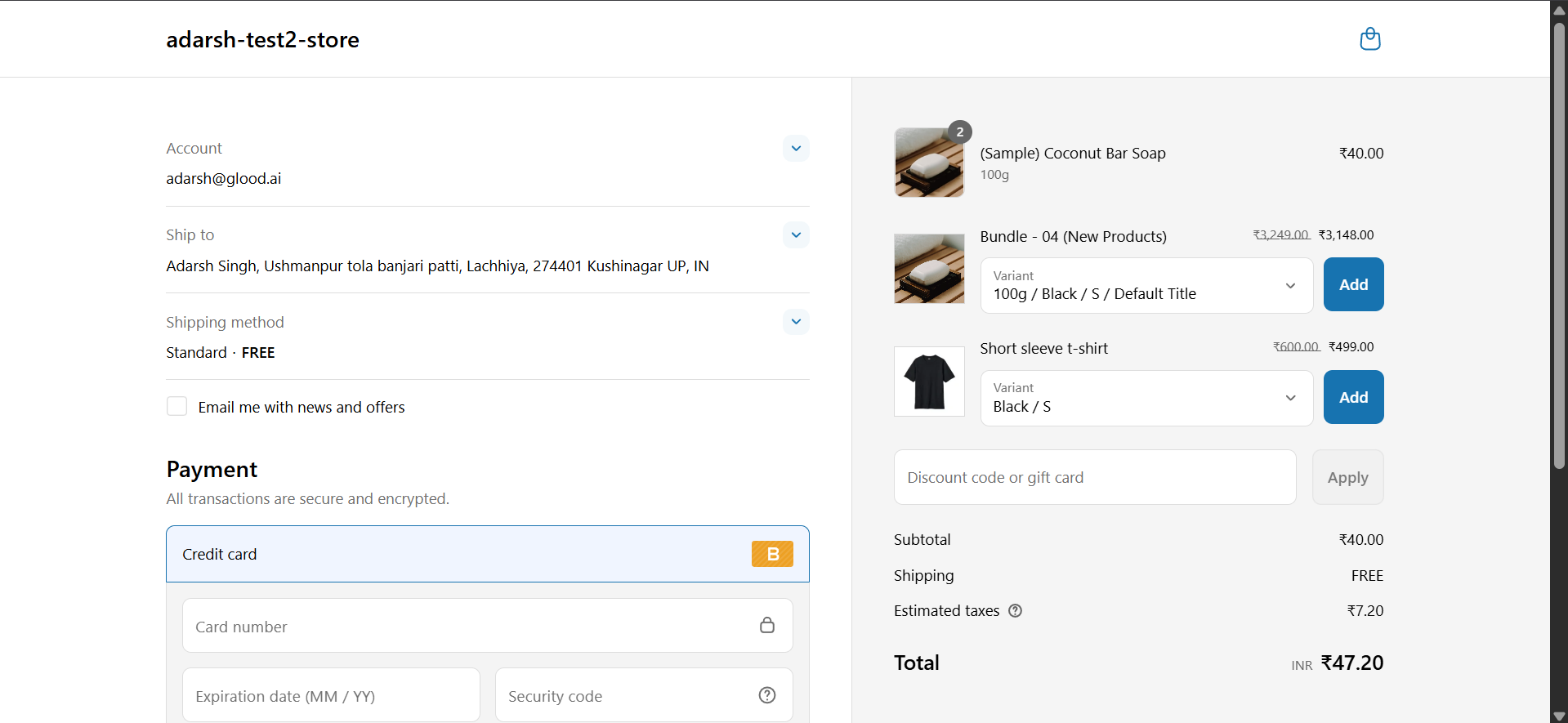
 #### 5. Once these steps are completed, the Checkout Upsell will automatically appear on your checkout screen for customers.
 ## Troubleshooting
### Unable to See the Checkout Upsell?
If you've set up your campaign but don't see the upsell appearing on your checkout screen, you'll need to add the Checkout app section in your Shopify store.
Follow these steps to configure the Checkout Upsell on desktop devices:
1. From your Shopify admin, navigate to **Settings > Checkout**
2. In the Configurations section, find and click **Customize** next to your desired configuration
3. In the checkout editor, select the page where you want the upsell to appear
4. Click **Sections** to open the sidebar
5. Click **⊕ Add app block** in your chosen section
6. Select the Glood.AI upsell app block
7. Customize the app block settings:
* Drag and drop to reposition
* Click the block to adjust available settings
8. Click **Save** to apply your changes
### Additional Resources
For more detailed information about configuring app blocks across devices, refer to [Add app blocks from installed apps](https://help.shopify.com/en/manual/checkout-settings/customize-checkout-configurations/checkout-apps#add-app).
## Additional Configuration Settings
### Checkout Upsell Configuration
#### Upsell Products
The Upsell Products section provides two main functionalities:
1. **Checkout Editor Integration**
* Access the Shopify Checkout Visual Editor to position the upsell block
* Drag and drop the "Glood: Checkout Upsell" section to your desired location
* Customize the block's appearance and layout within the checkout flow
* Preview how the upsell will appear to customers
2. **Product Selection and Management**
* Add products to be shown as recommendations on the checkout screen
* Add products manually or use AI generated product
#### Manual 1:1 Recommendations
Configure specific product pairs to be shown together during checkout:
* Enable "Override Recommendations with Manual Recommendations when available"
* Select a trigger product that when added to cart will show specific recommendations
* Choose the recommended product(s) to be displayed when that trigger product is in the chekout-screen
#### Excluded Products
Configure which products should not appear in checkout upsell recommendations:
* Exclude individual products by selecting them from your product catalog
* Exclude groups of products by specifying product tags (e.g. exclude all products tagged as "subscription")
* Set up exclusion rules using product attributes like price range, vendor, or collection
* Excluded products will never appear as recommendations, even if they match other recommendation criteria
#### Placement and Layout
Click the "Open Checkout Editor" button to configure the placement and layout of the checkout upsell section:
* Access Shopify's checkout editor to position the upsell block
* Drag and drop the "Glood: Checkout Upsell" section to your desired location
* Customize appearance settings like fonts, colors and spacing
* Preview how the upsell will appear across different devices
## Support
If you need help with setting up or customizing checkout upsells, contact our support team at [support@glood.ai](mailto:support@glood.ai)
# Add Checkout Upsell on Post Checkout Screen
Source: https://docs.glood.ai/for-developers/how-to-guides/add-checkout-upsell-post-checkout
Post checkout upsells display personalized product recommendations immediately after purchase completion. These recommendations can significantly increase average order value by suggesting products that complement items the customer has just purchased.
## Implementation Steps
#### 1. Open the "Glood Product Recommendations" app in your Glood.AI admin
## Troubleshooting
### Unable to See the Checkout Upsell?
If you've set up your campaign but don't see the upsell appearing on your checkout screen, you'll need to add the Checkout app section in your Shopify store.
Follow these steps to configure the Checkout Upsell on desktop devices:
1. From your Shopify admin, navigate to **Settings > Checkout**
2. In the Configurations section, find and click **Customize** next to your desired configuration
3. In the checkout editor, select the page where you want the upsell to appear
4. Click **Sections** to open the sidebar
5. Click **⊕ Add app block** in your chosen section
6. Select the Glood.AI upsell app block
7. Customize the app block settings:
* Drag and drop to reposition
* Click the block to adjust available settings
8. Click **Save** to apply your changes
### Additional Resources
For more detailed information about configuring app blocks across devices, refer to [Add app blocks from installed apps](https://help.shopify.com/en/manual/checkout-settings/customize-checkout-configurations/checkout-apps#add-app).
## Additional Configuration Settings
### Checkout Upsell Configuration
#### Upsell Products
The Upsell Products section provides two main functionalities:
1. **Checkout Editor Integration**
* Access the Shopify Checkout Visual Editor to position the upsell block
* Drag and drop the "Glood: Checkout Upsell" section to your desired location
* Customize the block's appearance and layout within the checkout flow
* Preview how the upsell will appear to customers
2. **Product Selection and Management**
* Add products to be shown as recommendations on the checkout screen
* Add products manually or use AI generated product
#### Manual 1:1 Recommendations
Configure specific product pairs to be shown together during checkout:
* Enable "Override Recommendations with Manual Recommendations when available"
* Select a trigger product that when added to cart will show specific recommendations
* Choose the recommended product(s) to be displayed when that trigger product is in the chekout-screen
#### Excluded Products
Configure which products should not appear in checkout upsell recommendations:
* Exclude individual products by selecting them from your product catalog
* Exclude groups of products by specifying product tags (e.g. exclude all products tagged as "subscription")
* Set up exclusion rules using product attributes like price range, vendor, or collection
* Excluded products will never appear as recommendations, even if they match other recommendation criteria
#### Placement and Layout
Click the "Open Checkout Editor" button to configure the placement and layout of the checkout upsell section:
* Access Shopify's checkout editor to position the upsell block
* Drag and drop the "Glood: Checkout Upsell" section to your desired location
* Customize appearance settings like fonts, colors and spacing
* Preview how the upsell will appear across different devices
## Support
If you need help with setting up or customizing checkout upsells, contact our support team at [support@glood.ai](mailto:support@glood.ai)
# Add Checkout Upsell on Post Checkout Screen
Source: https://docs.glood.ai/for-developers/how-to-guides/add-checkout-upsell-post-checkout
Post checkout upsells display personalized product recommendations immediately after purchase completion. These recommendations can significantly increase average order value by suggesting products that complement items the customer has just purchased.
## Implementation Steps
#### 1. Open the "Glood Product Recommendations" app in your Glood.AI admin
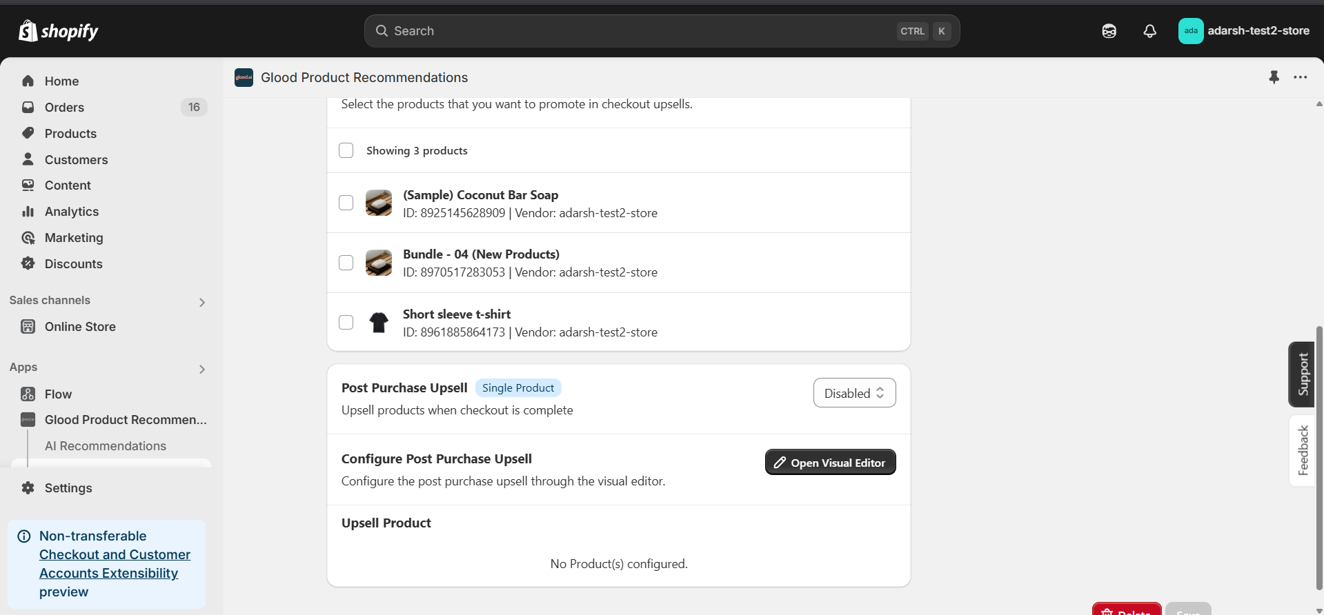 * After filling in all the campaign details, make sure the Post Purchase Upsell section is enabled.
* Enable the toggle inside the Post Purchase Upsell section (as shown in the image).
* After filling in all the campaign details, make sure the Post Purchase Upsell section is enabled.
* Enable the toggle inside the Post Purchase Upsell section (as shown in the image).
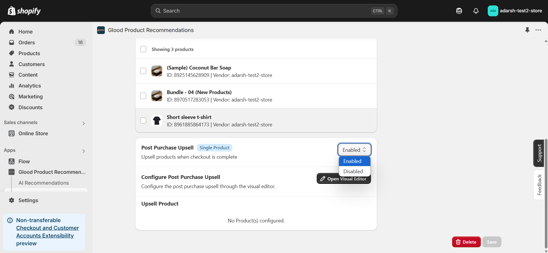 * Once enabled, click the Save button.
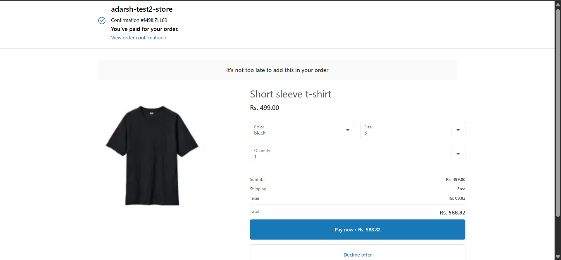
#### 6. This will ensure that the selected upsell product(s) are shown on the post-checkout screen, right after the customer completes their order.
* Once enabled, click the Save button.
#### 6. This will ensure that the selected upsell product(s) are shown on the post-checkout screen, right after the customer completes their order.
 ## Troubleshooting
### Unable to See the Checkout Upsell?
If your checkout upsell still isn't showing, verify that your post-purchase configuration is set correctly:
* From your Shopify admin, go to **Settings > Checkout**
* Scroll down to the **Post-purchase page** section
* Under Add tracking scripts and other customizations, ensure **Glood Product Recommendations** app is selected/configured to run post-purchase experiences
* If nothing is selected, choose the **Glood Product Recommendations** app to handle Post Checkout Upsell
* Once configured, this will ensure that your upsell campaigns display on the post-checkout screen.
## Additional Configuration Settings
#### Post Purchase Upsell Configuration
Control whether post-purchase upsells appear after checkout completion:
* Enable or disable post-purchase upsells using the "Control Post Purchase Upsell" toggle
* When enabled, recommended products will be shown to customers on the order confirmation page
* When disabled, no additional product recommendations will appear after purchase completion
#### Excluded Products
Configure which products should not appear in checkout upsell recommendations:
* Exclude individual products by selecting them from your product catalog
* Exclude groups of products by specifying product tags (e.g. exclude all products tagged as "subscription")
* Set up exclusion rules using product attributes like price range, vendor, or collection
* Excluded products will never appear as recommendations, even if they match other recommendation criteria
## Support
If you need help with setting up or customizing post checkout upsells, contact our support team at [support@glood.ai](mailto:support@glood.ai)
# Add Sections to Mini Cart
Source: https://docs.glood.ai/for-developers/how-to-guides/add-sections-to-mini-cart
This guide walks you through the process of adding Glood.AI product recommendations to your store's mini cart (also known as AJAX cart).
## Overview
AJAX cart recommendations appear when customers view their cart in a slide-out drawer or popup. These recommendations update dynamically as customers add or remove items from their cart.
## Implementation Steps
### 1. Create AJAX Section
First, create a new section in your Glood.AI dashboard:
1. Go to **Sections** in your Glood.AI admin
2. Click **Create New Section**
3. Select **AJAX Cart** as the page type
4. Configure your desired recommendation strategy
5. Save the section
### 2. Place Section in Mini Cart
Add the section html (from section details page) to your theme's mini cart template:
### 3. Configure Load/Unload Hooks
To control when the AJAX cart recommendations load and unload, implement these hooks in your section template:
```js
// Load recommendations when mini cart opens
loadAjaxCart: (bodyElem) => {
const ajaxCart = bodyElem.querySelector('cart-drawer');
return ajaxCart.classList.contains("active");
},
// Unload recommendations when mini cart closes
unloadAjaxCart: (bodyElem) => {
const ajaxCart = bodyElem.querySelector('cart-drawer');
return !ajaxCart.classList.contains("active");
}
```
## Testing
To verify your implementation:
1. Add an item to your cart
2. Open the mini cart
3. Verify that recommendations appear
4. Close the mini cart
5. Verify that recommendations are removed
6. Test with different cart contents to ensure recommendations update
## Troubleshooting
Common issues and solutions:
* **Recommendations don't load**: Verify your section ID and ensure the mini cart element selector matches your theme
* **Recommendations don't update**: Check that loadAjaxCart and unloadAjaxCart hooks are properly configured
* **Performance issues**: Consider adjusting the number of recommended products shown
## Next Steps
* Customize the recommendation layout to match your theme
* Add tracking to measure recommendation performance
* Configure product filtering rules
For more details on hooks and configuration options, see the [Template Hooks](/for-developers/section-template/hooks) documentation.
# Enable Custom Events in V3 Template
Source: https://docs.glood.ai/for-developers/how-to-guides/enable-custom-events
Learn how to enable and configure custom events to control section visibility on your store
## Overview
Custom events provide a flexible way to control section behavior in your store. This guide demonstrates how to set up and use custom events to manage section rendering based on various scenarios and conditions.
Custom events enable you to:
* Control section visibility based on specific triggers
* Manage section rendering timing
* Implement custom loading behaviors
* Create dynamic user experiences
## Configuration
### Set Up Init Event Name
In your app-embed settings, locate the "Init Event Name" section inside the app-embed and in the input field write your desired event name (e.g., initialize\_app).
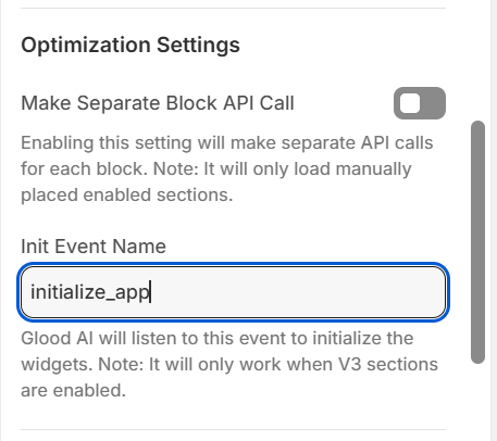
This setting tells Glood AI which event to listen for before initializing the sections.
## Usage
### Basic Implementation
1. Set your desired event name in the "Init Event Name" field
2. By default, no sections will be visible on the store
3. Trigger the event to show sections
### Example
Here's a simple example of how to trigger the custom event. When this event is dispatched, Glood AI will initialize all sections that are configured to listen for this event:
```javascript
// This will trigger the sections to become visible
dispatchEvent(new CustomEvent("initialize_app"));
```
### Common Use Cases
1. **Scroll-Based Loading**
```javascript
window.addEventListener('scroll', () => {
if (isScrolledToBottom()) {
dispatchEvent(new CustomEvent("initialize_app"));
}
});
```
2. **User Interaction Based**
```javascript
document.querySelector('.load-recommendations').addEventListener('click', () => {
dispatchEvent(new CustomEvent("initialize_app"));
});
```
3. **Time-Based Loading**
```javascript
setTimeout(() => {
dispatchEvent(new CustomEvent("initialize_app"));
}, 3000); // Show sections after 3 seconds
```
## Best Practices
1. **Event Naming**
* Use clear, descriptive event names
* Follow a consistent naming convention
* Avoid generic names that might conflict with other events
2. **Performance**
* Trigger events at appropriate times to optimize page load
* Consider user experience when deciding when to show sections
* Avoid triggering events too early or too late
3. **Error Handling**
* Always check if the event was successfully dispatched
* Provide fallback behavior if needed
* Log events for debugging purposes
## Troubleshooting
If sections aren't appearing as expected:
1. Verify that V3 sections are enabled
2. Check that the event name matches exactly in both settings and code
3. Ensure the event is being dispatched correctly
4. Check browser console for any errors
5. Verify that the sections are properly configured
## Support
If you need help with setting up or customizing events, contact our support team at [support@glood.ai](mailto:support@glood.ai)
# Enable Labels on Store
Source: https://docs.glood.ai/for-developers/how-to-guides/enable-labels
Learn how to configure and enable product labels in your store
## Configuration
### Settings Configuration
Configure your labels in `settings.json`. Each label has a name, text color, and background color:
```json
"labels": [
{
"name": "new",
"textColor": "#ffffff",
"backgroundColor": "#333333"
},
{
"name": "trending",
"textColor": "#ffffff",
"backgroundColor": "#444444"
},
{
"name": "bestseller",
"textColor": "#ffffff",
"backgroundColor": "#222222"
}
],
"maxLabelsCount": 2
```
### Template Implementation
Add this code to your `theme.liquid` to display labels on products. The code checks for matching tags and applies the configured styling:
```liquid
{% assign labels_cnt = 0 %}
{% for label in template.settings.labels %}
{% if labels_cnt < template.settings.max_labels_count and product.tags contains label.name %}
## Troubleshooting
### Unable to See the Checkout Upsell?
If your checkout upsell still isn't showing, verify that your post-purchase configuration is set correctly:
* From your Shopify admin, go to **Settings > Checkout**
* Scroll down to the **Post-purchase page** section
* Under Add tracking scripts and other customizations, ensure **Glood Product Recommendations** app is selected/configured to run post-purchase experiences
* If nothing is selected, choose the **Glood Product Recommendations** app to handle Post Checkout Upsell
* Once configured, this will ensure that your upsell campaigns display on the post-checkout screen.
## Additional Configuration Settings
#### Post Purchase Upsell Configuration
Control whether post-purchase upsells appear after checkout completion:
* Enable or disable post-purchase upsells using the "Control Post Purchase Upsell" toggle
* When enabled, recommended products will be shown to customers on the order confirmation page
* When disabled, no additional product recommendations will appear after purchase completion
#### Excluded Products
Configure which products should not appear in checkout upsell recommendations:
* Exclude individual products by selecting them from your product catalog
* Exclude groups of products by specifying product tags (e.g. exclude all products tagged as "subscription")
* Set up exclusion rules using product attributes like price range, vendor, or collection
* Excluded products will never appear as recommendations, even if they match other recommendation criteria
## Support
If you need help with setting up or customizing post checkout upsells, contact our support team at [support@glood.ai](mailto:support@glood.ai)
# Add Sections to Mini Cart
Source: https://docs.glood.ai/for-developers/how-to-guides/add-sections-to-mini-cart
This guide walks you through the process of adding Glood.AI product recommendations to your store's mini cart (also known as AJAX cart).
## Overview
AJAX cart recommendations appear when customers view their cart in a slide-out drawer or popup. These recommendations update dynamically as customers add or remove items from their cart.
## Implementation Steps
### 1. Create AJAX Section
First, create a new section in your Glood.AI dashboard:
1. Go to **Sections** in your Glood.AI admin
2. Click **Create New Section**
3. Select **AJAX Cart** as the page type
4. Configure your desired recommendation strategy
5. Save the section
### 2. Place Section in Mini Cart
Add the section html (from section details page) to your theme's mini cart template:
### 3. Configure Load/Unload Hooks
To control when the AJAX cart recommendations load and unload, implement these hooks in your section template:
```js
// Load recommendations when mini cart opens
loadAjaxCart: (bodyElem) => {
const ajaxCart = bodyElem.querySelector('cart-drawer');
return ajaxCart.classList.contains("active");
},
// Unload recommendations when mini cart closes
unloadAjaxCart: (bodyElem) => {
const ajaxCart = bodyElem.querySelector('cart-drawer');
return !ajaxCart.classList.contains("active");
}
```
## Testing
To verify your implementation:
1. Add an item to your cart
2. Open the mini cart
3. Verify that recommendations appear
4. Close the mini cart
5. Verify that recommendations are removed
6. Test with different cart contents to ensure recommendations update
## Troubleshooting
Common issues and solutions:
* **Recommendations don't load**: Verify your section ID and ensure the mini cart element selector matches your theme
* **Recommendations don't update**: Check that loadAjaxCart and unloadAjaxCart hooks are properly configured
* **Performance issues**: Consider adjusting the number of recommended products shown
## Next Steps
* Customize the recommendation layout to match your theme
* Add tracking to measure recommendation performance
* Configure product filtering rules
For more details on hooks and configuration options, see the [Template Hooks](/for-developers/section-template/hooks) documentation.
# Enable Custom Events in V3 Template
Source: https://docs.glood.ai/for-developers/how-to-guides/enable-custom-events
Learn how to enable and configure custom events to control section visibility on your store
## Overview
Custom events provide a flexible way to control section behavior in your store. This guide demonstrates how to set up and use custom events to manage section rendering based on various scenarios and conditions.
Custom events enable you to:
* Control section visibility based on specific triggers
* Manage section rendering timing
* Implement custom loading behaviors
* Create dynamic user experiences
## Configuration
### Set Up Init Event Name
In your app-embed settings, locate the "Init Event Name" section inside the app-embed and in the input field write your desired event name (e.g., initialize\_app).

This setting tells Glood AI which event to listen for before initializing the sections.
## Usage
### Basic Implementation
1. Set your desired event name in the "Init Event Name" field
2. By default, no sections will be visible on the store
3. Trigger the event to show sections
### Example
Here's a simple example of how to trigger the custom event. When this event is dispatched, Glood AI will initialize all sections that are configured to listen for this event:
```javascript
// This will trigger the sections to become visible
dispatchEvent(new CustomEvent("initialize_app"));
```
### Common Use Cases
1. **Scroll-Based Loading**
```javascript
window.addEventListener('scroll', () => {
if (isScrolledToBottom()) {
dispatchEvent(new CustomEvent("initialize_app"));
}
});
```
2. **User Interaction Based**
```javascript
document.querySelector('.load-recommendations').addEventListener('click', () => {
dispatchEvent(new CustomEvent("initialize_app"));
});
```
3. **Time-Based Loading**
```javascript
setTimeout(() => {
dispatchEvent(new CustomEvent("initialize_app"));
}, 3000); // Show sections after 3 seconds
```
## Best Practices
1. **Event Naming**
* Use clear, descriptive event names
* Follow a consistent naming convention
* Avoid generic names that might conflict with other events
2. **Performance**
* Trigger events at appropriate times to optimize page load
* Consider user experience when deciding when to show sections
* Avoid triggering events too early or too late
3. **Error Handling**
* Always check if the event was successfully dispatched
* Provide fallback behavior if needed
* Log events for debugging purposes
## Troubleshooting
If sections aren't appearing as expected:
1. Verify that V3 sections are enabled
2. Check that the event name matches exactly in both settings and code
3. Ensure the event is being dispatched correctly
4. Check browser console for any errors
5. Verify that the sections are properly configured
## Support
If you need help with setting up or customizing events, contact our support team at [support@glood.ai](mailto:support@glood.ai)
# Enable Labels on Store
Source: https://docs.glood.ai/for-developers/how-to-guides/enable-labels
Learn how to configure and enable product labels in your store
## Configuration
### Settings Configuration
Configure your labels in `settings.json`. Each label has a name, text color, and background color:
```json
"labels": [
{
"name": "new",
"textColor": "#ffffff",
"backgroundColor": "#333333"
},
{
"name": "trending",
"textColor": "#ffffff",
"backgroundColor": "#444444"
},
{
"name": "bestseller",
"textColor": "#ffffff",
"backgroundColor": "#222222"
}
],
"maxLabelsCount": 2
```
### Template Implementation
Add this code to your `theme.liquid` to display labels on products. The code checks for matching tags and applies the configured styling:
```liquid
{% assign labels_cnt = 0 %}
{% for label in template.settings.labels %}
{% if labels_cnt < template.settings.max_labels_count and product.tags contains label.name %}
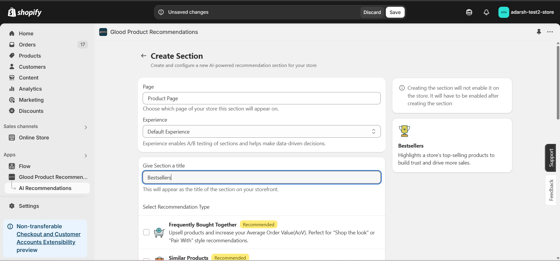
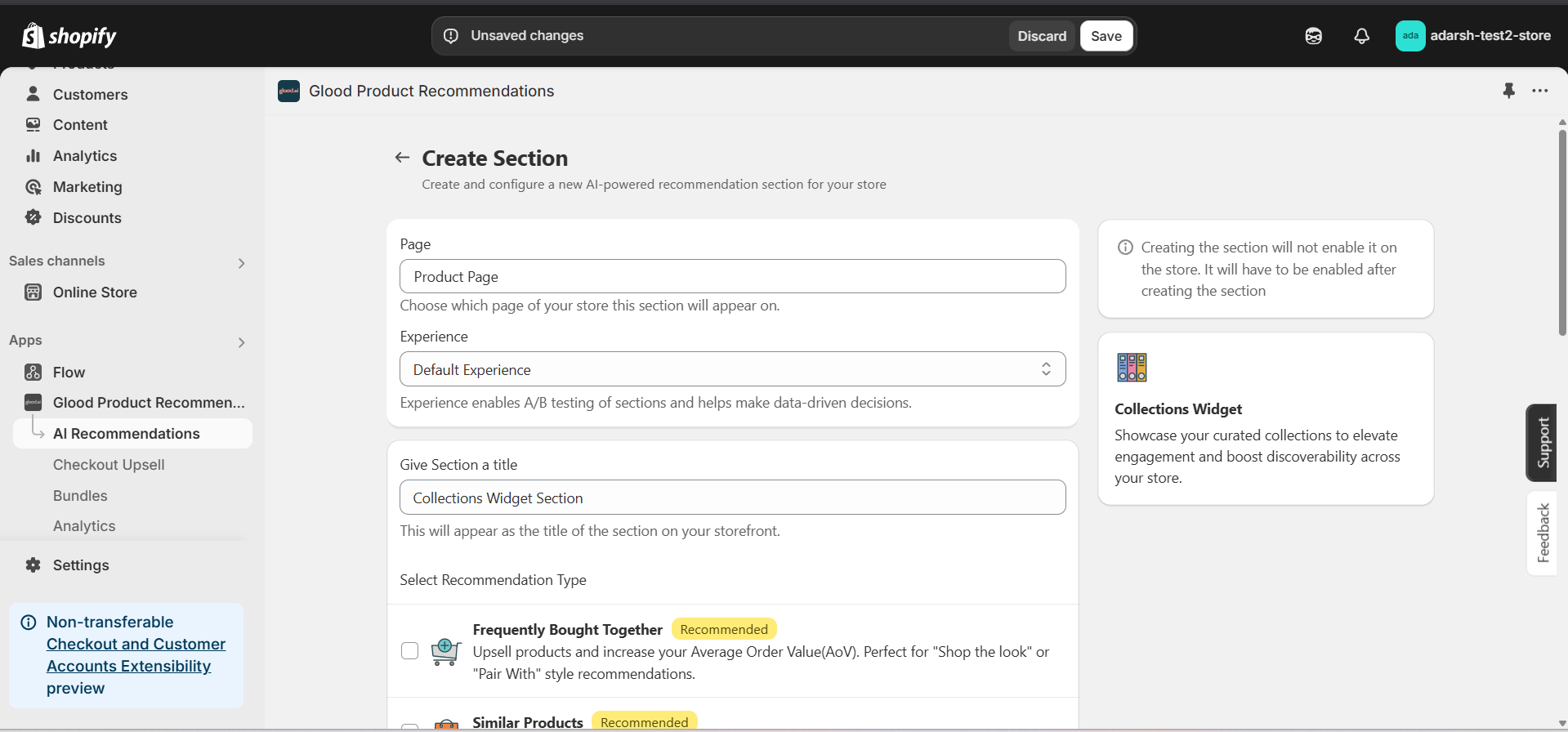
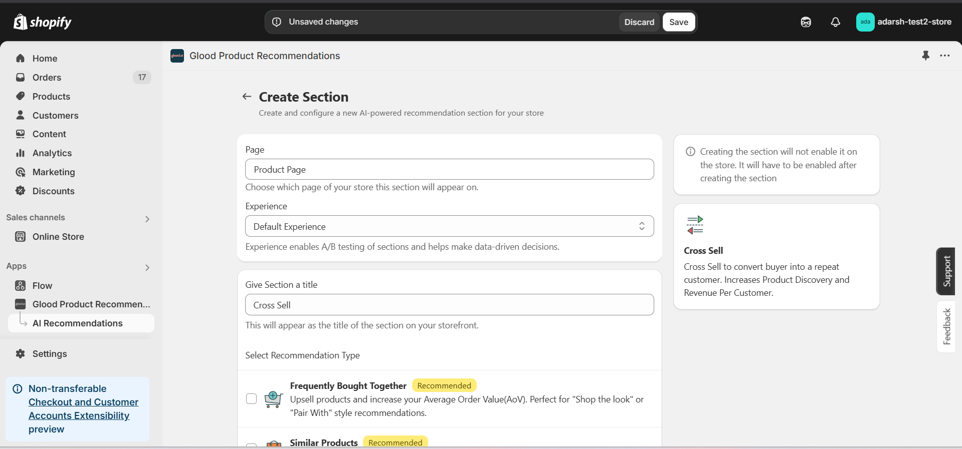
 #### 3. Click on the "Create Section" button on the top-right corner
* This will open the Create AI Recommendation Section screen
* Select the page where you want to display the section
* Choose the experience type and give the section a title (e.g., Best Selling Products)
* Under **Select Recommendation Type**, choose **Bestsellers** to display your top-selling products
#### 3. Click on the "Create Section" button on the top-right corner
* This will open the Create AI Recommendation Section screen
* Select the page where you want to display the section
* Choose the experience type and give the section a title (e.g., Best Selling Products)
* Under **Select Recommendation Type**, choose **Bestsellers** to display your top-selling products
 #### 4. Click on the Save button to create the section
* After selecting Bestsellers as your recommendation type and filling out the necessary details, click on the Save button
* This will create the section and open the section detail page
* **Note:** The section is disabled by default until you enable it
#### 4. Click on the Save button to create the section
* After selecting Bestsellers as your recommendation type and filling out the necessary details, click on the Save button
* This will create the section and open the section detail page
* **Note:** The section is disabled by default until you enable it
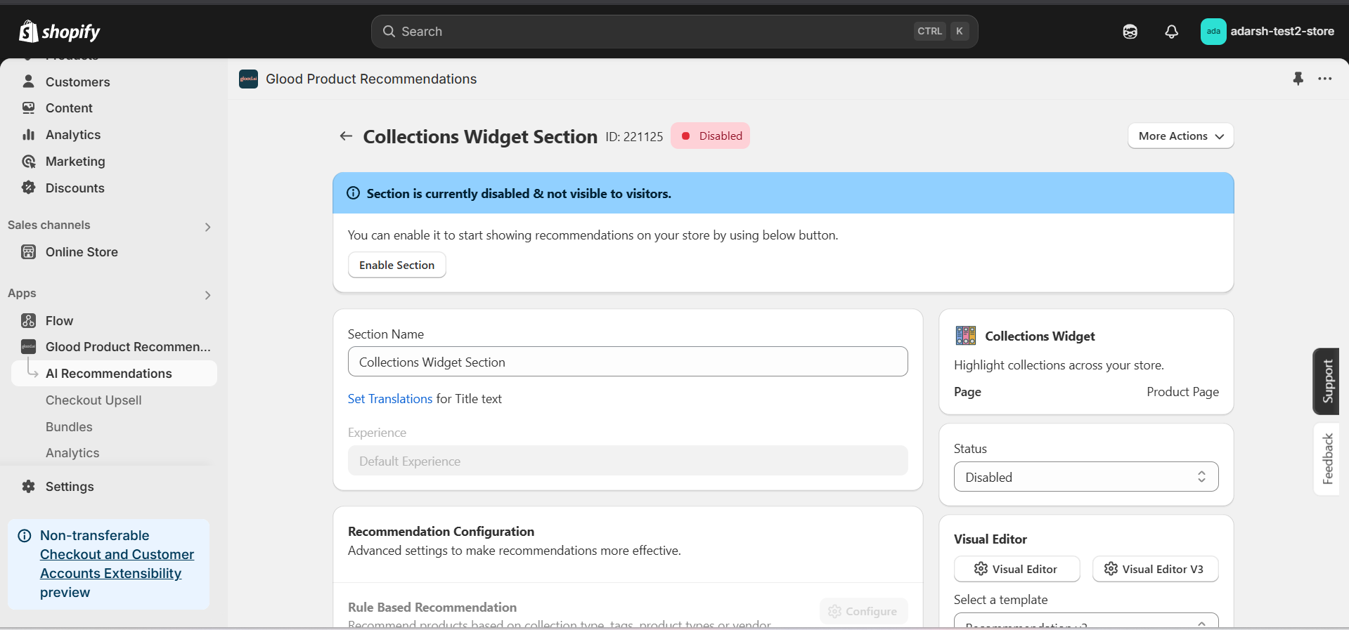
 #### 5. Configure Your Section (Section Detail Page)
→ Once saved, you'll be redirected to the Section Detail Page:
#### 5. Configure Your Section (Section Detail Page)
→ Once saved, you'll be redirected to the Section Detail Page:
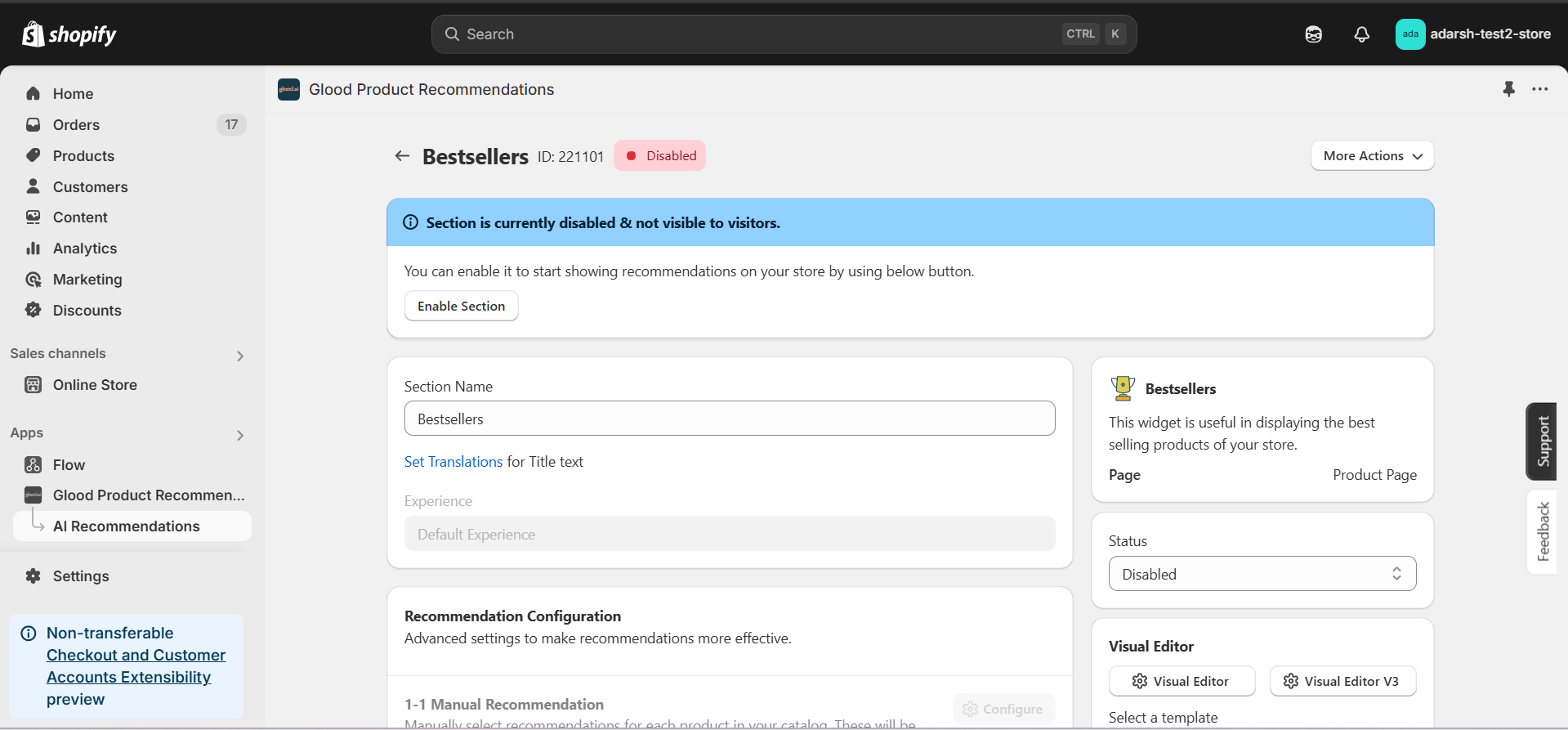 → Enable your section by clicking on the enable section button.
Here are the key configuration options available:
**→ Basic Info**
* **Section Name:** Customize the name of your section
* **Set Translations:** Add translations for different languages
**→ Recommendation Configuration**
* **Show Sold Out Items as Recommendations:** If enabled, even out-of-stock items may appear in the suggestion list.
**→ Location & Position**
* Choose where to show the section on your Shopify store:
* Enter a div ID, class selector or xPath to specify the location (default: #shopify-section-product-template)
* Set the position number to control where the section appears within that location (1 = first section)
* Use breakpoint-based configuration for granular control across different screen sizes
* For direct theme code placement, copy the provided widget code snippet
* Optional: Enable "Require app block placement" to control section display in storefront
**→ Advanced Configuration Settings**
Configure additional settings:
**1. Product Ranking Criteria**
* Choose how recommended products should be ranked and ordered
* Options include:
* No criteria (default)
* Price (high to low)
* Price (low to high)
* New products first
* Personalized for viewer
* Random
**2. Fallback Criteria**
* Define what happens when primary recommendations aren't available
* Options include:
* Random (default)
* Trending
* No criteria
**3. Price Range Limits**
* **Minimum Price:** Set a floor price for displayed products
* **Maximum Price:** Set a ceiling price for displayed products
**→ Status Section**
* Control whether this recommendation section is active or inactive on your store
* Simple toggle switch to enable/disable the section
**→ Visual Editor**
* Choose between Visual Editor or Visual Editor V3 for customizing your section's appearance
* Select a template:
* For stores with v2 templates, only Visual Editor will be visible
* For stores with v3 templates, both Visual Editor and Visual Editor V3 will be visible
* Make changes to your section's appearance by clicking the Visual Editor or Visual Editor V3 button based on your assigned template
* Customize layout, styling and content through the editor interface
* Configure template-specific settings by clicking the "Click Here" link
* Select a default layout style:
* Carousel
* Horizontal Grid
* Choose layout style for different screen sizes:
* Small screens (mobile): Select Carousel or Horizontal Grid
* Medium screens (tablet): Select Carousel or Horizontal Grid
* Large screens (desktop): Select Carousel or Horizontal Grid
**→ Segmentation**
* Control which visitors see this recommendation section
* Available targeting options:
* All visitors (default)
* First-time visitors
* Returning visitors
* Buyers
* Is customer
* Is not customer
* Helps create personalized experiences for different user segments
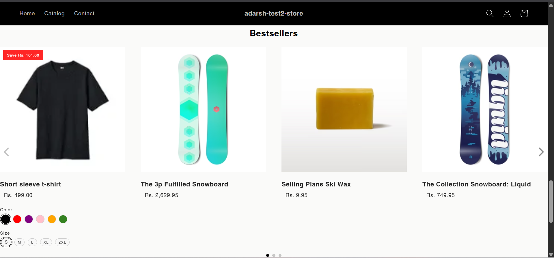
#### 6. Preview and Test Your Section
→ After configuration, preview and test the section to ensure it works as expected:
→ Enable your section by clicking on the enable section button.
Here are the key configuration options available:
**→ Basic Info**
* **Section Name:** Customize the name of your section
* **Set Translations:** Add translations for different languages
**→ Recommendation Configuration**
* **Show Sold Out Items as Recommendations:** If enabled, even out-of-stock items may appear in the suggestion list.
**→ Location & Position**
* Choose where to show the section on your Shopify store:
* Enter a div ID, class selector or xPath to specify the location (default: #shopify-section-product-template)
* Set the position number to control where the section appears within that location (1 = first section)
* Use breakpoint-based configuration for granular control across different screen sizes
* For direct theme code placement, copy the provided widget code snippet
* Optional: Enable "Require app block placement" to control section display in storefront
**→ Advanced Configuration Settings**
Configure additional settings:
**1. Product Ranking Criteria**
* Choose how recommended products should be ranked and ordered
* Options include:
* No criteria (default)
* Price (high to low)
* Price (low to high)
* New products first
* Personalized for viewer
* Random
**2. Fallback Criteria**
* Define what happens when primary recommendations aren't available
* Options include:
* Random (default)
* Trending
* No criteria
**3. Price Range Limits**
* **Minimum Price:** Set a floor price for displayed products
* **Maximum Price:** Set a ceiling price for displayed products
**→ Status Section**
* Control whether this recommendation section is active or inactive on your store
* Simple toggle switch to enable/disable the section
**→ Visual Editor**
* Choose between Visual Editor or Visual Editor V3 for customizing your section's appearance
* Select a template:
* For stores with v2 templates, only Visual Editor will be visible
* For stores with v3 templates, both Visual Editor and Visual Editor V3 will be visible
* Make changes to your section's appearance by clicking the Visual Editor or Visual Editor V3 button based on your assigned template
* Customize layout, styling and content through the editor interface
* Configure template-specific settings by clicking the "Click Here" link
* Select a default layout style:
* Carousel
* Horizontal Grid
* Choose layout style for different screen sizes:
* Small screens (mobile): Select Carousel or Horizontal Grid
* Medium screens (tablet): Select Carousel or Horizontal Grid
* Large screens (desktop): Select Carousel or Horizontal Grid
**→ Segmentation**
* Control which visitors see this recommendation section
* Available targeting options:
* All visitors (default)
* First-time visitors
* Returning visitors
* Buyers
* Is customer
* Is not customer
* Helps create personalized experiences for different user segments
#### 6. Preview and Test Your Section
→ After configuration, preview and test the section to ensure it works as expected:
 ## Support
If you need help with setting up or customizing Bestsellers sections, contact our support team at [support@glood.ai](mailto:support@glood.ai)
# How to Create Bundles
Source: https://docs.glood.ai/for-developers/how-to-guides/how-to-create-bundle
This guide explains how to create bundles in your store using Glood.AI. Bundles allow you to group related items together and offer them at a special price, helping increase average order value and provide more value to your customers.
# Creating a Bundle
Learn how to create and configure bundles that will automatically be recommended to your customers based on their shopping behavior.
## Implementation Steps
#### 1. Open the "Glood Product Recommendations" app in your Glood.AI admin
## Support
If you need help with setting up or customizing Bestsellers sections, contact our support team at [support@glood.ai](mailto:support@glood.ai)
# How to Create Bundles
Source: https://docs.glood.ai/for-developers/how-to-guides/how-to-create-bundle
This guide explains how to create bundles in your store using Glood.AI. Bundles allow you to group related items together and offer them at a special price, helping increase average order value and provide more value to your customers.
# Creating a Bundle
Learn how to create and configure bundles that will automatically be recommended to your customers based on their shopping behavior.
## Implementation Steps
#### 1. Open the "Glood Product Recommendations" app in your Glood.AI admin
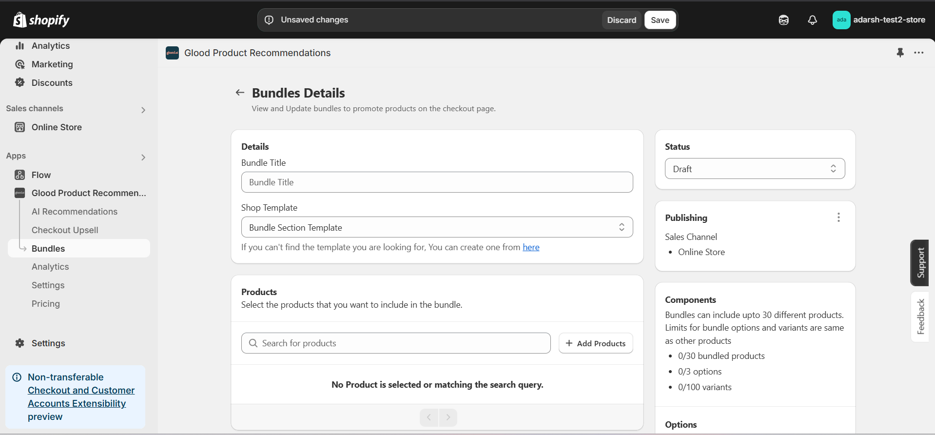
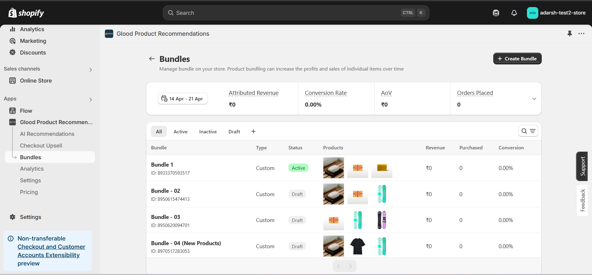 #### 3. Create and Configure a Bundle
1. Click the “+ Create Bundle” button on the Bundles page.
2. Fill in the following details on the Bundle Details page:
→ **Bundle Title:** Enter the name of the bundle.
→ **Products:** Click “+ Add Products” to include items in the bundle.
→ **Discounts:** (Optional) Select a discount and set a percentage.
→ **Images:** Add images to represent the bundle.
→ **Status:** Set as Draft or Active.
→ **Product Tags / Type / Collection:** Organize the bundle by adding relevant metadata.
3. Save your progress once all fields are filled.
#### 3. Create and Configure a Bundle
1. Click the “+ Create Bundle” button on the Bundles page.
2. Fill in the following details on the Bundle Details page:
→ **Bundle Title:** Enter the name of the bundle.
→ **Products:** Click “+ Add Products” to include items in the bundle.
→ **Discounts:** (Optional) Select a discount and set a percentage.
→ **Images:** Add images to represent the bundle.
→ **Status:** Set as Draft or Active.
→ **Product Tags / Type / Collection:** Organize the bundle by adding relevant metadata.
3. Save your progress once all fields are filled.
 #### 4. Final Step
After completing all the steps above, your bundle will be successfully created. It will now appear on the Bundles screen, where you can manage it, make edits, track its performance, and monitor how it contributes to your store’s conversions.
## Support
If you need help with creating or managing bundles, contact our support team at [support@glood.ai](mailto:support@glood.ai)
# How to create Collections Widget section
Source: https://docs.glood.ai/for-developers/how-to-guides/how-to-create-collection-widget-section
The Collection Widget section allows you to showcase products from specific collections on your store. This feature helps highlight curated product groups and makes it easier for customers to discover items from particular collections, improving navigation and potentially increasing sales.
## Implementation Steps
#### 1. Open the "Glood Product Recommendations" app in your Glood.AI admin
#### 4. Final Step
After completing all the steps above, your bundle will be successfully created. It will now appear on the Bundles screen, where you can manage it, make edits, track its performance, and monitor how it contributes to your store’s conversions.
## Support
If you need help with creating or managing bundles, contact our support team at [support@glood.ai](mailto:support@glood.ai)
# How to create Collections Widget section
Source: https://docs.glood.ai/for-developers/how-to-guides/how-to-create-collection-widget-section
The Collection Widget section allows you to showcase products from specific collections on your store. This feature helps highlight curated product groups and makes it easier for customers to discover items from particular collections, improving navigation and potentially increasing sales.
## Implementation Steps
#### 1. Open the "Glood Product Recommendations" app in your Glood.AI admin
 #### 5. Configure Your Section (Section Detail Page)
→ Once saved, you'll be redirected to the Section Detail Page:
#### 5. Configure Your Section (Section Detail Page)
→ Once saved, you'll be redirected to the Section Detail Page:
 → Enable your section by clicking on the enable section button.
Here are the key configuration options available:
**→ Basic Info**
* **Section Name:** Customize the name of your section
* **Set Translations:** Add translations for different languages
**→ Collection Selection**
* Choose which collections to display in the widget
* Select multiple collections if desired
* Set display order for collections
**→ Location & Position**
* Choose where to show the section on your Shopify store:
* Enter a div ID, class selector or xPath to specify the location (default: #shopify-section-product-template)
* Set the position number to control where the section appears within that location (1 = first section)
* Use breakpoint-based configuration for granular control across different screen sizes
* For direct theme code placement, copy the provided widget code snippet
* Optional: Enable "Require app block placement" to control section display in storefront
**→ Advanced Configuration Settings**
Configure additional settings:
**1. Product Ranking Criteria**
* Choose how products should be ranked and ordered
* Options include:
* No criteria (default)
* Bestsellers first
* Price (high to low)
* Price (low to high)
* New products first
* Random
**2. Fallback Criteria**
* Define what happens when primary recommendations aren't available
* Options include:
* Random (default)
* Best sellers
* Trending
* No criteria
**3. Price Range Limits**
* **Minimum Price:** Set a floor price for displayed products
* **Maximum Price:** Set a ceiling price for displayed products
**→ Status Section**
* Control whether this recommendation section is active or inactive on your store
* Simple toggle switch to enable/disable the section
**→ Visual Editor**
* Choose between Visual Editor or Visual Editor V3 for customizing your section's appearance
* Select a template:
* For stores with v2 templates, only Visual Editor will be visible
* For stores with v3 templates, both Visual Editor and Visual Editor V3 will be visible
* Make changes to your section's appearance by clicking the Visual Editor or Visual Editor V3 button
* Customize layout, styling and content through the editor interface
* Select a default layout style:
* Carousel
* Horizontal Grid
* Choose layout style for different screen sizes:
* Small screens (mobile): Select Carousel or Horizontal Grid
* Medium screens (tablet): Select Carousel or Horizontal Grid
* Large screens (desktop): Select Carousel or Horizontal Grid
**→ Segmentation**
* Control which visitors see this recommendation section
* Available targeting options:
* All visitors (default)
* First-time visitors
* Returning visitors
* Buyers
* Is customer
* Is not customer
* Helps create personalized experiences for different user segments
#### 6. Preview and Test Your Section
→ After configuration, preview and test the section to ensure it works as expected and your selected collections are displaying correctly.
## Support
If you need help with setting up or customizing Collection Widget sections, contact our support team at [support@glood.ai](mailto:support@glood.ai)
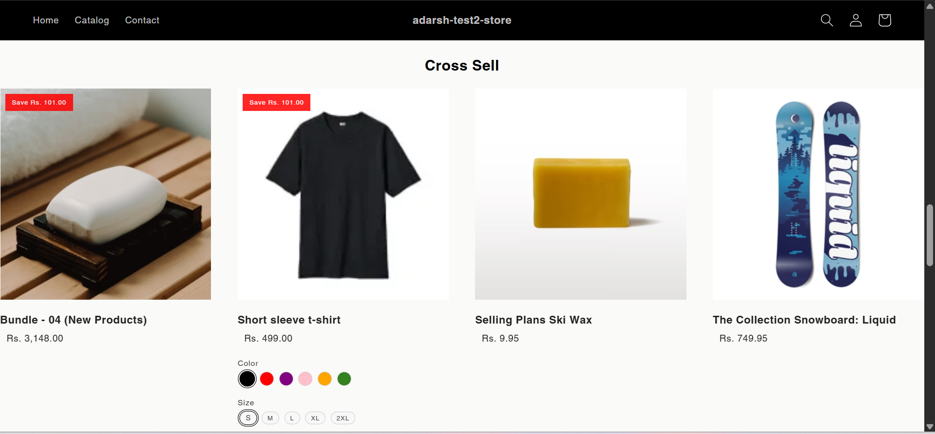
# How to create Cross Sell section
Source: https://docs.glood.ai/for-developers/how-to-guides/how-to-create-cross-sell-section
The Cross Sell section helps drive additional sales by recommending complementary or related products that enhance the value of the customer's current selection. This AI-powered recommendation section analyzes purchase patterns and product relationships to suggest items that work well together, encouraging customers to discover relevant products they may need or want.
## Implementation Steps
#### 1. Open the "Glood Product Recommendations" app in your Glood.AI admin
→ Enable your section by clicking on the enable section button.
Here are the key configuration options available:
**→ Basic Info**
* **Section Name:** Customize the name of your section
* **Set Translations:** Add translations for different languages
**→ Collection Selection**
* Choose which collections to display in the widget
* Select multiple collections if desired
* Set display order for collections
**→ Location & Position**
* Choose where to show the section on your Shopify store:
* Enter a div ID, class selector or xPath to specify the location (default: #shopify-section-product-template)
* Set the position number to control where the section appears within that location (1 = first section)
* Use breakpoint-based configuration for granular control across different screen sizes
* For direct theme code placement, copy the provided widget code snippet
* Optional: Enable "Require app block placement" to control section display in storefront
**→ Advanced Configuration Settings**
Configure additional settings:
**1. Product Ranking Criteria**
* Choose how products should be ranked and ordered
* Options include:
* No criteria (default)
* Bestsellers first
* Price (high to low)
* Price (low to high)
* New products first
* Random
**2. Fallback Criteria**
* Define what happens when primary recommendations aren't available
* Options include:
* Random (default)
* Best sellers
* Trending
* No criteria
**3. Price Range Limits**
* **Minimum Price:** Set a floor price for displayed products
* **Maximum Price:** Set a ceiling price for displayed products
**→ Status Section**
* Control whether this recommendation section is active or inactive on your store
* Simple toggle switch to enable/disable the section
**→ Visual Editor**
* Choose between Visual Editor or Visual Editor V3 for customizing your section's appearance
* Select a template:
* For stores with v2 templates, only Visual Editor will be visible
* For stores with v3 templates, both Visual Editor and Visual Editor V3 will be visible
* Make changes to your section's appearance by clicking the Visual Editor or Visual Editor V3 button
* Customize layout, styling and content through the editor interface
* Select a default layout style:
* Carousel
* Horizontal Grid
* Choose layout style for different screen sizes:
* Small screens (mobile): Select Carousel or Horizontal Grid
* Medium screens (tablet): Select Carousel or Horizontal Grid
* Large screens (desktop): Select Carousel or Horizontal Grid
**→ Segmentation**
* Control which visitors see this recommendation section
* Available targeting options:
* All visitors (default)
* First-time visitors
* Returning visitors
* Buyers
* Is customer
* Is not customer
* Helps create personalized experiences for different user segments
#### 6. Preview and Test Your Section
→ After configuration, preview and test the section to ensure it works as expected and your selected collections are displaying correctly.
## Support
If you need help with setting up or customizing Collection Widget sections, contact our support team at [support@glood.ai](mailto:support@glood.ai)
# How to create Cross Sell section
Source: https://docs.glood.ai/for-developers/how-to-guides/how-to-create-cross-sell-section
The Cross Sell section helps drive additional sales by recommending complementary or related products that enhance the value of the customer's current selection. This AI-powered recommendation section analyzes purchase patterns and product relationships to suggest items that work well together, encouraging customers to discover relevant products they may need or want.
## Implementation Steps
#### 1. Open the "Glood Product Recommendations" app in your Glood.AI admin
 #### 5. Configure Your Section (Section Detail Page)
→ Once you've saved your section, you'll be redirected to the Section Detail Page, which looks like this:
#### 5. Configure Your Section (Section Detail Page)
→ Once you've saved your section, you'll be redirected to the Section Detail Page, which looks like this:
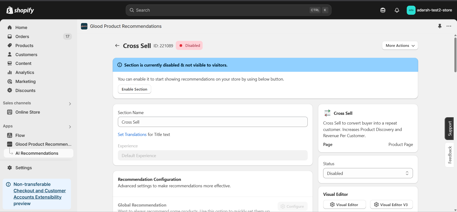 → Firstly Enable your section on your store by clicking on the enable section button.
Here, you can fine-tune how your Cross Sell recommendations behave on your store. Here's a quick rundown of the editable options:
**→ Basic Info**
* **Section Name:** You can rename your section here if needed.
* **Set Translations:** Customize how the title appears in different languages.
**→ Recommendation Configuration**
This section allows you to customize how product recommendations are generated for your Cross Sell section. You can combine multiple methods to ensure accurate and dynamic suggestions.
**1. Rule-Based Recommendation**
* Click Configure to recommend products based on specific collections, tags, product types, or vendors.
* Useful for creating category-based cross-selling rules.
**2. 1-1 Manual Recommendation**
* Click Configure to manually select cross-sell products for individual items.
* Highest priority – these recommendations override others if set.
**3. Advanced Configuration**
→ Includes extra options:
* **Automatic Recommendation:** Enable this to let the system automatically suggest products based on your store's real-time sales data using proprietary algorithms.
* **Enable Random Recommendations:** Use fallback random suggestions when no data is available.
* **Show Sold Out Items as Recommendations:** If enabled, even out-of-stock items may appear in the suggestion list.
**→ Excluded Products and Tags**
* Excluded Products and Tags are used to remove specific products or tags from being recommended only within this particular section.
* For detailed instructions on excluding products and tags, see our [How to Exclude Products and Tags guide](/for-developers/how-to-guides/how-to-exclude-products-and-tags).
* **Note:** Excluded items won't appear in recommendations for this section only. To exclude items globally, configure them in your store settings.
**→ Disabled Products and Tags**
* Disabled Products and Tags are used to prevent the recommendation section from appearing on specific product pages or pages with specific tags.
* For detailed instructions on disabling products and tags, see our [How to Disable Products and Tags guide](/for-developers/how-to-guides/how-to-disable-products-and-tags).
* **Note:** When a product or tag is disabled, the entire recommendation section will not be shown on those product pages.
**→ Whitelist Products and Tags**
* Whitelist Products and Tags are used to restrict recommendations to only show specific products or products with specific tags within this section.
* **Note:** When using whitelists, only the specified products or products with the specified tags will be eligible to appear as recommendations in this section.
**→ Location & Position**
* Choose where to show the section on your Shopify store:
* Enter a div ID, class selector or xPath to specify the location (default: #shopify-section-product-template)
* Set the position number to control where the section appears within that location (1 = first section)
* Use breakpoint-based configuration for granular control across different screen sizes
* For direct theme code placement, copy the provided widget code snippet
* Optional: Enable "Require app block placement" to control section display in storefront
**→ Advanced Configuration Settings**
Configure additional settings to fine-tune how recommendations are generated and displayed:
**1. Product Ranking Criteria**
* Choose how recommended products should be ranked and ordered
* Options include:
* No criteria (default)
* Bestsellers first
* Price (high to low)
* Price (low to high)
* New products first
* Personalized for viewer
* Random
**2. Fallback Criteria**
* Define what happens when primary recommendations aren't available
* Options include:
* Random (default)
* Best sellers
* No criteria
* Trending
**3. Price Range Limits**
* **Minimum Price:** Set a floor price for recommended products
* **Maximum Price:** Set a ceiling price for recommended products
* Helps ensure recommendations stay within desired price ranges
**→ Status Section**
* Control whether this recommendation section is active or inactive on your store
* Simple toggle switch to enable/disable the section
**→ Visual Editor**
* Choose between Visual Editor or Visual Editor V3 for customizing your section's appearance
* Select a template:
* For stores with v2 templates, only Visual Editor will be visible
* For stores with v3 templates, both Visual Editor and Visual Editor V3 will be visible
* Make changes to your section's appearance by clicking the Visual Editor or Visual Editor V3 button based on your assigned template
* Customize layout, styling and content through the editor interface
* Configure template-specific settings by clicking the "Click Here" link
* Select a default layout style:
* Carousel
* Horizontal Grid
* Choose layout style for different screen sizes:
* Small screens (mobile): Select Carousel or Horizontal Grid
* Medium screens (tablet): Select Carousel or Horizontal Grid
* Large screens (desktop): Select Carousel or Horizontal Grid
**→ Segmentation**
* Control which visitors see this recommendation section
* Available targeting options:
* All visitors (default)
* First-time visitors
* Returning visitors
* Buyers
* Is customer
* Is not customer
* Helps create personalized experiences for different user segments
#### 6. Preview and Test Your Section
→ After configuring your section, you can preview and test it to ensure it works as expected:
→ Firstly Enable your section on your store by clicking on the enable section button.
Here, you can fine-tune how your Cross Sell recommendations behave on your store. Here's a quick rundown of the editable options:
**→ Basic Info**
* **Section Name:** You can rename your section here if needed.
* **Set Translations:** Customize how the title appears in different languages.
**→ Recommendation Configuration**
This section allows you to customize how product recommendations are generated for your Cross Sell section. You can combine multiple methods to ensure accurate and dynamic suggestions.
**1. Rule-Based Recommendation**
* Click Configure to recommend products based on specific collections, tags, product types, or vendors.
* Useful for creating category-based cross-selling rules.
**2. 1-1 Manual Recommendation**
* Click Configure to manually select cross-sell products for individual items.
* Highest priority – these recommendations override others if set.
**3. Advanced Configuration**
→ Includes extra options:
* **Automatic Recommendation:** Enable this to let the system automatically suggest products based on your store's real-time sales data using proprietary algorithms.
* **Enable Random Recommendations:** Use fallback random suggestions when no data is available.
* **Show Sold Out Items as Recommendations:** If enabled, even out-of-stock items may appear in the suggestion list.
**→ Excluded Products and Tags**
* Excluded Products and Tags are used to remove specific products or tags from being recommended only within this particular section.
* For detailed instructions on excluding products and tags, see our [How to Exclude Products and Tags guide](/for-developers/how-to-guides/how-to-exclude-products-and-tags).
* **Note:** Excluded items won't appear in recommendations for this section only. To exclude items globally, configure them in your store settings.
**→ Disabled Products and Tags**
* Disabled Products and Tags are used to prevent the recommendation section from appearing on specific product pages or pages with specific tags.
* For detailed instructions on disabling products and tags, see our [How to Disable Products and Tags guide](/for-developers/how-to-guides/how-to-disable-products-and-tags).
* **Note:** When a product or tag is disabled, the entire recommendation section will not be shown on those product pages.
**→ Whitelist Products and Tags**
* Whitelist Products and Tags are used to restrict recommendations to only show specific products or products with specific tags within this section.
* **Note:** When using whitelists, only the specified products or products with the specified tags will be eligible to appear as recommendations in this section.
**→ Location & Position**
* Choose where to show the section on your Shopify store:
* Enter a div ID, class selector or xPath to specify the location (default: #shopify-section-product-template)
* Set the position number to control where the section appears within that location (1 = first section)
* Use breakpoint-based configuration for granular control across different screen sizes
* For direct theme code placement, copy the provided widget code snippet
* Optional: Enable "Require app block placement" to control section display in storefront
**→ Advanced Configuration Settings**
Configure additional settings to fine-tune how recommendations are generated and displayed:
**1. Product Ranking Criteria**
* Choose how recommended products should be ranked and ordered
* Options include:
* No criteria (default)
* Bestsellers first
* Price (high to low)
* Price (low to high)
* New products first
* Personalized for viewer
* Random
**2. Fallback Criteria**
* Define what happens when primary recommendations aren't available
* Options include:
* Random (default)
* Best sellers
* No criteria
* Trending
**3. Price Range Limits**
* **Minimum Price:** Set a floor price for recommended products
* **Maximum Price:** Set a ceiling price for recommended products
* Helps ensure recommendations stay within desired price ranges
**→ Status Section**
* Control whether this recommendation section is active or inactive on your store
* Simple toggle switch to enable/disable the section
**→ Visual Editor**
* Choose between Visual Editor or Visual Editor V3 for customizing your section's appearance
* Select a template:
* For stores with v2 templates, only Visual Editor will be visible
* For stores with v3 templates, both Visual Editor and Visual Editor V3 will be visible
* Make changes to your section's appearance by clicking the Visual Editor or Visual Editor V3 button based on your assigned template
* Customize layout, styling and content through the editor interface
* Configure template-specific settings by clicking the "Click Here" link
* Select a default layout style:
* Carousel
* Horizontal Grid
* Choose layout style for different screen sizes:
* Small screens (mobile): Select Carousel or Horizontal Grid
* Medium screens (tablet): Select Carousel or Horizontal Grid
* Large screens (desktop): Select Carousel or Horizontal Grid
**→ Segmentation**
* Control which visitors see this recommendation section
* Available targeting options:
* All visitors (default)
* First-time visitors
* Returning visitors
* Buyers
* Is customer
* Is not customer
* Helps create personalized experiences for different user segments
#### 6. Preview and Test Your Section
→ After configuring your section, you can preview and test it to ensure it works as expected:
 ## Support
If you need help with setting up or customizing Cross Sell sections, contact our support team at [support@glood.ai](mailto:support@glood.ai)
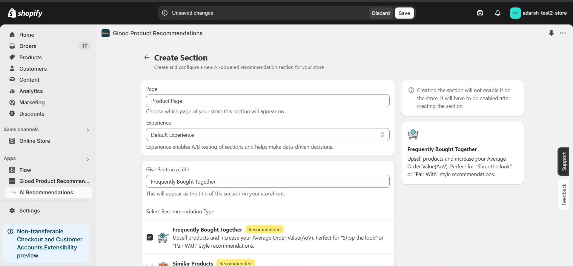
# How to Create Frequently Bought Together Section
Source: https://docs.glood.ai/for-developers/how-to-guides/how-to-create-fbt-section
The Frequently Bought Together section helps boost sales by recommending complementary products that are often purchased alongside the one currently being viewed. These smart, data-driven suggestions appear on the product page or during checkout, encouraging customers to add more items to their cart in a single click — increasing average order value and enhancing the overall shopping experience.
## Implementation Steps
#### 1. Open the "Glood Product Recommendations" app in your Glood.AI admin
## Support
If you need help with setting up or customizing Cross Sell sections, contact our support team at [support@glood.ai](mailto:support@glood.ai)
# How to Create Frequently Bought Together Section
Source: https://docs.glood.ai/for-developers/how-to-guides/how-to-create-fbt-section
The Frequently Bought Together section helps boost sales by recommending complementary products that are often purchased alongside the one currently being viewed. These smart, data-driven suggestions appear on the product page or during checkout, encouraging customers to add more items to their cart in a single click — increasing average order value and enhancing the overall shopping experience.
## Implementation Steps
#### 1. Open the "Glood Product Recommendations" app in your Glood.AI admin
 #### 5. Configure Your Section (Section Detail Page)
→ Once you've saved your section, you’ll be redirected to the Section Detail Page, which looks like this:
#### 5. Configure Your Section (Section Detail Page)
→ Once you've saved your section, you’ll be redirected to the Section Detail Page, which looks like this:
 → Firstly Enable your section on your store by clicking on the enable section button.
Here, you can fine-tune how your Frequently Bought Together recommendations behave on your store. Here’s a quick rundown of the editable options:
**→ Basic Info**
* **Section Name:** You can rename your section here if needed.
* **Set Translations:** Customize how the title appears in different languages.
**→ Recommendation Configuration**
This section allows you to customize how product recommendations are generated for your Frequently Bought Together section. You can combine multiple methods to ensure accurate and dynamic suggestions.
**1. Rule-Based Recommendation**
* Click Configure to recommend products based on specific collection types, tags, product types, or vendors.
* Ideal for category- or tag-specific bundling logic.
**2. 1-1 Manual Recommendation**
* Click Configure to manually select product recommendations for individual products.
* Highest priority – these recommendations override others if set.
**3. Advanced Configuration**
→ Includes extra options:
* **Automatic Recommendation:** Enable this to let the system automatically suggest products based on your store's real-time sales data using proprietary algorithms.
* **Enable Random Recommendations:** Use fallback random suggestions when no data is available.
* **Show Sold Out Items as Recommendations:** If enabled, even out-of-stock items may appear in the suggestion list.
**→ Excluded Products and Tags**
* Excluded Products and Tags are used to remove specific products or tags from being recommended only within this particular section.
* For detailed instructions on excluding products and tags, see our [How to Exclude Products and Tags guide](/for-developers/how-to-guides/how-to-exclude-products-and-tags).
* **Note:** Excluded items won't appear in recommendations for this section only. To exclude items globally, configure them in your store settings.
**→ Disabled Products and Tags**
* Disabled Products and Tags are used to prevent the recommendation section from appearing on specific product pages or pages with specific tags.
* For detailed instructions on disabling products and tags, see our [How to Disable Products and Tags guide](/for-developers/how-to-guides/how-to-disable-products-and-tags).
* **Note:** When a product or tag is disabled, the entire recommendation section will not be shown on those product pages. To disable items globally, configure them in your store settings.
**→ Whitelist Products and Tags**
* Whitelist Products and Tags are used to restrict recommendations to only show specific products or products with specific tags within this section.
* **Note:** When using whitelists, only the specified products or products with the specified tags will be eligible to appear as recommendations in this section. This provides precise control over what can be recommended.
**→ Discount Configuration (Optional)**
The Discount Configuration allows you to set up automatic discounts for products purchased together through this section. You can configure discounts in two ways:
**1. Percentage Discount**
* Set a percentage discount that will be applied to the section
* Example: 10% off when buying recommended items together
**2. Fixed Amount Discount**
* Set a specific amount to be deducted from the total price
* Example: \$20 off when purchasing recommended products together
**→ Location & Position**
* Choose where to show the section on your Shopify store:
* Enter a div ID, class selector or xPath to specify the location (default: #shopify-section-product-template)
* Set the position number to control where the section appears within that location (1 = first section)
* Use breakpoint-based configuration for granular control across different screen sizes
* For direct theme code placement, copy the provided widget code snippet
* Optional: Enable "Require app block placement" to control section display in storefront
**→ Advanced Configuration Settings**
Configure additional settings to fine-tune how recommendations are generated and displayed:
**1. Price Percentage Threshold**
* Set a threshold percentage to control which products appear as recommendations
* Example: Setting 200% means only products costing up to twice the main product's price will be shown
* Helps maintain relevant price ranges in recommendations
**2. Product Ranking Criteria**
* Choose how recommended products should be ranked and ordered
* Options include:
* No criteria (default)
* Bestsellers first
* Price (high to low)
* Price (low to high)
* New products first
* Personalized for viewer
* Random
**3. Fallback Criteria**
* Define what happens when primary recommendations aren't available
* Options include:
* Random (default)
* Best sellers
* No criteria
* Trending
**4. Price Range Limits**
* **Minimum Price:** Set a floor price for recommended products
* **Maximum Price:** Set a ceiling price for recommended products
* Helps ensure recommendations stay within desired price ranges
**Note:** These advanced settings are optional. The recommendation system will work with default values if not configured.
**→ Status Section**
* Control whether this recommendation section is active or inactive on your store
* Simple toggle switch to enable/disable the section from the section details page
**→ Visual Editor**
* Choose between Visual Editor or Visual Editor V3 for customizing your section's appearance
* Select a template:
* For stores with v2 templates, only Visual Editor will be visible
* For stores with v3 templates, both Visual Editor and Visual Editor V3 will be visible
* Make changes to your section's appearance by clicking the Visual Editor or Visual Editor V3 button based on your assigned template
* Customize layout, styling and content through the editor interface
* Configure template-specific settings by clicking the "Click Here" link
* Select a default layout style:
* Carousel
* Horizontal Grid
* Amazon like Bought Together
* Choose layout style for different screen sizes:
* Small screens (mobile): Select Carousel, Horizontal Grid, or Amazon like Bought Together layout
* Medium screens (tablet): Select Carousel, Horizontal Grid, or Amazon like Bought Together layout
* Large screens (desktop): Select Carousel, Horizontal Grid, or Amazon like Bought Together layout
**→ Segmentation**
* Control which visitors see this recommendation section
* Available targeting options:
* All visitors (default)
* First-time visitors
* Returning visitors
* Buyers
* Is customer
* Is not customer
* Helps create personalized experiences for different user segments
#### 6. Preview and Test Your Section
→ After configuring your section, you can preview and test it to ensure it works as expected:
→ Firstly Enable your section on your store by clicking on the enable section button.
Here, you can fine-tune how your Frequently Bought Together recommendations behave on your store. Here’s a quick rundown of the editable options:
**→ Basic Info**
* **Section Name:** You can rename your section here if needed.
* **Set Translations:** Customize how the title appears in different languages.
**→ Recommendation Configuration**
This section allows you to customize how product recommendations are generated for your Frequently Bought Together section. You can combine multiple methods to ensure accurate and dynamic suggestions.
**1. Rule-Based Recommendation**
* Click Configure to recommend products based on specific collection types, tags, product types, or vendors.
* Ideal for category- or tag-specific bundling logic.
**2. 1-1 Manual Recommendation**
* Click Configure to manually select product recommendations for individual products.
* Highest priority – these recommendations override others if set.
**3. Advanced Configuration**
→ Includes extra options:
* **Automatic Recommendation:** Enable this to let the system automatically suggest products based on your store's real-time sales data using proprietary algorithms.
* **Enable Random Recommendations:** Use fallback random suggestions when no data is available.
* **Show Sold Out Items as Recommendations:** If enabled, even out-of-stock items may appear in the suggestion list.
**→ Excluded Products and Tags**
* Excluded Products and Tags are used to remove specific products or tags from being recommended only within this particular section.
* For detailed instructions on excluding products and tags, see our [How to Exclude Products and Tags guide](/for-developers/how-to-guides/how-to-exclude-products-and-tags).
* **Note:** Excluded items won't appear in recommendations for this section only. To exclude items globally, configure them in your store settings.
**→ Disabled Products and Tags**
* Disabled Products and Tags are used to prevent the recommendation section from appearing on specific product pages or pages with specific tags.
* For detailed instructions on disabling products and tags, see our [How to Disable Products and Tags guide](/for-developers/how-to-guides/how-to-disable-products-and-tags).
* **Note:** When a product or tag is disabled, the entire recommendation section will not be shown on those product pages. To disable items globally, configure them in your store settings.
**→ Whitelist Products and Tags**
* Whitelist Products and Tags are used to restrict recommendations to only show specific products or products with specific tags within this section.
* **Note:** When using whitelists, only the specified products or products with the specified tags will be eligible to appear as recommendations in this section. This provides precise control over what can be recommended.
**→ Discount Configuration (Optional)**
The Discount Configuration allows you to set up automatic discounts for products purchased together through this section. You can configure discounts in two ways:
**1. Percentage Discount**
* Set a percentage discount that will be applied to the section
* Example: 10% off when buying recommended items together
**2. Fixed Amount Discount**
* Set a specific amount to be deducted from the total price
* Example: \$20 off when purchasing recommended products together
**→ Location & Position**
* Choose where to show the section on your Shopify store:
* Enter a div ID, class selector or xPath to specify the location (default: #shopify-section-product-template)
* Set the position number to control where the section appears within that location (1 = first section)
* Use breakpoint-based configuration for granular control across different screen sizes
* For direct theme code placement, copy the provided widget code snippet
* Optional: Enable "Require app block placement" to control section display in storefront
**→ Advanced Configuration Settings**
Configure additional settings to fine-tune how recommendations are generated and displayed:
**1. Price Percentage Threshold**
* Set a threshold percentage to control which products appear as recommendations
* Example: Setting 200% means only products costing up to twice the main product's price will be shown
* Helps maintain relevant price ranges in recommendations
**2. Product Ranking Criteria**
* Choose how recommended products should be ranked and ordered
* Options include:
* No criteria (default)
* Bestsellers first
* Price (high to low)
* Price (low to high)
* New products first
* Personalized for viewer
* Random
**3. Fallback Criteria**
* Define what happens when primary recommendations aren't available
* Options include:
* Random (default)
* Best sellers
* No criteria
* Trending
**4. Price Range Limits**
* **Minimum Price:** Set a floor price for recommended products
* **Maximum Price:** Set a ceiling price for recommended products
* Helps ensure recommendations stay within desired price ranges
**Note:** These advanced settings are optional. The recommendation system will work with default values if not configured.
**→ Status Section**
* Control whether this recommendation section is active or inactive on your store
* Simple toggle switch to enable/disable the section from the section details page
**→ Visual Editor**
* Choose between Visual Editor or Visual Editor V3 for customizing your section's appearance
* Select a template:
* For stores with v2 templates, only Visual Editor will be visible
* For stores with v3 templates, both Visual Editor and Visual Editor V3 will be visible
* Make changes to your section's appearance by clicking the Visual Editor or Visual Editor V3 button based on your assigned template
* Customize layout, styling and content through the editor interface
* Configure template-specific settings by clicking the "Click Here" link
* Select a default layout style:
* Carousel
* Horizontal Grid
* Amazon like Bought Together
* Choose layout style for different screen sizes:
* Small screens (mobile): Select Carousel, Horizontal Grid, or Amazon like Bought Together layout
* Medium screens (tablet): Select Carousel, Horizontal Grid, or Amazon like Bought Together layout
* Large screens (desktop): Select Carousel, Horizontal Grid, or Amazon like Bought Together layout
**→ Segmentation**
* Control which visitors see this recommendation section
* Available targeting options:
* All visitors (default)
* First-time visitors
* Returning visitors
* Buyers
* Is customer
* Is not customer
* Helps create personalized experiences for different user segments
#### 6. Preview and Test Your Section
→ After configuring your section, you can preview and test it to ensure it works as expected:
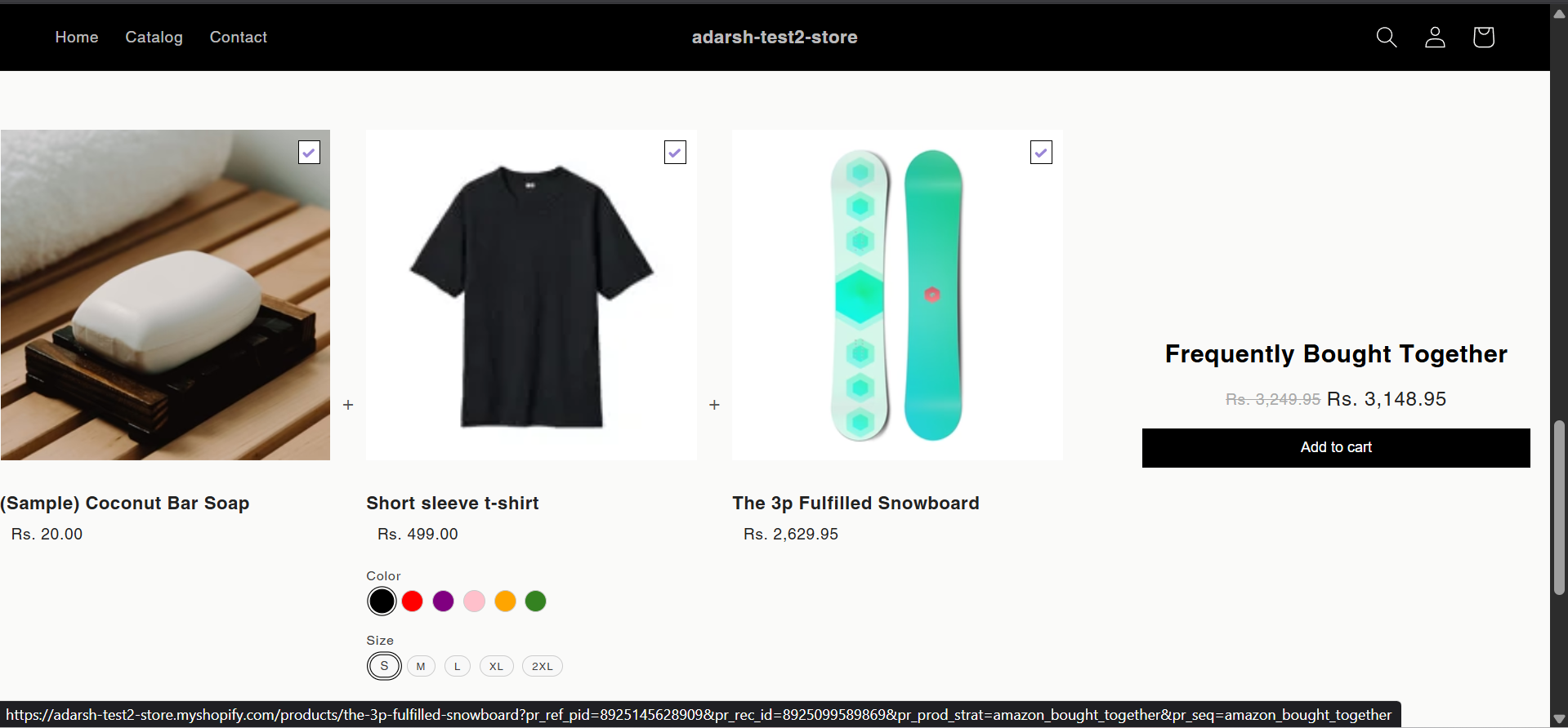 ## Support
If you need help with setting up or customizing FBT sections, contact our support team at [support@glood.ai](mailto:support@glood.ai)
# How to create Personalized for You section
Source: https://docs.glood.ai/for-developers/how-to-guides/how-to-create-pfy-section
The Personalized for You section provides tailored product recommendations based on each visitor's browsing history, preferences, and behavior. This AI-powered feature helps create a personalized shopping experience that can significantly increase engagement and conversion rates.
## Implementation Steps
#### 1. Open the "Glood Product Recommendations" app in your Glood.AI admin
## Support
If you need help with setting up or customizing FBT sections, contact our support team at [support@glood.ai](mailto:support@glood.ai)
# How to create Personalized for You section
Source: https://docs.glood.ai/for-developers/how-to-guides/how-to-create-pfy-section
The Personalized for You section provides tailored product recommendations based on each visitor's browsing history, preferences, and behavior. This AI-powered feature helps create a personalized shopping experience that can significantly increase engagement and conversion rates.
## Implementation Steps
#### 1. Open the "Glood Product Recommendations" app in your Glood.AI admin
 #### 5. Configure Your Section (Section Detail Page)
→ Once saved, you'll be redirected to the Section Detail Page:
#### 5. Configure Your Section (Section Detail Page)
→ Once saved, you'll be redirected to the Section Detail Page:
 → Enable your section by clicking on the enable section button.
Here are the key configuration options available:
**→ Basic Info**
* **Section Name:** Customize the name of your section
* **Set Translations:** Add translations for different languages
**→ Excluded Products and Tags**
* Excluded Products and Tags are used to remove specific products or tags from being recommended only within this particular section.
* For detailed instructions on excluding products and tags, see our [How to Exclude Products and Tags guide](/for-developers/how-to-guides/how-to-exclude-products-and-tags).
* **Note:** Excluded items won't appear in recommendations for this section only. To exclude items globally, configure them in your store settings.
**→ Disabled Products and Tags**
* Disabled Products and Tags are used to prevent the recommendation section from appearing on specific product pages or pages with specific tags.
* For detailed instructions on disabling products and tags, see our [How to Disable Products and Tags guide](/for-developers/how-to-guides/how-to-disable-products-and-tags).
* **Note:** When a product or tag is disabled, the entire recommendation section will not be shown on those product pages. To disable items globally, configure them in your store settings.
**→ Whitelist Products and Tags**
* Whitelist Products and Tags are used to restrict recommendations to only show specific products or products with specific tags within this section.
* **Note:** When using whitelists, only the specified products or products with the specified tags will be eligible to appear as recommendations in this section. This provides precise control over what can be recommended.
**→ Location & Position**
* Choose where to show the section on your Shopify store:
* Enter a div ID, class selector or xPath to specify the location (default: #shopify-section-product-template)
* Set the position number to control where the section appears within that location (1 = first section)
* Use breakpoint-based configuration for granular control across different screen sizes
* For direct theme code placement, copy the provided widget code snippet
* Optional: Enable "Require app block placement" to control section display in storefront
**→ Advanced Configuration Settings**
Configure additional settings:
**1. Product Ranking Criteria**
* Choose how recommended products should be ranked and ordered
* Options include:
* No criteria (default)
* Bestsellers first
* Price (high to low)
* Price (low to high)
* New products first
* Random
**2. Fallback Criteria**
* Define what happens when personalized recommendations aren't available
* Options include:
* Random (default)
* Best sellers
* Trending
* No criteria
**3. Price Range Limits**
* **Minimum Price:** Set a floor price for displayed products
* **Maximum Price:** Set a ceiling price for displayed products
**→ Status Section**
* Control whether this recommendation section is active or inactive on your store
* Simple toggle switch to enable/disable the section
**→ Visual Editor**
* Choose between Visual Editor or Visual Editor V3 for customizing your section's appearance
* Select a template:
* For stores with v2 templates, only Visual Editor will be visible
* For stores with v3 templates, both Visual Editor and Visual Editor V3 will be visible
* Make changes to your section's appearance by clicking the Visual Editor or Visual Editor V3 button based on your assigned template
* Customize layout, styling and content through the editor interface
* Configure template-specific settings by clicking the "Click Here" link
* Select a default layout style:
* Carousel
* Horizontal Grid
* Choose layout style for different screen sizes:
* Small screens (mobile): Select Carousel or Horizontal Grid
* Medium screens (tablet): Select Carousel or Horizontal Grid
* Large screens (desktop): Select Carousel or Horizontal Grid
**→ Segmentation**
* Control which visitors see this recommendation section
* Available targeting options:
* All visitors (default)
* First-time visitors
* Returning visitors
* Buyers
* Is customer
* Is not customer
* Helps create personalized experiences for different user segments
#### 6. Preview and Test Your Section
→ After configuration, preview and test the section to ensure it works as expected:
→ Enable your section by clicking on the enable section button.
Here are the key configuration options available:
**→ Basic Info**
* **Section Name:** Customize the name of your section
* **Set Translations:** Add translations for different languages
**→ Excluded Products and Tags**
* Excluded Products and Tags are used to remove specific products or tags from being recommended only within this particular section.
* For detailed instructions on excluding products and tags, see our [How to Exclude Products and Tags guide](/for-developers/how-to-guides/how-to-exclude-products-and-tags).
* **Note:** Excluded items won't appear in recommendations for this section only. To exclude items globally, configure them in your store settings.
**→ Disabled Products and Tags**
* Disabled Products and Tags are used to prevent the recommendation section from appearing on specific product pages or pages with specific tags.
* For detailed instructions on disabling products and tags, see our [How to Disable Products and Tags guide](/for-developers/how-to-guides/how-to-disable-products-and-tags).
* **Note:** When a product or tag is disabled, the entire recommendation section will not be shown on those product pages. To disable items globally, configure them in your store settings.
**→ Whitelist Products and Tags**
* Whitelist Products and Tags are used to restrict recommendations to only show specific products or products with specific tags within this section.
* **Note:** When using whitelists, only the specified products or products with the specified tags will be eligible to appear as recommendations in this section. This provides precise control over what can be recommended.
**→ Location & Position**
* Choose where to show the section on your Shopify store:
* Enter a div ID, class selector or xPath to specify the location (default: #shopify-section-product-template)
* Set the position number to control where the section appears within that location (1 = first section)
* Use breakpoint-based configuration for granular control across different screen sizes
* For direct theme code placement, copy the provided widget code snippet
* Optional: Enable "Require app block placement" to control section display in storefront
**→ Advanced Configuration Settings**
Configure additional settings:
**1. Product Ranking Criteria**
* Choose how recommended products should be ranked and ordered
* Options include:
* No criteria (default)
* Bestsellers first
* Price (high to low)
* Price (low to high)
* New products first
* Random
**2. Fallback Criteria**
* Define what happens when personalized recommendations aren't available
* Options include:
* Random (default)
* Best sellers
* Trending
* No criteria
**3. Price Range Limits**
* **Minimum Price:** Set a floor price for displayed products
* **Maximum Price:** Set a ceiling price for displayed products
**→ Status Section**
* Control whether this recommendation section is active or inactive on your store
* Simple toggle switch to enable/disable the section
**→ Visual Editor**
* Choose between Visual Editor or Visual Editor V3 for customizing your section's appearance
* Select a template:
* For stores with v2 templates, only Visual Editor will be visible
* For stores with v3 templates, both Visual Editor and Visual Editor V3 will be visible
* Make changes to your section's appearance by clicking the Visual Editor or Visual Editor V3 button based on your assigned template
* Customize layout, styling and content through the editor interface
* Configure template-specific settings by clicking the "Click Here" link
* Select a default layout style:
* Carousel
* Horizontal Grid
* Choose layout style for different screen sizes:
* Small screens (mobile): Select Carousel or Horizontal Grid
* Medium screens (tablet): Select Carousel or Horizontal Grid
* Large screens (desktop): Select Carousel or Horizontal Grid
**→ Segmentation**
* Control which visitors see this recommendation section
* Available targeting options:
* All visitors (default)
* First-time visitors
* Returning visitors
* Buyers
* Is customer
* Is not customer
* Helps create personalized experiences for different user segments
#### 6. Preview and Test Your Section
→ After configuration, preview and test the section to ensure it works as expected:
 ## Support
If you need help with setting up or customizing Personalized for You sections, contact our support team at [support@glood.ai](mailto:support@glood.ai)
# How to create Promoted Products section
Source: https://docs.glood.ai/for-developers/how-to-guides/how-to-create-promoted-products-section
The Promoted Products section allows you to manually curate and display specific products that you want to highlight to your customers. This feature gives you complete control over which products appear in the recommendation section, making it perfect for showcasing new launches, seasonal items, or special promotions.
## Implementation Steps
#### 1. Open the "Glood Product Recommendations" app in your Glood.AI admin
## Support
If you need help with setting up or customizing Personalized for You sections, contact our support team at [support@glood.ai](mailto:support@glood.ai)
# How to create Promoted Products section
Source: https://docs.glood.ai/for-developers/how-to-guides/how-to-create-promoted-products-section
The Promoted Products section allows you to manually curate and display specific products that you want to highlight to your customers. This feature gives you complete control over which products appear in the recommendation section, making it perfect for showcasing new launches, seasonal items, or special promotions.
## Implementation Steps
#### 1. Open the "Glood Product Recommendations" app in your Glood.AI admin
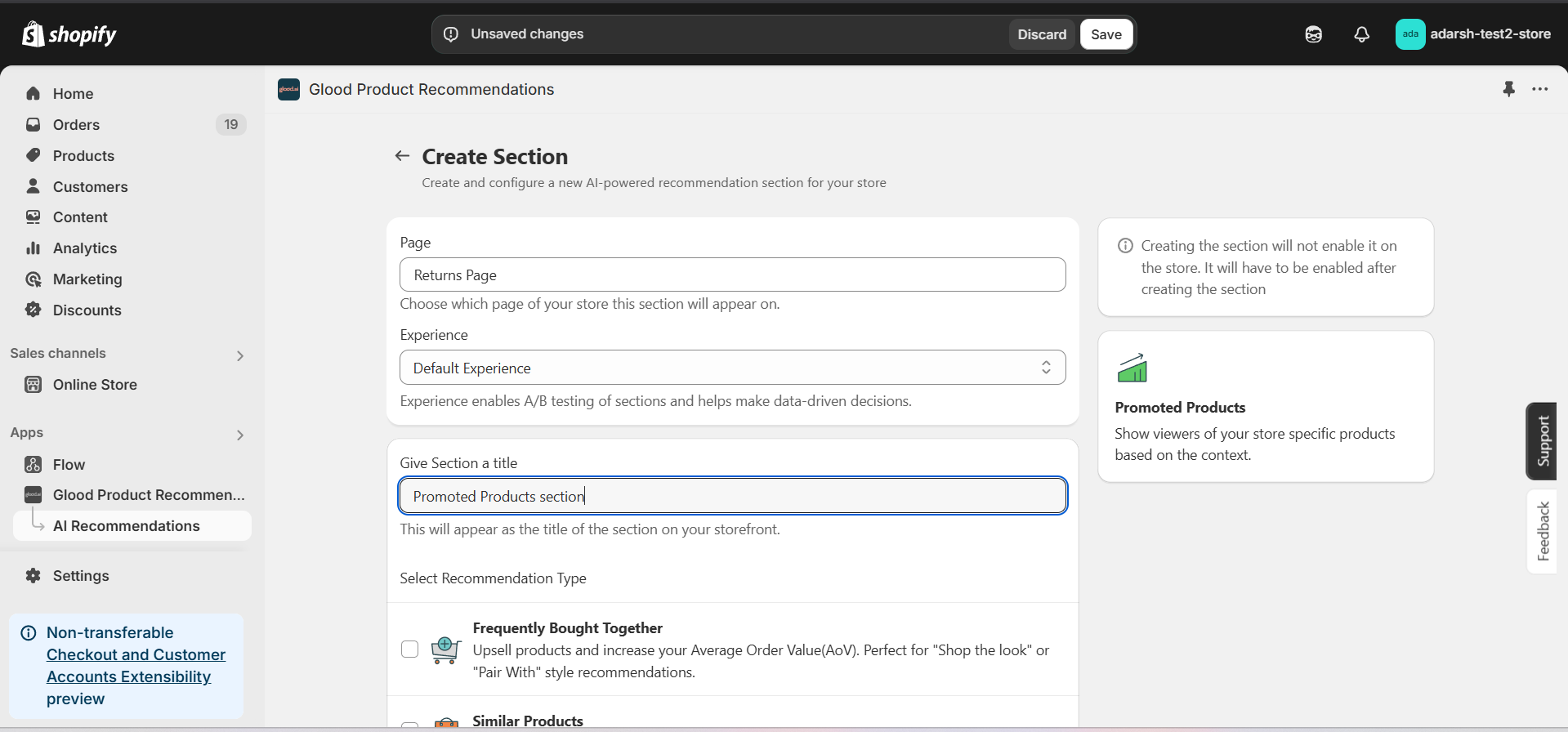 #### 5. Configure Your Section (Section Detail Page)
→ Once saved, you'll be redirected to the Section Detail Page:
#### 5. Configure Your Section (Section Detail Page)
→ Once saved, you'll be redirected to the Section Detail Page:
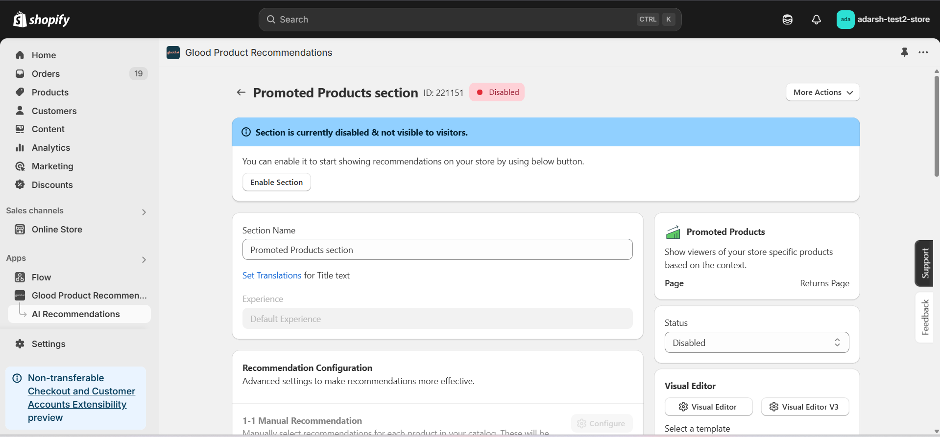 → Enable your section by clicking on the enable section button.
Here are the key configuration options available:
**→ Basic Info**
* **Section Name:** Customize the name of your section
* **Set Translations:** Add translations for different languages
**→ Object Recommendation**
* Click "Add Recommendation" button to define recommendation strategies
* Enter page URL in the input field that appears
* Once URL is entered, "Add Products" button will be enabled
* Click "Add Products" to select products for the recommendation
* Products will be displayed based on the defined recommendation strategies
**→ Location & Position**
* Choose where to show the section on your Shopify store:
* Enter a div ID, class selector or xPath to specify the location (default: #shopify-section-product-template)
* Set the position number to control where the section appears within that location (1 = first section)
* Use breakpoint-based configuration for granular control across different screen sizes
* For direct theme code placement, copy the provided widget code snippet
* Optional: Enable "Require app block placement" to control section display in storefront
**→ Advanced Configuration Settings**
Configure additional settings:
**1. Product Ranking Criteria**
* Choose how recommended products should be ranked and ordered
* Options include:
* No criteria (default)
* Bestsellers first
* Price (high to low)
* Price (low to high)
* New products first
* Personalized for viewer
* Random
**2. Fallback Criteria**
* Define what happens when primary recommendations aren't available
* Options include:
* Random (default)
* Best sellers
* Trending
* No criteria
**3. Price Range Limits**
* **Minimum Price:** Set a floor price for displayed products
* **Maximum Price:** Set a ceiling price for displayed products
**→ Status Section**
* Control whether this recommendation section is active or inactive on your store
* Simple toggle switch to enable/disable the section
**→ Visual Editor**
* Choose between Visual Editor or Visual Editor V3 for customizing your section's appearance
* Select a template:
* For stores with v2 templates, only Visual Editor will be visible
* For stores with v3 templates, both Visual Editor and Visual Editor V3 will be visible
* Make changes to your section's appearance by clicking the Visual Editor or Visual Editor V3 button
* Customize layout, styling and content through the editor interface
* Select a default layout style:
* Carousel
* Horizontal Grid
* Choose layout style for different screen sizes:
* Small screens (mobile): Select Carousel or Horizontal Grid
* Medium screens (tablet): Select Carousel or Horizontal Grid
* Large screens (desktop): Select Carousel or Horizontal Grid
**→ Segmentation**
* Control which visitors see this recommendation section
* Available targeting options:
* All visitors (default)
* First-time visitors
* Returning visitors
* Buyers
* Is customer
* Is not customer
* Helps create personalized experiences for different user segments
#### 6. Preview and Test Your Section
→ After configuration, preview the section to ensure products are displaying correctly and the layout meets your requirements.
## Support
If you need assistance setting up or customizing Promoted Products sections, contact our support team at [support@glood.ai](mailto:support@glood.ai)
# How to create Recent Launch section
Source: https://docs.glood.ai/for-developers/how-to-guides/how-to-create-recent-launch-section
The Recent Launch section showcases your store's newest products, helping customers discover fresh additions to your catalog. This feature is particularly effective for stores that regularly update their inventory and want to highlight their latest offerings to customers.
## Implementation Steps
#### 1. Open the "Glood Product Recommendations" app in your Glood.AI admin
→ Enable your section by clicking on the enable section button.
Here are the key configuration options available:
**→ Basic Info**
* **Section Name:** Customize the name of your section
* **Set Translations:** Add translations for different languages
**→ Object Recommendation**
* Click "Add Recommendation" button to define recommendation strategies
* Enter page URL in the input field that appears
* Once URL is entered, "Add Products" button will be enabled
* Click "Add Products" to select products for the recommendation
* Products will be displayed based on the defined recommendation strategies
**→ Location & Position**
* Choose where to show the section on your Shopify store:
* Enter a div ID, class selector or xPath to specify the location (default: #shopify-section-product-template)
* Set the position number to control where the section appears within that location (1 = first section)
* Use breakpoint-based configuration for granular control across different screen sizes
* For direct theme code placement, copy the provided widget code snippet
* Optional: Enable "Require app block placement" to control section display in storefront
**→ Advanced Configuration Settings**
Configure additional settings:
**1. Product Ranking Criteria**
* Choose how recommended products should be ranked and ordered
* Options include:
* No criteria (default)
* Bestsellers first
* Price (high to low)
* Price (low to high)
* New products first
* Personalized for viewer
* Random
**2. Fallback Criteria**
* Define what happens when primary recommendations aren't available
* Options include:
* Random (default)
* Best sellers
* Trending
* No criteria
**3. Price Range Limits**
* **Minimum Price:** Set a floor price for displayed products
* **Maximum Price:** Set a ceiling price for displayed products
**→ Status Section**
* Control whether this recommendation section is active or inactive on your store
* Simple toggle switch to enable/disable the section
**→ Visual Editor**
* Choose between Visual Editor or Visual Editor V3 for customizing your section's appearance
* Select a template:
* For stores with v2 templates, only Visual Editor will be visible
* For stores with v3 templates, both Visual Editor and Visual Editor V3 will be visible
* Make changes to your section's appearance by clicking the Visual Editor or Visual Editor V3 button
* Customize layout, styling and content through the editor interface
* Select a default layout style:
* Carousel
* Horizontal Grid
* Choose layout style for different screen sizes:
* Small screens (mobile): Select Carousel or Horizontal Grid
* Medium screens (tablet): Select Carousel or Horizontal Grid
* Large screens (desktop): Select Carousel or Horizontal Grid
**→ Segmentation**
* Control which visitors see this recommendation section
* Available targeting options:
* All visitors (default)
* First-time visitors
* Returning visitors
* Buyers
* Is customer
* Is not customer
* Helps create personalized experiences for different user segments
#### 6. Preview and Test Your Section
→ After configuration, preview the section to ensure products are displaying correctly and the layout meets your requirements.
## Support
If you need assistance setting up or customizing Promoted Products sections, contact our support team at [support@glood.ai](mailto:support@glood.ai)
# How to create Recent Launch section
Source: https://docs.glood.ai/for-developers/how-to-guides/how-to-create-recent-launch-section
The Recent Launch section showcases your store's newest products, helping customers discover fresh additions to your catalog. This feature is particularly effective for stores that regularly update their inventory and want to highlight their latest offerings to customers.
## Implementation Steps
#### 1. Open the "Glood Product Recommendations" app in your Glood.AI admin
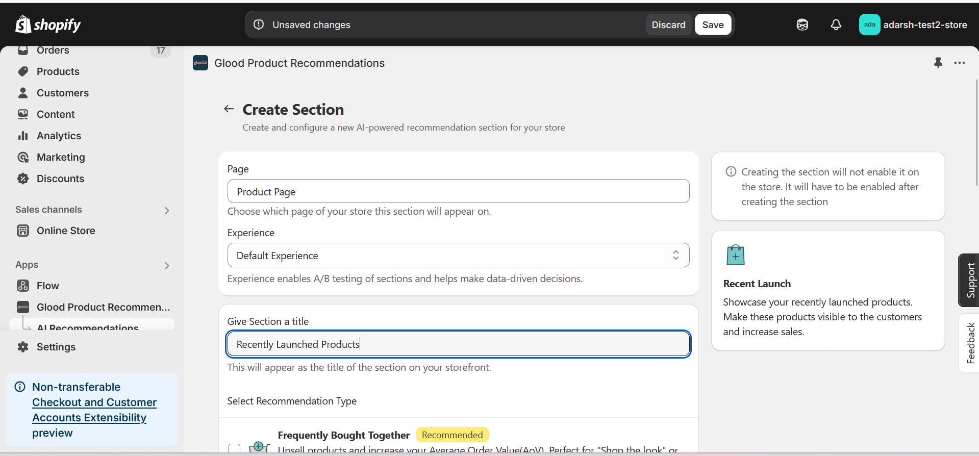 #### 5. Configure Your Section (Section Detail Page)
→ Once saved, you'll be redirected to the Section Detail Page:
#### 5. Configure Your Section (Section Detail Page)
→ Once saved, you'll be redirected to the Section Detail Page:
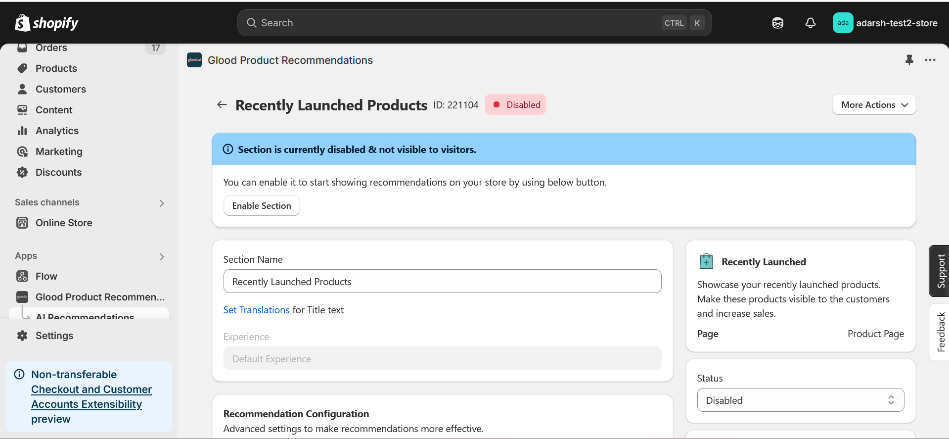 → Enable your section by clicking on the enable section button.
Here are the key configuration options available:
**→ Basic Info**
* **Section Name:** Customize the name of your section
* **Set Translations:** Add translations for different languages
**→ Recommendation Configuration**
* **Show Sold Out Items as Recommendations:** If enabled, even out-of-stock items may appear in the suggestion list.
**→ Location & Position**
* Choose where to show the section on your Shopify store:
* Enter a div ID, class selector or xPath to specify the location (default: #shopify-section-product-template)
* Set the position number to control where the section appears within that location (1 = first section)
* Use breakpoint-based configuration for granular control across different screen sizes
* For direct theme code placement, copy the provided widget code snippet
* Optional: Enable "Require app block placement" to control section display in storefront
**→ Advanced Configuration Settings**
Configure additional settings:
**1. Product Ranking Criteria**
* Choose how recommended products should be ranked and ordered
* Options include:
* No criteria (default)
* Bestsellers first
* Price (high to low)
* Price (low to high)
* Personalized for viewer
* Random
**2. Fallback Criteria**
* Define what happens when primary recommendations aren't available
* Options include:
* Random (default)
* Best sellers
* Trending
* No criteria
**3. Price Range Limits**
* **Minimum Price:** Set a floor price for displayed products
* **Maximum Price:** Set a ceiling price for displayed products
**→ Status Section**
* Control whether this recommendation section is active or inactive on your store
* Simple toggle switch to enable/disable the section
**→ Visual Editor**
* Choose between Visual Editor or Visual Editor V3 for customizing your section's appearance
* Select a template:
* For stores with v2 templates, only Visual Editor will be visible
* For stores with v3 templates, both Visual Editor and Visual Editor V3 will be visible
* Make changes to your section's appearance by clicking the Visual Editor or Visual Editor V3 button based on your assigned template
* Customize layout, styling and content through the editor interface
* Configure template-specific settings by clicking the "Click Here" link
* Select a default layout style:
* Carousel
* Horizontal Grid
* Choose layout style for different screen sizes:
* Small screens (mobile): Select Carousel or Horizontal Grid
* Medium screens (tablet): Select Carousel or Horizontal Grid
* Large screens (desktop): Select Carousel or Horizontal Grid
**→ Segmentation**
* Control which visitors see this recommendation section
* Available targeting options:
* All visitors (default)
* First-time visitors
* Returning visitors
* Buyers
* Is customer
* Is not customer
* Helps create personalized experiences for different user segments
#### 6. Preview and Test Your Section
→ After configuration, preview and test the section to ensure it works as expected.
→ Enable your section by clicking on the enable section button.
Here are the key configuration options available:
**→ Basic Info**
* **Section Name:** Customize the name of your section
* **Set Translations:** Add translations for different languages
**→ Recommendation Configuration**
* **Show Sold Out Items as Recommendations:** If enabled, even out-of-stock items may appear in the suggestion list.
**→ Location & Position**
* Choose where to show the section on your Shopify store:
* Enter a div ID, class selector or xPath to specify the location (default: #shopify-section-product-template)
* Set the position number to control where the section appears within that location (1 = first section)
* Use breakpoint-based configuration for granular control across different screen sizes
* For direct theme code placement, copy the provided widget code snippet
* Optional: Enable "Require app block placement" to control section display in storefront
**→ Advanced Configuration Settings**
Configure additional settings:
**1. Product Ranking Criteria**
* Choose how recommended products should be ranked and ordered
* Options include:
* No criteria (default)
* Bestsellers first
* Price (high to low)
* Price (low to high)
* Personalized for viewer
* Random
**2. Fallback Criteria**
* Define what happens when primary recommendations aren't available
* Options include:
* Random (default)
* Best sellers
* Trending
* No criteria
**3. Price Range Limits**
* **Minimum Price:** Set a floor price for displayed products
* **Maximum Price:** Set a ceiling price for displayed products
**→ Status Section**
* Control whether this recommendation section is active or inactive on your store
* Simple toggle switch to enable/disable the section
**→ Visual Editor**
* Choose between Visual Editor or Visual Editor V3 for customizing your section's appearance
* Select a template:
* For stores with v2 templates, only Visual Editor will be visible
* For stores with v3 templates, both Visual Editor and Visual Editor V3 will be visible
* Make changes to your section's appearance by clicking the Visual Editor or Visual Editor V3 button based on your assigned template
* Customize layout, styling and content through the editor interface
* Configure template-specific settings by clicking the "Click Here" link
* Select a default layout style:
* Carousel
* Horizontal Grid
* Choose layout style for different screen sizes:
* Small screens (mobile): Select Carousel or Horizontal Grid
* Medium screens (tablet): Select Carousel or Horizontal Grid
* Large screens (desktop): Select Carousel or Horizontal Grid
**→ Segmentation**
* Control which visitors see this recommendation section
* Available targeting options:
* All visitors (default)
* First-time visitors
* Returning visitors
* Buyers
* Is customer
* Is not customer
* Helps create personalized experiences for different user segments
#### 6. Preview and Test Your Section
→ After configuration, preview and test the section to ensure it works as expected.
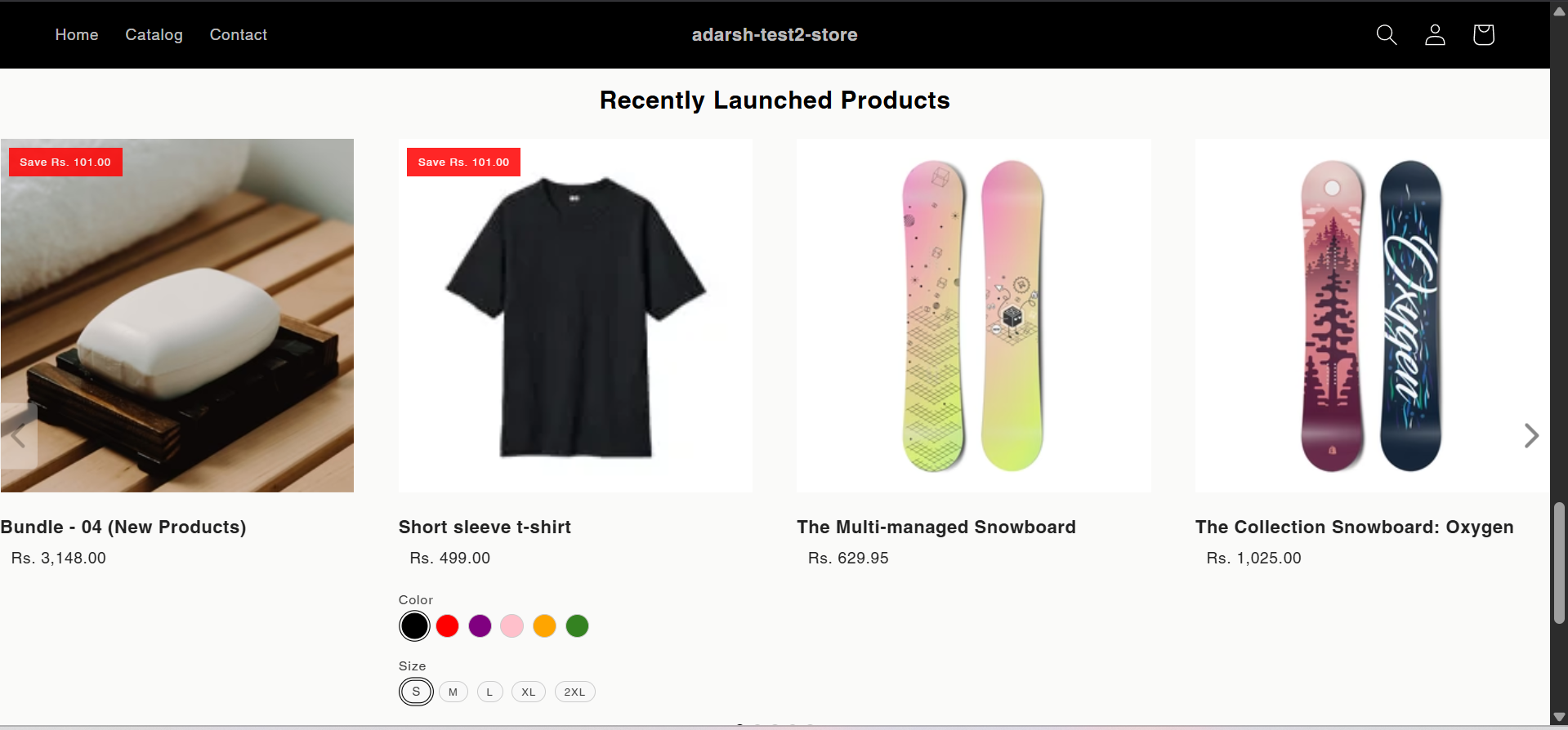 ## Support
If you need help with setting up or customizing Recent Launch sections, contact our support team at [support@glood.ai](mailto:support@glood.ai)
# How to create Recently Viewed section
Source: https://docs.glood.ai/for-developers/how-to-guides/how-to-create-recently-viewed-section
The Recently Viewed section helps enhance the shopping experience by displaying products that customers have previously viewed during their browsing session. This feature makes it easy for customers to return to items they were interested in, potentially increasing engagement and conversion rates.
## Implementation Steps
#### 1. Open the "Glood Product Recommendations" app in your Glood.AI admin
## Support
If you need help with setting up or customizing Recent Launch sections, contact our support team at [support@glood.ai](mailto:support@glood.ai)
# How to create Recently Viewed section
Source: https://docs.glood.ai/for-developers/how-to-guides/how-to-create-recently-viewed-section
The Recently Viewed section helps enhance the shopping experience by displaying products that customers have previously viewed during their browsing session. This feature makes it easy for customers to return to items they were interested in, potentially increasing engagement and conversion rates.
## Implementation Steps
#### 1. Open the "Glood Product Recommendations" app in your Glood.AI admin
 #### 5. Configure Your Section (Section Detail Page)
→ Once saved, you'll be redirected to the Section Detail Page:
#### 5. Configure Your Section (Section Detail Page)
→ Once saved, you'll be redirected to the Section Detail Page:
 → Enable your section by clicking on the enable section button.
Here are the key configuration options available:
**→ Basic Info**
* **Section Name:** Customize the name of your section
* **Set Translations:** Add translations for different languages
**→ Location & Position**
* Choose where to show the section on your Shopify store:
* Enter a div ID, class selector or xPath to specify the location (default: #shopify-section-product-template)
* Set the position number to control where the section appears within that location (1 = first section)
* Use breakpoint-based configuration for granular control across different screen sizes
* For direct theme code placement, copy the provided widget code snippet
* Optional: Enable "Require app block placement" to control section display in storefront
**→ Advanced Configuration Settings**
Configure additional settings:
**1. Product Ranking Criteria**
* Choose how recommended products should be ranked and ordered
* Options include:
* No criteria (default)
* Bestsellers first
* Price (high to low)
* Price (low to high)
* New products first
* Personalized for viewer
* Random
**2. Fallback Criteria**
* Define what happens when primary recommendations aren't available
* Options include:
* Random (default)
* Best sellers
* No criteria
* Trending
**3. Price Range Limits**
* **Minimum Price:** Set a floor price for displayed products
* **Maximum Price:** Set a ceiling price for displayed products
**→ Status Section**
* Control whether this recommendation section is active or inactive on your store
* Simple toggle switch to enable/disable the section
**→ Visual Editor**
* Choose between Visual Editor or Visual Editor V3 for customizing your section's appearance
* Select a template:
* For stores with v2 templates, only Visual Editor will be visible
* For stores with v3 templates, both Visual Editor and Visual Editor V3 will be visible
* Make changes to your section's appearance by clicking the Visual Editor or Visual Editor V3 button based on your assigned template
* Customize layout, styling and content through the editor interface
* Configure template-specific settings by clicking the "Click Here" link
* Select a default layout style:
* Carousel
* Horizontal Grid
* Choose layout style for different screen sizes:
* Small screens (mobile): Select Carousel or Horizontal Grid
* Medium screens (tablet): Select Carousel or Horizontal Grid
* Large screens (desktop): Select Carousel or Horizontal Grid
**→ Segmentation**
* Control which visitors see this recommendation section
* Available targeting options:
* All visitors (default)
* First-time visitors
* Returning visitors
* Buyers
* Is customer
* Is not customer
* Helps create personalized experiences for different user segments
#### 6. Preview and Test Your Section
→ After configuration, preview and test the section to ensure it works as expected:
→ Enable your section by clicking on the enable section button.
Here are the key configuration options available:
**→ Basic Info**
* **Section Name:** Customize the name of your section
* **Set Translations:** Add translations for different languages
**→ Location & Position**
* Choose where to show the section on your Shopify store:
* Enter a div ID, class selector or xPath to specify the location (default: #shopify-section-product-template)
* Set the position number to control where the section appears within that location (1 = first section)
* Use breakpoint-based configuration for granular control across different screen sizes
* For direct theme code placement, copy the provided widget code snippet
* Optional: Enable "Require app block placement" to control section display in storefront
**→ Advanced Configuration Settings**
Configure additional settings:
**1. Product Ranking Criteria**
* Choose how recommended products should be ranked and ordered
* Options include:
* No criteria (default)
* Bestsellers first
* Price (high to low)
* Price (low to high)
* New products first
* Personalized for viewer
* Random
**2. Fallback Criteria**
* Define what happens when primary recommendations aren't available
* Options include:
* Random (default)
* Best sellers
* No criteria
* Trending
**3. Price Range Limits**
* **Minimum Price:** Set a floor price for displayed products
* **Maximum Price:** Set a ceiling price for displayed products
**→ Status Section**
* Control whether this recommendation section is active or inactive on your store
* Simple toggle switch to enable/disable the section
**→ Visual Editor**
* Choose between Visual Editor or Visual Editor V3 for customizing your section's appearance
* Select a template:
* For stores with v2 templates, only Visual Editor will be visible
* For stores with v3 templates, both Visual Editor and Visual Editor V3 will be visible
* Make changes to your section's appearance by clicking the Visual Editor or Visual Editor V3 button based on your assigned template
* Customize layout, styling and content through the editor interface
* Configure template-specific settings by clicking the "Click Here" link
* Select a default layout style:
* Carousel
* Horizontal Grid
* Choose layout style for different screen sizes:
* Small screens (mobile): Select Carousel or Horizontal Grid
* Medium screens (tablet): Select Carousel or Horizontal Grid
* Large screens (desktop): Select Carousel or Horizontal Grid
**→ Segmentation**
* Control which visitors see this recommendation section
* Available targeting options:
* All visitors (default)
* First-time visitors
* Returning visitors
* Buyers
* Is customer
* Is not customer
* Helps create personalized experiences for different user segments
#### 6. Preview and Test Your Section
→ After configuration, preview and test the section to ensure it works as expected:
 ## Support
If you need help with setting up or customizing Recently Viewed sections, contact our support team at [support@glood.ai](mailto:support@glood.ai)
# How to create Similar Products Section
Source: https://docs.glood.ai/for-developers/how-to-guides/how-to-create-similar-products-section
The Similar Products section helps enhance product discovery by showcasing items that share characteristics with the product currently being viewed. This AI-powered recommendation section analyzes product attributes, categories, and user behavior patterns to suggest relevant alternatives, helping customers find exactly what they're looking for while increasing engagement and potential sales.
## Implementation Steps
#### 1. Open the "Glood Product Recommendations" app in your Glood.AI admin
## Support
If you need help with setting up or customizing Recently Viewed sections, contact our support team at [support@glood.ai](mailto:support@glood.ai)
# How to create Similar Products Section
Source: https://docs.glood.ai/for-developers/how-to-guides/how-to-create-similar-products-section
The Similar Products section helps enhance product discovery by showcasing items that share characteristics with the product currently being viewed. This AI-powered recommendation section analyzes product attributes, categories, and user behavior patterns to suggest relevant alternatives, helping customers find exactly what they're looking for while increasing engagement and potential sales.
## Implementation Steps
#### 1. Open the "Glood Product Recommendations" app in your Glood.AI admin
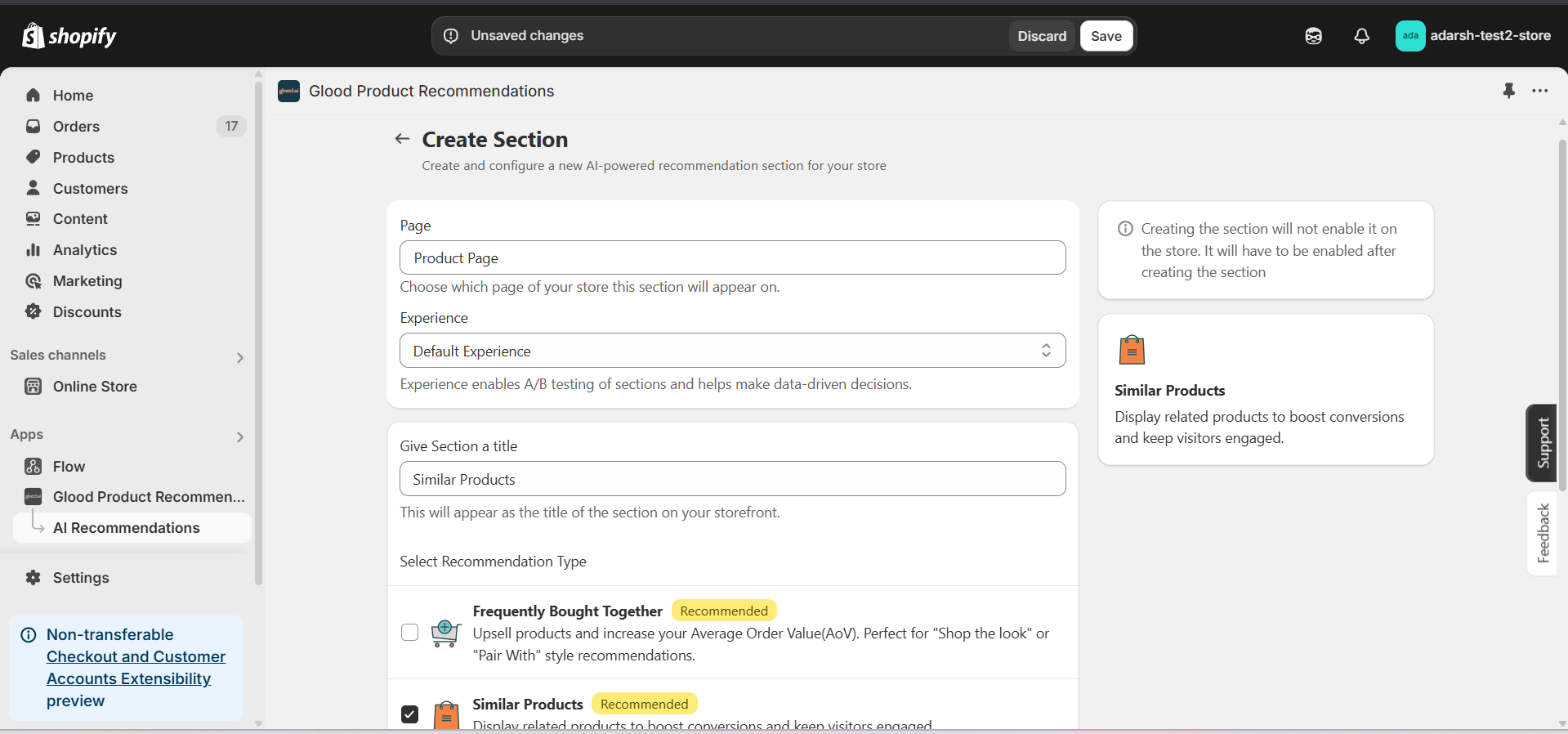 #### 5. Configure Your Section (Section Detail Page)
→ Once you've saved your section, you'll be redirected to the Section Detail Page, which looks like this:
#### 5. Configure Your Section (Section Detail Page)
→ Once you've saved your section, you'll be redirected to the Section Detail Page, which looks like this:
 → Firstly Enable your section on your store by clicking on the enable section button.
Here, you can fine-tune how your Similar Products recommendations behave on your store. Here's a quick rundown of the editable options:
**→ Basic Info**
* **Section Name:** You can rename your section here if needed.
* **Set Translations:** Customize how the title appears in different languages.
**→ Recommendation Configuration**
This section allows you to customize how product recommendations are generated for your Similar Products section. You can combine multiple methods to ensure accurate and dynamic suggestions.
**1. 1-1 Manual Recommendation**
* Click Configure to manually select similar products for individual items.
* Highest priority – these recommendations override others if set.
**2. Advanced Configuration (Expandable)**
→ Includes extra options:
* **Automatic Recommendation:** Enable this to let the system automatically suggest products based on your store's real-time sales data using proprietary algorithms.
* **Enable Random Recommendations:** Use fallback random suggestions when no similar products are found.
* **Show Sold Out Items as Recommendations:** If enabled, even out-of-stock items may appear in the suggestion list.
**→ Excluded Products and Tags**
* Excluded Products and Tags are used to remove specific products or tags from being recommended only within this particular section.
* For detailed instructions on excluding products and tags, see our [How to Exclude Products and Tags guide](/for-developers/how-to-guides/how-to-exclude-products-and-tags).
* **Note:** Excluded items won't appear in recommendations for this section only. To exclude items globally, configure them in your store settings.
**→ Disabled Products and Tags**
* Disabled Products and Tags are used to prevent the recommendation section from appearing on specific product pages or pages with specific tags.
* For detailed instructions on disabling products and tags, see our [How to Disable Products and Tags guide](/for-developers/how-to-guides/how-to-disable-products-and-tags).
* **Note:** When a product or tag is disabled, the entire recommendation section will not be shown on those product pages.
**→ Whitelist Products and Tags**
* Whitelist Products and Tags are used to restrict recommendations to only show specific products or products with specific tags within this section.
* **Note:** When using whitelists, only the specified products or products with the specified tags will be eligible to appear as recommendations in this section.
**→ Location & Position**
* Choose where to show the section on your Shopify store:
* Enter a div ID, class selector or xPath to specify the location (default: #shopify-section-product-template)
* Set the position number to control where the section appears within that location (1 = first section)
* Use breakpoint-based configuration for granular control across different screen sizes
* For direct theme code placement, copy the provided widget code snippet
* Optional: Enable "Require app block placement" to control section display in storefront
**→ Advanced Configuration Settings**
Configure additional settings to fine-tune how recommendations are generated and displayed:
**1. Product Ranking Criteria**
* Choose how recommended products should be ranked and ordered
* Options include:
* Similarity score (default)
* Price (high to low)
* Price (low to high)
* New products first
* Bestsellers first
* Random
**2. Product Filter Criteria**
* Filter which products can be recommended based on specific attributes
* Options include:
* Collection: Only recommend products from the same collection
* Products: Only recommend specific products
* Product Type: Only recommend products with matching product type
* Vendor: Only recommend products from the same vendor
* No criteria (default): No filtering applied
**3. Fallback Criteria**
* Define what happens when primary recommendations aren't available
* Options include:
* Random (default)
* Best sellers
* No criteria
* Trending
**4. Price Range Limits**
* **Minimum Price:** Set a floor price for recommended products
* **Maximum Price:** Set a ceiling price for recommended products
* Helps ensure recommendations stay within desired price ranges
**→ Status Section**
* Control whether this recommendation section is active or inactive on your store
* Simple toggle switch to enable/disable the section
**→ Visual Editor**
* Choose between Visual Editor or Visual Editor V3 for customizing your section's appearance
* Select a template:
* For stores with v2 templates, only Visual Editor will be visible
* For stores with v3 templates, both Visual Editor and Visual Editor V3 will be visible
* Make changes to your section's appearance by clicking the Visual Editor or Visual Editor V3 button based on your assigned template
* Customize layout, styling and content through the editor interface
* Configure template-specific settings by clicking the "Click Here" link
* Select a default layout style:
* Carousel
* Horizontal Grid
* Choose layout style for different screen sizes:
* Small screens (mobile): Select Carousel or Horizontal Grid
* Medium screens (tablet): Select Carousel or Horizontal Grid
* Large screens (desktop): Select Carousel or Horizontal Grid
**→ Segmentation**
* Control which visitors see this recommendation section
* Available targeting options:
* All visitors (default)
* First-time visitors
* Returning visitors
* Buyers
* Is customer
* Is not customer
* Helps create personalized experiences for different user segments
#### 6. Preview and Test Your Section
→ After configuring your section, you can preview and test it to ensure it works as expected:
→ Firstly Enable your section on your store by clicking on the enable section button.
Here, you can fine-tune how your Similar Products recommendations behave on your store. Here's a quick rundown of the editable options:
**→ Basic Info**
* **Section Name:** You can rename your section here if needed.
* **Set Translations:** Customize how the title appears in different languages.
**→ Recommendation Configuration**
This section allows you to customize how product recommendations are generated for your Similar Products section. You can combine multiple methods to ensure accurate and dynamic suggestions.
**1. 1-1 Manual Recommendation**
* Click Configure to manually select similar products for individual items.
* Highest priority – these recommendations override others if set.
**2. Advanced Configuration (Expandable)**
→ Includes extra options:
* **Automatic Recommendation:** Enable this to let the system automatically suggest products based on your store's real-time sales data using proprietary algorithms.
* **Enable Random Recommendations:** Use fallback random suggestions when no similar products are found.
* **Show Sold Out Items as Recommendations:** If enabled, even out-of-stock items may appear in the suggestion list.
**→ Excluded Products and Tags**
* Excluded Products and Tags are used to remove specific products or tags from being recommended only within this particular section.
* For detailed instructions on excluding products and tags, see our [How to Exclude Products and Tags guide](/for-developers/how-to-guides/how-to-exclude-products-and-tags).
* **Note:** Excluded items won't appear in recommendations for this section only. To exclude items globally, configure them in your store settings.
**→ Disabled Products and Tags**
* Disabled Products and Tags are used to prevent the recommendation section from appearing on specific product pages or pages with specific tags.
* For detailed instructions on disabling products and tags, see our [How to Disable Products and Tags guide](/for-developers/how-to-guides/how-to-disable-products-and-tags).
* **Note:** When a product or tag is disabled, the entire recommendation section will not be shown on those product pages.
**→ Whitelist Products and Tags**
* Whitelist Products and Tags are used to restrict recommendations to only show specific products or products with specific tags within this section.
* **Note:** When using whitelists, only the specified products or products with the specified tags will be eligible to appear as recommendations in this section.
**→ Location & Position**
* Choose where to show the section on your Shopify store:
* Enter a div ID, class selector or xPath to specify the location (default: #shopify-section-product-template)
* Set the position number to control where the section appears within that location (1 = first section)
* Use breakpoint-based configuration for granular control across different screen sizes
* For direct theme code placement, copy the provided widget code snippet
* Optional: Enable "Require app block placement" to control section display in storefront
**→ Advanced Configuration Settings**
Configure additional settings to fine-tune how recommendations are generated and displayed:
**1. Product Ranking Criteria**
* Choose how recommended products should be ranked and ordered
* Options include:
* Similarity score (default)
* Price (high to low)
* Price (low to high)
* New products first
* Bestsellers first
* Random
**2. Product Filter Criteria**
* Filter which products can be recommended based on specific attributes
* Options include:
* Collection: Only recommend products from the same collection
* Products: Only recommend specific products
* Product Type: Only recommend products with matching product type
* Vendor: Only recommend products from the same vendor
* No criteria (default): No filtering applied
**3. Fallback Criteria**
* Define what happens when primary recommendations aren't available
* Options include:
* Random (default)
* Best sellers
* No criteria
* Trending
**4. Price Range Limits**
* **Minimum Price:** Set a floor price for recommended products
* **Maximum Price:** Set a ceiling price for recommended products
* Helps ensure recommendations stay within desired price ranges
**→ Status Section**
* Control whether this recommendation section is active or inactive on your store
* Simple toggle switch to enable/disable the section
**→ Visual Editor**
* Choose between Visual Editor or Visual Editor V3 for customizing your section's appearance
* Select a template:
* For stores with v2 templates, only Visual Editor will be visible
* For stores with v3 templates, both Visual Editor and Visual Editor V3 will be visible
* Make changes to your section's appearance by clicking the Visual Editor or Visual Editor V3 button based on your assigned template
* Customize layout, styling and content through the editor interface
* Configure template-specific settings by clicking the "Click Here" link
* Select a default layout style:
* Carousel
* Horizontal Grid
* Choose layout style for different screen sizes:
* Small screens (mobile): Select Carousel or Horizontal Grid
* Medium screens (tablet): Select Carousel or Horizontal Grid
* Large screens (desktop): Select Carousel or Horizontal Grid
**→ Segmentation**
* Control which visitors see this recommendation section
* Available targeting options:
* All visitors (default)
* First-time visitors
* Returning visitors
* Buyers
* Is customer
* Is not customer
* Helps create personalized experiences for different user segments
#### 6. Preview and Test Your Section
→ After configuring your section, you can preview and test it to ensure it works as expected:
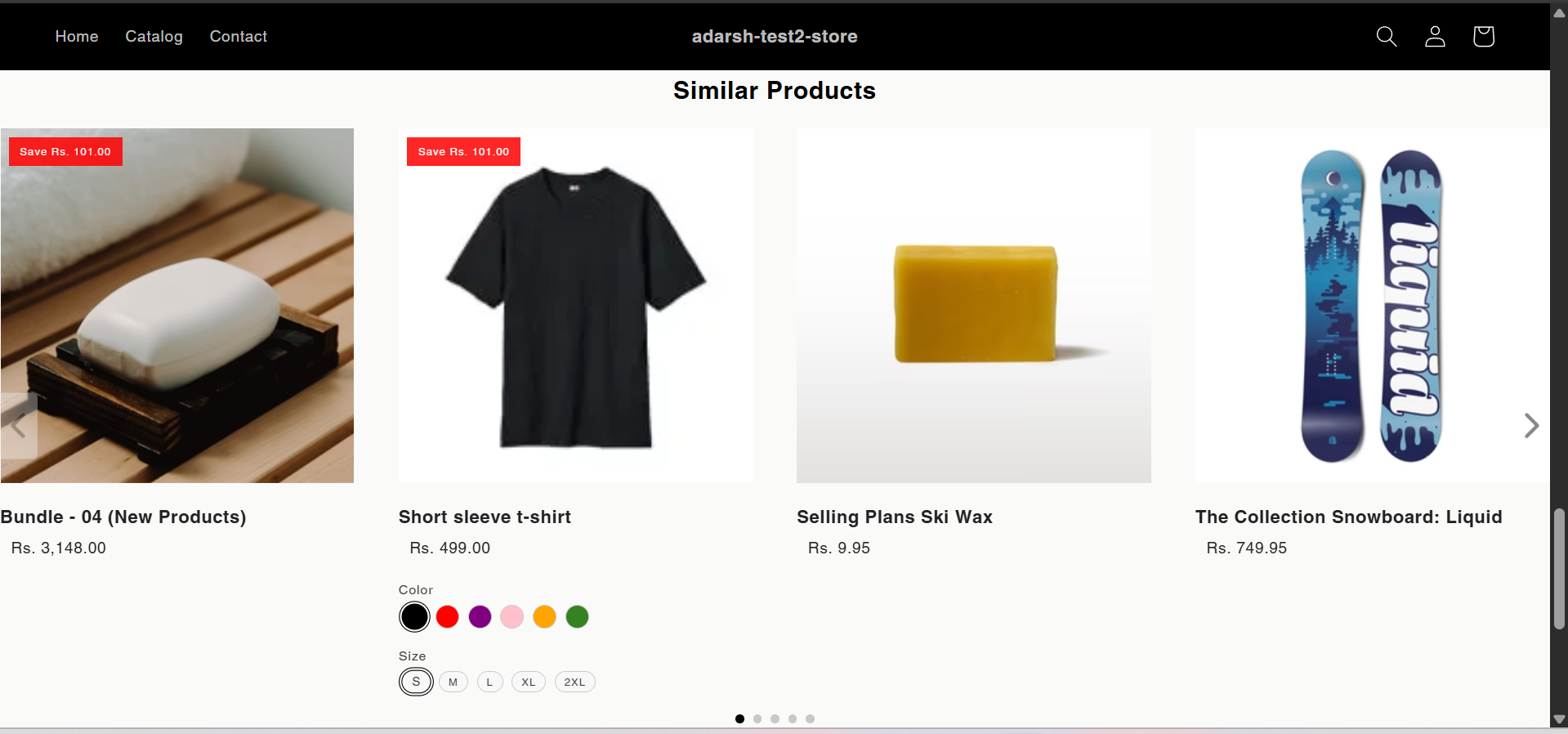 ## Support
If you need help with setting up or customizing Similar Products sections, contact our support team at [support@glood.ai](mailto:support@glood.ai)
# How to create Slot Based Recommendation section
Source: https://docs.glood.ai/for-developers/how-to-guides/how-to-create-slot-based-recommendation-section
The Slot Based Recommendation section allows you to create customized recommendation slots with different recommendation types. This feature gives you the flexibility to combine multiple recommendation strategies in a single section, helping you create more dynamic and targeted product displays.
## Implementation Steps
#### 1. Open the "Glood Product Recommendations" app in your Glood.AI admin
## Support
If you need help with setting up or customizing Similar Products sections, contact our support team at [support@glood.ai](mailto:support@glood.ai)
# How to create Slot Based Recommendation section
Source: https://docs.glood.ai/for-developers/how-to-guides/how-to-create-slot-based-recommendation-section
The Slot Based Recommendation section allows you to create customized recommendation slots with different recommendation types. This feature gives you the flexibility to combine multiple recommendation strategies in a single section, helping you create more dynamic and targeted product displays.
## Implementation Steps
#### 1. Open the "Glood Product Recommendations" app in your Glood.AI admin
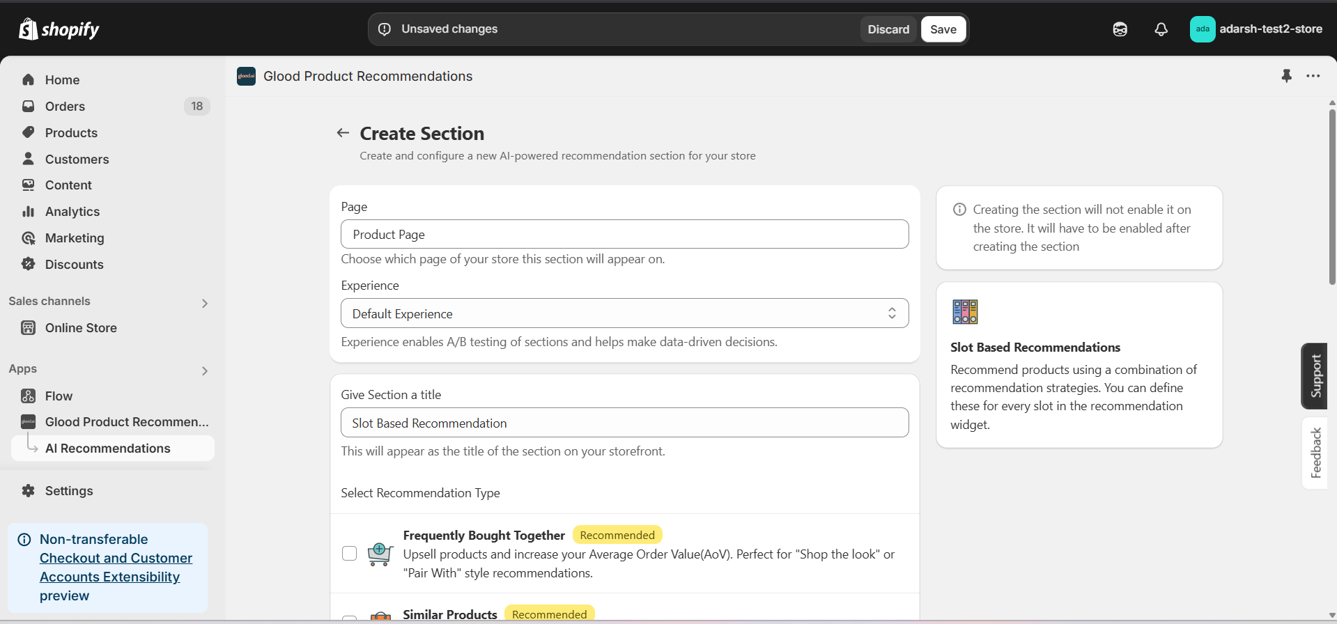 #### 5. Configure Your Section (Section Detail Page)
→ Once saved, you'll be redirected to the Section Detail Page:
#### 5. Configure Your Section (Section Detail Page)
→ Once saved, you'll be redirected to the Section Detail Page:
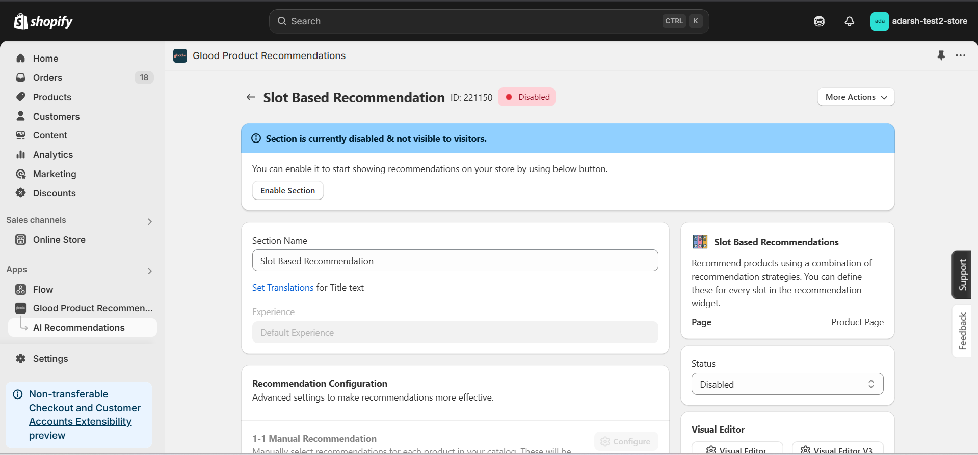 → Enable your section by clicking on the enable section button.
Here are the key configuration options available:
**→ Basic Info**
* **Section Name:** Customize the name of your section
* **Set Translations:** Add translations for different languages
**→ Slot Configuration**
* Create multiple slots with different recommendation types
* For each slot, you can:
* Set the recommendation type (Similar Products, Cross-sell, Trending, etc.)
**→ Location & Position**
* Choose where to show the section on your Shopify store:
* Enter a div ID, class selector or xPath to specify the location (default: #shopify-section-product-template)
* Set the position number to control where the section appears within that location (1 = first section)
* Use breakpoint-based configuration for granular control across different screen sizes
* For direct theme code placement, copy the provided widget code snippet
* Optional: Enable "Require app block placement" to control section display in storefront
**→ Advanced Configuration Settings**
Configure additional settings:
**1. Product Ranking Criteria**
* Choose how recommended products should be ranked and ordered
* Options include:
* No criteria (default)
* Bestsellers first
* Price (high to low)
* Price (low to high)
* New products first
* Personalized for viewer
* Random
**2. Fallback Criteria**
* Define what happens when primary recommendations aren't available
* Options include:
* Random (default)
* Best sellers
* Trending
* No criteria
**3. Price Range Limits**
* **Minimum Price:** Set a floor price for displayed products
* **Maximum Price:** Set a ceiling price for displayed products
**→ Status Section**
* Control whether this recommendation section is active or inactive on your store
* Simple toggle switch to enable/disable the section
**→ Visual Editor**
* Choose between Visual Editor or Visual Editor V3 for customizing your section's appearance
* Select a template:
* For stores with v2 templates, only Visual Editor will be visible
* For stores with v3 templates, both Visual Editor and Visual Editor V3 will be visible
* Make changes to your section's appearance by clicking the Visual Editor or Visual Editor V3 button
* Customize layout, styling and content through the editor interface
* Select a default layout style:
* Carousel
* Horizontal Grid
* Choose layout style for different screen sizes:
* Small screens (mobile): Select Carousel or Horizontal Grid
* Medium screens (tablet): Select Carousel or Horizontal Grid
* Large screens (desktop): Select Carousel or Horizontal Grid
**→ Segmentation**
* Control which visitors see this recommendation section
* Available targeting options:
* All visitors (default)
* First-time visitors
* Returning visitors
* Buyers
* Is customer
* Is not customer
* Helps create personalized experiences for different user segments
#### 6. Preview and Test Your Section
→ After configuration, preview and test the section to ensure it works as expected and all slots are displaying correctly.
## Support
If you need help with setting up or customizing Slot Based Recommendation sections, contact our support team at [support@glood.ai](mailto:support@glood.ai)
# How to create Trending section
Source: https://docs.glood.ai/for-developers/how-to-guides/how-to-create-trending-section
The Trending section showcases products that are currently popular among shoppers. This feature helps highlight in-demand items and can drive sales by leveraging social proof and creating urgency.
## Implementation Steps
#### 1. Open the "Glood Product Recommendations" app in your Glood.AI admin
→ Enable your section by clicking on the enable section button.
Here are the key configuration options available:
**→ Basic Info**
* **Section Name:** Customize the name of your section
* **Set Translations:** Add translations for different languages
**→ Slot Configuration**
* Create multiple slots with different recommendation types
* For each slot, you can:
* Set the recommendation type (Similar Products, Cross-sell, Trending, etc.)
**→ Location & Position**
* Choose where to show the section on your Shopify store:
* Enter a div ID, class selector or xPath to specify the location (default: #shopify-section-product-template)
* Set the position number to control where the section appears within that location (1 = first section)
* Use breakpoint-based configuration for granular control across different screen sizes
* For direct theme code placement, copy the provided widget code snippet
* Optional: Enable "Require app block placement" to control section display in storefront
**→ Advanced Configuration Settings**
Configure additional settings:
**1. Product Ranking Criteria**
* Choose how recommended products should be ranked and ordered
* Options include:
* No criteria (default)
* Bestsellers first
* Price (high to low)
* Price (low to high)
* New products first
* Personalized for viewer
* Random
**2. Fallback Criteria**
* Define what happens when primary recommendations aren't available
* Options include:
* Random (default)
* Best sellers
* Trending
* No criteria
**3. Price Range Limits**
* **Minimum Price:** Set a floor price for displayed products
* **Maximum Price:** Set a ceiling price for displayed products
**→ Status Section**
* Control whether this recommendation section is active or inactive on your store
* Simple toggle switch to enable/disable the section
**→ Visual Editor**
* Choose between Visual Editor or Visual Editor V3 for customizing your section's appearance
* Select a template:
* For stores with v2 templates, only Visual Editor will be visible
* For stores with v3 templates, both Visual Editor and Visual Editor V3 will be visible
* Make changes to your section's appearance by clicking the Visual Editor or Visual Editor V3 button
* Customize layout, styling and content through the editor interface
* Select a default layout style:
* Carousel
* Horizontal Grid
* Choose layout style for different screen sizes:
* Small screens (mobile): Select Carousel or Horizontal Grid
* Medium screens (tablet): Select Carousel or Horizontal Grid
* Large screens (desktop): Select Carousel or Horizontal Grid
**→ Segmentation**
* Control which visitors see this recommendation section
* Available targeting options:
* All visitors (default)
* First-time visitors
* Returning visitors
* Buyers
* Is customer
* Is not customer
* Helps create personalized experiences for different user segments
#### 6. Preview and Test Your Section
→ After configuration, preview and test the section to ensure it works as expected and all slots are displaying correctly.
## Support
If you need help with setting up or customizing Slot Based Recommendation sections, contact our support team at [support@glood.ai](mailto:support@glood.ai)
# How to create Trending section
Source: https://docs.glood.ai/for-developers/how-to-guides/how-to-create-trending-section
The Trending section showcases products that are currently popular among shoppers. This feature helps highlight in-demand items and can drive sales by leveraging social proof and creating urgency.
## Implementation Steps
#### 1. Open the "Glood Product Recommendations" app in your Glood.AI admin
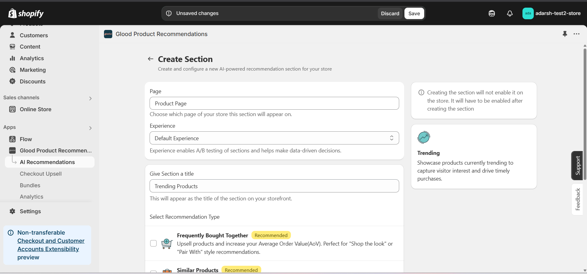 #### 5. Configure Your Section (Section Detail Page)
→ Once saved, you'll be redirected to the Section Detail Page:
#### 5. Configure Your Section (Section Detail Page)
→ Once saved, you'll be redirected to the Section Detail Page:
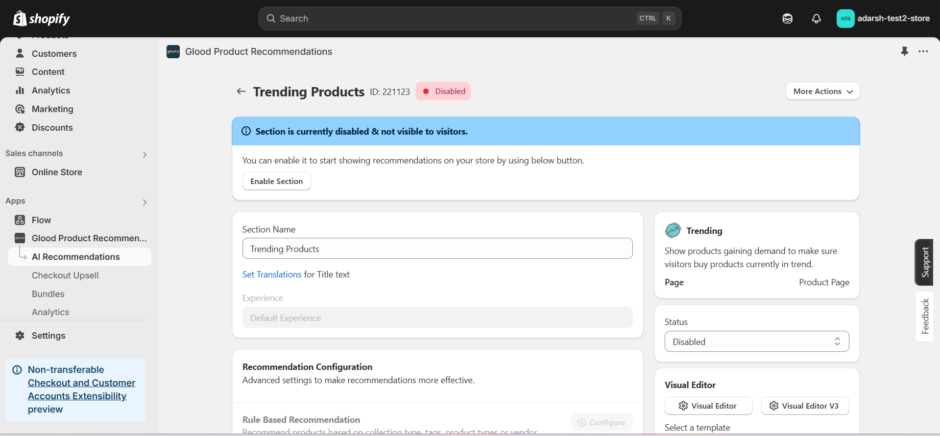 → Enable your section by clicking on the enable section button.
Here are the key configuration options available:
**→ Basic Info**
* **Section Name:** Customize the name of your section
* **Set Translations:** Add translations for different languages
**→ Recommendation Configuration**
* **Show Sold Out Items as Recommendations:** If enabled, even out-of-stock items may appear in the suggestion list.
**→ Location & Position**
* Choose where to show the section on your Shopify store:
* Enter a div ID, class selector or xPath to specify the location (default: #shopify-section-product-template)
* Set the position number to control where the section appears within that location (1 = first section)
* Use breakpoint-based configuration for granular control across different screen sizes
* For direct theme code placement, copy the provided widget code snippet
* Optional: Enable "Require app block placement" to control section display in storefront
**→ Advanced Configuration Settings**
Configure additional settings:
**1. Product Ranking Criteria**
* Choose how recommended products should be ranked and ordered
* Options include:
* No criteria (default)
* Bestsellers first
* Price (high to low)
* Price (low to high)
* New products first
* Personalized for viewer
* Random
**2. Fallback Criteria**
* Define what happens when primary recommendations aren't available
* Options include:
* Random (default)
* Best sellers
* No criteria
* Trending
**3. Price Range Limits**
* **Minimum Price:** Set a floor price for displayed products
* **Maximum Price:** Set a ceiling price for displayed products
**→ Status Section**
* Control whether this recommendation section is active or inactive on your store
* Simple toggle switch to enable/disable the section
**→ Visual Editor**
* Choose between Visual Editor or Visual Editor V3 for customizing your section's appearance
* Select a template:
* For stores with v2 templates, only Visual Editor will be visible
* For stores with v3 templates, both Visual Editor and Visual Editor V3 will be visible
* Make changes to your section's appearance by clicking the Visual Editor or Visual Editor V3 button based on your assigned template
* Customize layout, styling and content through the editor interface
* Configure template-specific settings by clicking the "Click Here" link
* Select a default layout style:
* Carousel
* Horizontal Grid
* Choose layout style for different screen sizes:
* Small screens (mobile): Select Carousel or Horizontal Grid
* Medium screens (tablet): Select Carousel or Horizontal Grid
* Large screens (desktop): Select Carousel or Horizontal Grid
**→ Segmentation**
* Control which visitors see this recommendation section
* Available targeting options:
* All visitors (default)
* First-time visitors
* Returning visitors
* Buyers
* Is customer
* Is not customer
* Helps create personalized experiences for different user segments
#### 6. Preview and Test Your Section
→ After configuration, preview and test the section to ensure it works as expected:
## Support
If you need help with setting up or customizing Trending sections, contact our support team at [support@glood.ai](mailto:support@glood.ai)
# How to Disable Products and Tags from Recommendations
Source: https://docs.glood.ai/for-developers/how-to-guides/how-to-disable-products-and-tags
This guide explains how to disable specific products and tags from appearing in your store's recommendations. You can disable items either within individual recommendation sections or globally across your entire store.
# 1. Section-Level Disabling
Learn how to disable products and tags from specific recommendation sections while keeping them available in other areas of your store.
## Implementation Steps
#### 1. Open the "Glood Product Recommendations" app in your Glood.AI admin
→ Enable your section by clicking on the enable section button.
Here are the key configuration options available:
**→ Basic Info**
* **Section Name:** Customize the name of your section
* **Set Translations:** Add translations for different languages
**→ Recommendation Configuration**
* **Show Sold Out Items as Recommendations:** If enabled, even out-of-stock items may appear in the suggestion list.
**→ Location & Position**
* Choose where to show the section on your Shopify store:
* Enter a div ID, class selector or xPath to specify the location (default: #shopify-section-product-template)
* Set the position number to control where the section appears within that location (1 = first section)
* Use breakpoint-based configuration for granular control across different screen sizes
* For direct theme code placement, copy the provided widget code snippet
* Optional: Enable "Require app block placement" to control section display in storefront
**→ Advanced Configuration Settings**
Configure additional settings:
**1. Product Ranking Criteria**
* Choose how recommended products should be ranked and ordered
* Options include:
* No criteria (default)
* Bestsellers first
* Price (high to low)
* Price (low to high)
* New products first
* Personalized for viewer
* Random
**2. Fallback Criteria**
* Define what happens when primary recommendations aren't available
* Options include:
* Random (default)
* Best sellers
* No criteria
* Trending
**3. Price Range Limits**
* **Minimum Price:** Set a floor price for displayed products
* **Maximum Price:** Set a ceiling price for displayed products
**→ Status Section**
* Control whether this recommendation section is active or inactive on your store
* Simple toggle switch to enable/disable the section
**→ Visual Editor**
* Choose between Visual Editor or Visual Editor V3 for customizing your section's appearance
* Select a template:
* For stores with v2 templates, only Visual Editor will be visible
* For stores with v3 templates, both Visual Editor and Visual Editor V3 will be visible
* Make changes to your section's appearance by clicking the Visual Editor or Visual Editor V3 button based on your assigned template
* Customize layout, styling and content through the editor interface
* Configure template-specific settings by clicking the "Click Here" link
* Select a default layout style:
* Carousel
* Horizontal Grid
* Choose layout style for different screen sizes:
* Small screens (mobile): Select Carousel or Horizontal Grid
* Medium screens (tablet): Select Carousel or Horizontal Grid
* Large screens (desktop): Select Carousel or Horizontal Grid
**→ Segmentation**
* Control which visitors see this recommendation section
* Available targeting options:
* All visitors (default)
* First-time visitors
* Returning visitors
* Buyers
* Is customer
* Is not customer
* Helps create personalized experiences for different user segments
#### 6. Preview and Test Your Section
→ After configuration, preview and test the section to ensure it works as expected:
## Support
If you need help with setting up or customizing Trending sections, contact our support team at [support@glood.ai](mailto:support@glood.ai)
# How to Disable Products and Tags from Recommendations
Source: https://docs.glood.ai/for-developers/how-to-guides/how-to-disable-products-and-tags
This guide explains how to disable specific products and tags from appearing in your store's recommendations. You can disable items either within individual recommendation sections or globally across your entire store.
# 1. Section-Level Disabling
Learn how to disable products and tags from specific recommendation sections while keeping them available in other areas of your store.
## Implementation Steps
#### 1. Open the "Glood Product Recommendations" app in your Glood.AI admin
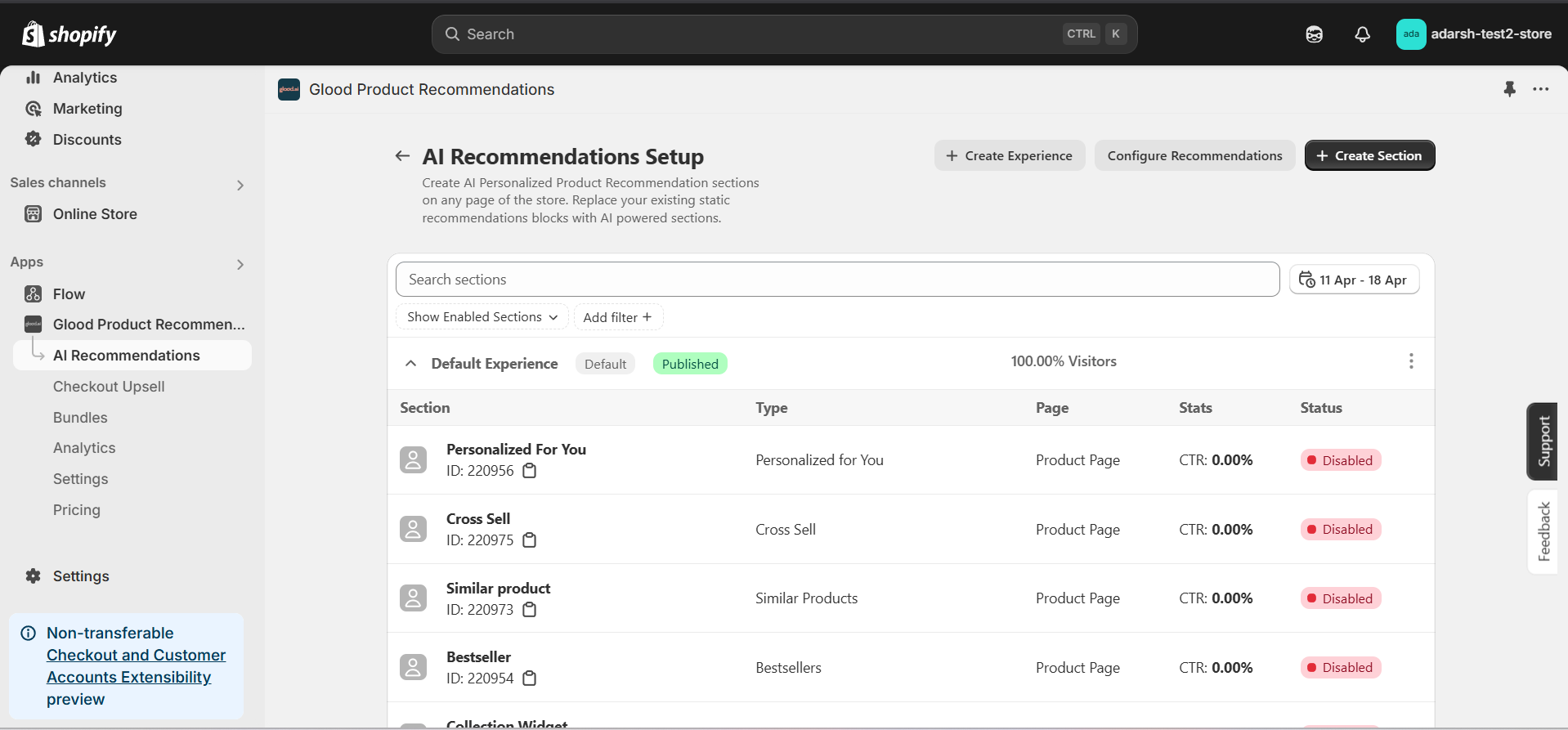 #### 3. Click on the section in which you want to disable products or tags
→ This will open the Section Detail page (as shown in the first image), where you can configure various settings for the selected section.
→ Scroll down to find the following options:
**Disabled Products** – Add specific products you want to hide from this section only.
**Disabled Tags** – Add tags to exclude all products associated with those tags from being recommended in this section.
#### 3. Click on the section in which you want to disable products or tags
→ This will open the Section Detail page (as shown in the first image), where you can configure various settings for the selected section.
→ Scroll down to find the following options:
**Disabled Products** – Add specific products you want to hide from this section only.
**Disabled Tags** – Add tags to exclude all products associated with those tags from being recommended in this section.
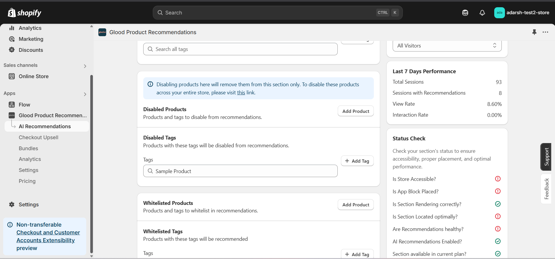 #### 4. Now you can add products and tags which you want to disable from the section recommendation
→ **Disabling Products** : Click on the "Add Product" button. It will open a screen (as shown in the figure below), where you can search for and add the products you want to disable from the section recommendation.
#### 4. Now you can add products and tags which you want to disable from the section recommendation
→ **Disabling Products** : Click on the "Add Product" button. It will open a screen (as shown in the figure below), where you can search for and add the products you want to disable from the section recommendation.
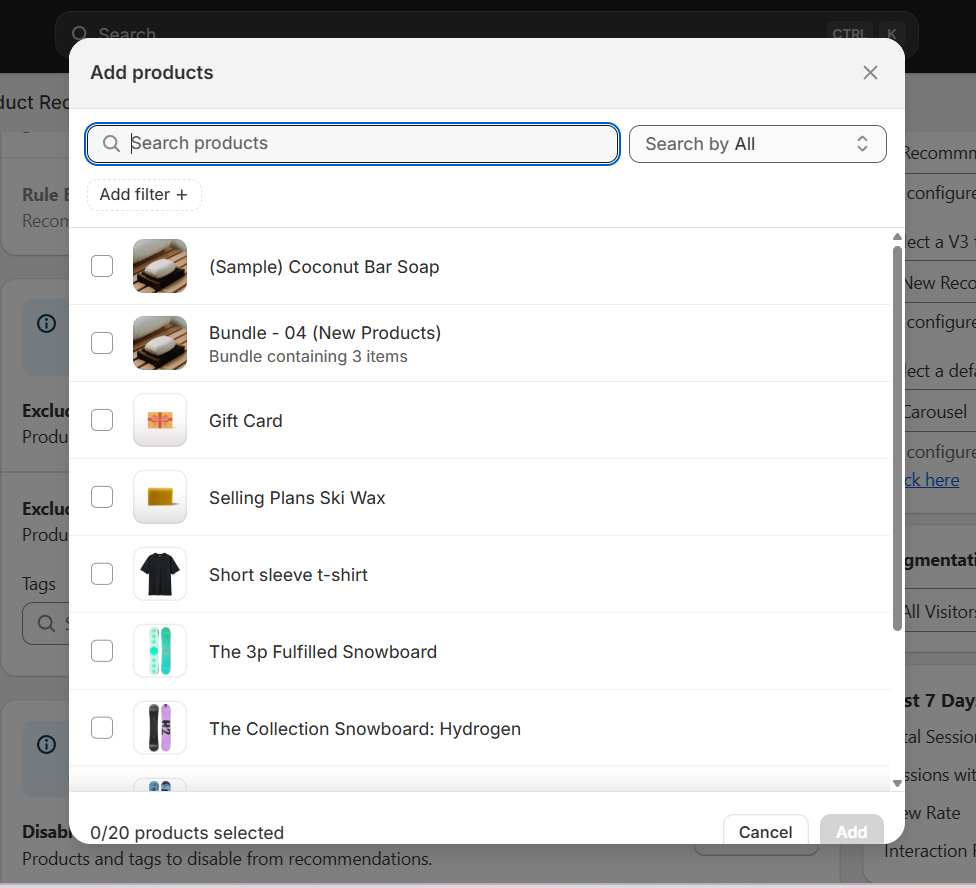 → **Disabling Tags**: In the Disable Tags section, use the search bar to find the tags you want to disable from the section recommendation and select them.
→ Once done, click on the SAVE button to apply the changes.
→ **Disabling Tags**: In the Disable Tags section, use the search bar to find the tags you want to disable from the section recommendation and select them.
→ Once done, click on the SAVE button to apply the changes.
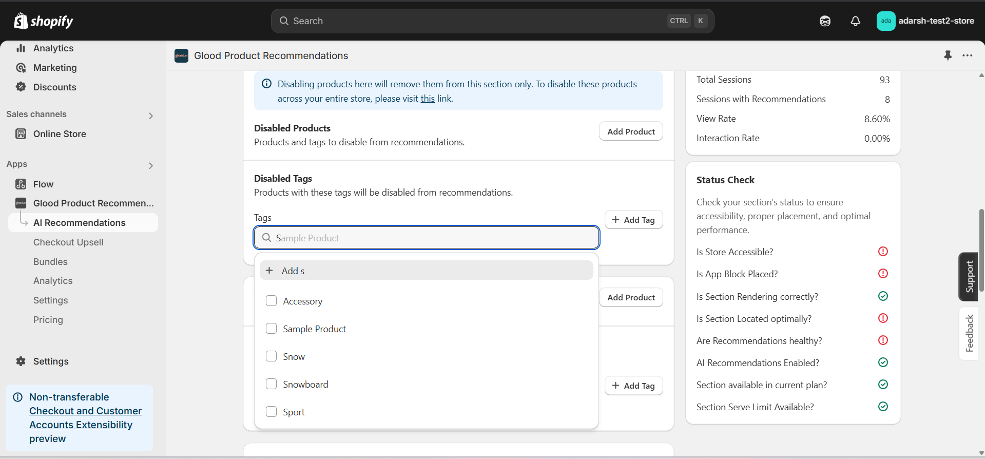 # 2. Global Disabling
Learn how to disable products and tags across your entire store. Products and tags disabled globally will not appear in any recommendation sections, checkout upsells, or other recommendation features.
## Implementation Steps
#### 1. Open the "Glood Product Recommendations" app in your Glood.AI admin
# 2. Global Disabling
Learn how to disable products and tags across your entire store. Products and tags disabled globally will not appear in any recommendation sections, checkout upsells, or other recommendation features.
## Implementation Steps
#### 1. Open the "Glood Product Recommendations" app in your Glood.AI admin
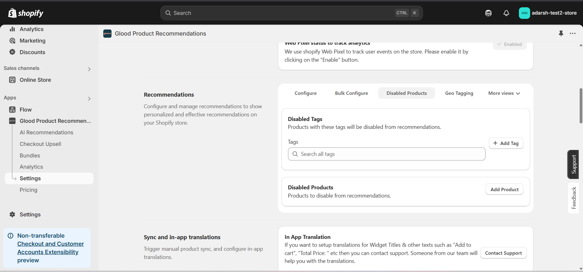 #### 3. Now you can add products and tags which you want to disable globally
→ **Disabling Products**: Click on the "Add Product" button. It will open a screen (as shown in the figure below), where you can search for and add the products you want to disable from all recommendations across your store.
#### 3. Now you can add products and tags which you want to disable globally
→ **Disabling Products**: Click on the "Add Product" button. It will open a screen (as shown in the figure below), where you can search for and add the products you want to disable from all recommendations across your store.
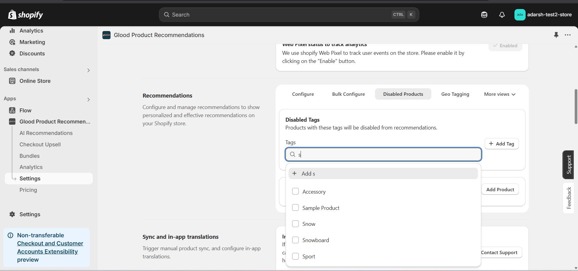 ## Support
If you need help with configuring product or tag exclusions, contact our support team at [support@glood.ai](mailto:support@glood.ai)
# How to Exclude Products and Tags from Recommendations
Source: https://docs.glood.ai/for-developers/how-to-guides/how-to-exclude-products-and-tags
This guide explains how to exclude specific products and tags from appearing in your store's recommendations. You can exclude items either within individual recommendation sections or globally across your entire store.
# 1. Section-Level Exclusions
Learn how to exclude products and tags from specific recommendation sections while keeping them available in other areas of your store.
## Implementation Steps
#### 1. Open the "Glood Product Recommendations" app in your Glood.AI admin
## Support
If you need help with configuring product or tag exclusions, contact our support team at [support@glood.ai](mailto:support@glood.ai)
# How to Exclude Products and Tags from Recommendations
Source: https://docs.glood.ai/for-developers/how-to-guides/how-to-exclude-products-and-tags
This guide explains how to exclude specific products and tags from appearing in your store's recommendations. You can exclude items either within individual recommendation sections or globally across your entire store.
# 1. Section-Level Exclusions
Learn how to exclude products and tags from specific recommendation sections while keeping them available in other areas of your store.
## Implementation Steps
#### 1. Open the "Glood Product Recommendations" app in your Glood.AI admin
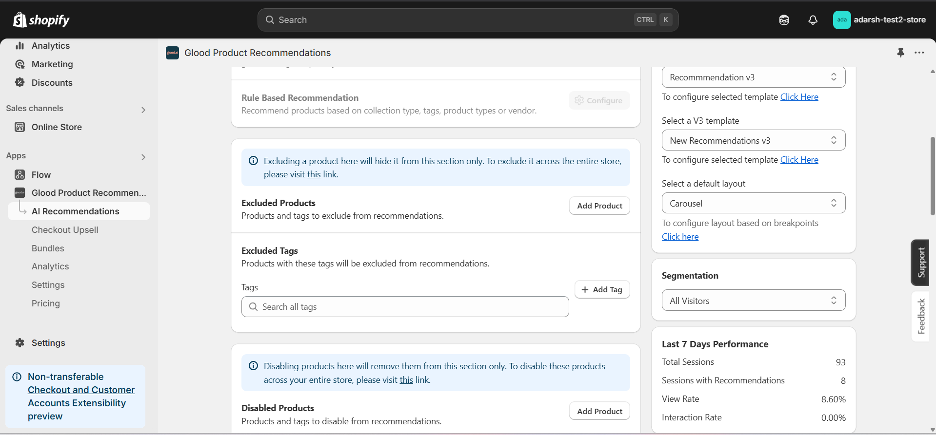 #### 4. Now you can add products and tags which you want to exclude from the section recommendation
→ **Excluding Products** : Click on the "Add Product" button. It will open a screen (as shown in the figure below), where you can search for and add the products you want to exclude from the section recommendation.
#### 4. Now you can add products and tags which you want to exclude from the section recommendation
→ **Excluding Products** : Click on the "Add Product" button. It will open a screen (as shown in the figure below), where you can search for and add the products you want to exclude from the section recommendation.
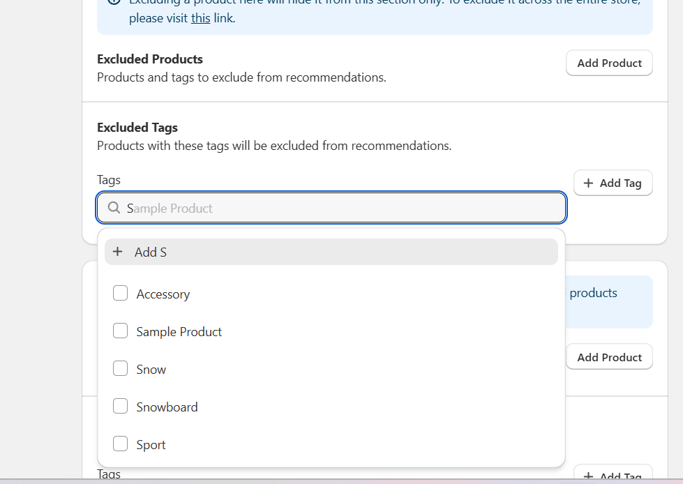 # 2. Global Exclusions
Learn how to exclude products and tags across your entire store. Products and tags excluded globally will not appear in any recommendation sections, checkout upsells, or other recommendation features.
## Implementation Steps
#### 1. Open the "Glood Product Recommendations" app in your Glood.AI admin
# 2. Global Exclusions
Learn how to exclude products and tags across your entire store. Products and tags excluded globally will not appear in any recommendation sections, checkout upsells, or other recommendation features.
## Implementation Steps
#### 1. Open the "Glood Product Recommendations" app in your Glood.AI admin
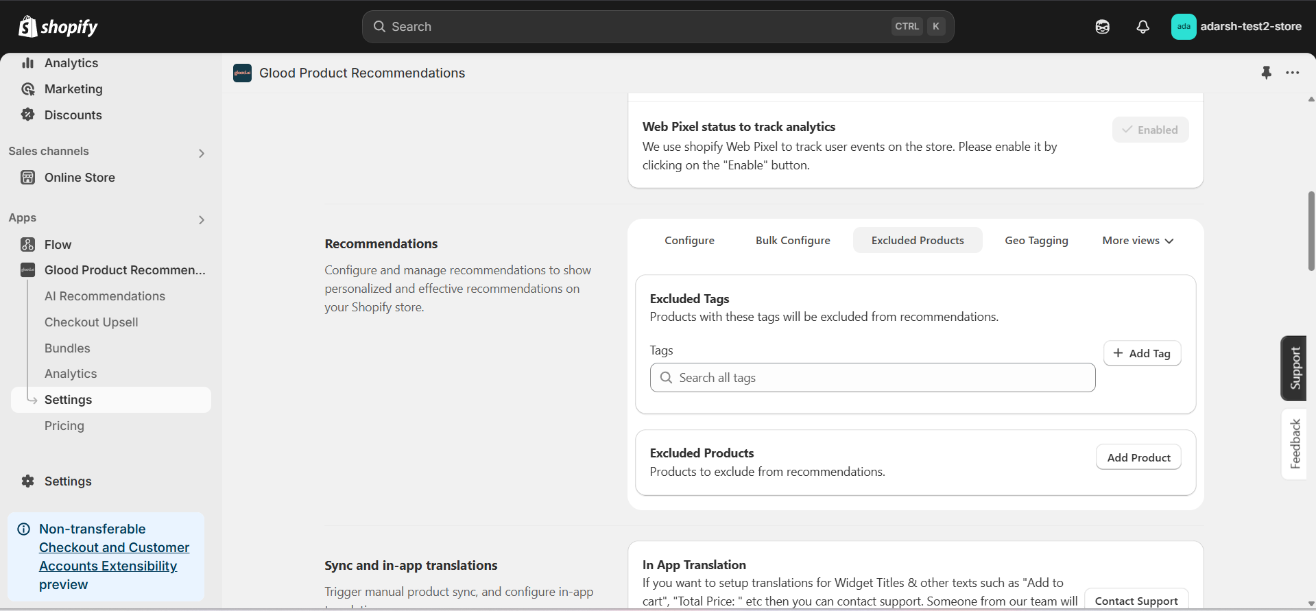 #### 3. Now you can add products and tags which you want to exclude globally
→ **Excluding Products**: Click on the "Add Product" button. It will open a screen (as shown in the figure below), where you can search for and add the products you want to exclude from all recommendations across your store.
#### 3. Now you can add products and tags which you want to exclude globally
→ **Excluding Products**: Click on the "Add Product" button. It will open a screen (as shown in the figure below), where you can search for and add the products you want to exclude from all recommendations across your store.

 ## Let's look at top features of Glood.AI
Glood.AI is a complete Conversion Optimization Platform for Shopify Plus. It includes a Personalized Recommendation Engine, AI Search & Merchendizing, Upselling, Bundles, A/B Testing, Visual Editor and more.
## Let's look at top features of Glood.AI
Glood.AI is a complete Conversion Optimization Platform for Shopify Plus. It includes a Personalized Recommendation Engine, AI Search & Merchendizing, Upselling, Bundles, A/B Testing, Visual Editor and more.