Overview
This document provides a comprehensive guide to all available styling settings for the Checkout Upsell extension. The styling configuration uses a nested JSON structure where you can customize different components.Styling Structure
The styling follows a 3-level hierarchy:- Component Level (e.g., “productCard”, “atcButton”)
- UI Element Level (e.g., “border”, “borderRadius”)
- Style Value (e.g., “base”, “loose”)
Styling (JSON Configuration)
Setting Key:styling
Type: Multi-line text field
Description: JSON object containing all styling configurations
Styling Components
A. Widget Title Styling
Component Key:widgetTitle
Available Properties:
size - Font size of the widget title
Values:
extraSmallsmallbasemediumlargeextraLarge
appearance - Color/tone of the widget title text
Values:
accent- Brand accent colorsubdued- Muted/secondary colorinfo- Informational bluesuccess- Success greenwarning- Warning yellowcritical- Error/critical reddecorative- Decorative styling
Example:
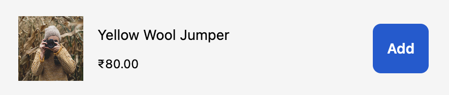
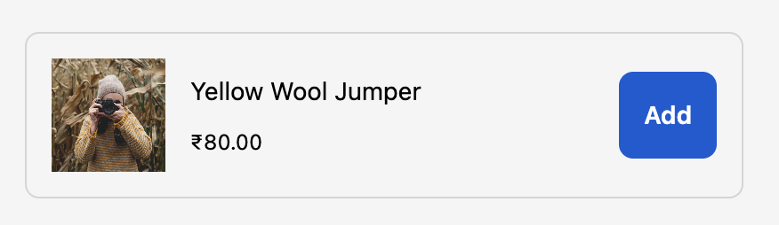
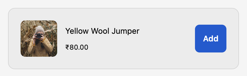
B. Product Card Container Styling
Component Key:productCard
Available Properties:
border - Border style around the product card
Values:
base- Standard borderdashed- Dashed borderdotted- Dotted bordernone- No border
borderWidth - Width/thickness of the border
Values:
base- Standard widthmedium- Medium thicknessthick- Thick border
borderRadius (or cornerRadius) - Rounded corners of the product card
Values:
none- Square cornerssmall- Slightly roundedbase- Standard roundinglarge- Very roundedfullyRounded- Fully rounded/pill shape
padding - Internal spacing within the product card
Values:
none- No paddingextraTight- Minimal paddingtight- Small paddingbase- Standard paddingloose- Large paddingextraLoose- Extra large padding
background - Background color of the product card
Values:
transparent- No backgroundbase- Standard backgroundsubdued- Muted background
Example:
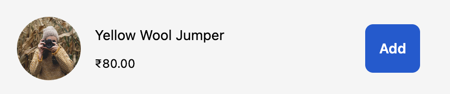
C. Product Image Styling
Component Key:productImage
Available Properties:
border - Border style around the product image
Values:
base- Standard borderdashed- Dashed borderdotted- Dotted bordernone- No border
borderWidth - Width/thickness of the image border
Values:
base- Standard widthmedium- Medium thicknessthick- Thick border
borderRadius (or cornerRadius) - Rounded corners of the product image
Values:
none- Square cornerssmall- Slightly roundedbase- Standard roundinglarge- Very roundedfullyRounded- Fully rounded/circular
Example:
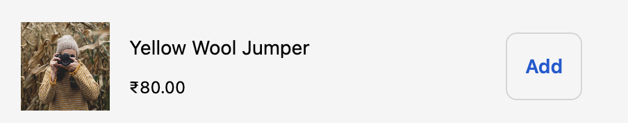
D. Add to Cart Button Styling
Component Key:atcButton
Available Properties:
kind - Visual style of the button
Values:
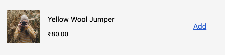
primary- Main action button (filled, prominent)secondary- Secondary action button (outlined)plain- Text-only button (looks like a link)
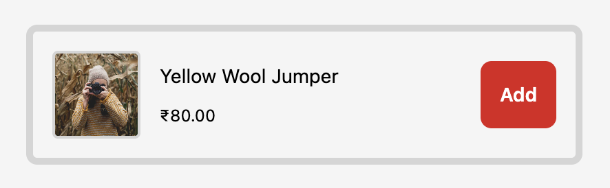
appearance - Color tone of the button
Values:
critical- Red/error stylingmonochrome- Black and white styling
For transparent buttons, use
kind: "plain" which renders as a text linkinlineAlignment - Horizontal alignment of button text
Values:
start- Align to startcenter- Center alignment (default)end- Align to end
Example:
Example (Transparent/Plain Button):
Example (Critical/Urgent Button):
Complete Examples
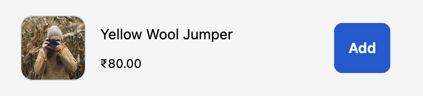
Example 1: Minimal Styling
Example 2: Card with Border
Example 3: Rounded Images
Example 4: Secondary Button Style
Example 5: Complete Custom Styling
Example 6: Modern Clean Design
Example 7: Bold with Borders
Example 8: Text-Link Style Buttons
Implementation Notes
1. JSON Validation
- The styling field expects valid JSON
- If JSON parsing fails, default styles will be applied
- Empty object
{}is valid and will use all defaults
2. Optional Properties
- All styling properties are optional
- Omitted properties will use Shopify’s default styles
- Partial configurations are supported
3. Brand Consistency
- Styles respect the merchant’s branding settings
- Some colors are controlled by the merchant’s brand settings
- Custom styles work within Shopify’s design system constraints
4. Fallback Behavior
- Invalid values fallback to defaults
- Unknown properties are ignored
- System ensures checkout remains functional
Troubleshooting
Styles not applying
Styles not applying
Solution: Verify JSON syntax is valid. Use a JSON validator.
Wrong colors
Wrong colors
Solution: Check if merchant’s brand settings override your appearance values.
Button looks wrong
Button looks wrong
Border not showing
Border not showing
Solution: Ensure both
border and borderWidth are set (not just one)